| Image |
Comment |
| 08/22/2009 10:47:44 AM |
Mourning Laundryby kivgaenComment by ace flyman: Real life story. I like the angle, but I might try cropping it tighter up to the boarder or so, which leaves just the basket and washer pretty much ? |
 Photographer found comment helpful. Photographer found comment helpful. |
| 08/22/2009 12:07:15 AM |
Mourning Laundryby kivgaenComment by vawendy: I don't care for the inner border. I think it would be stronger without it. I do like the chaos and the angle, however! Seems a tad pale. Did you play a little more contrast? I'd be curious if more contrast would hurt or help the photo... |
| Photographer found comment helpful. |
| 08/21/2009 05:59:11 PM |
|
| Photographer found comment helpful. |
| 08/21/2009 02:24:18 PM |
Mourning Laundryby kivgaenComment by BeefnCheez: i see now why people dont like these borders (crap i was probably the 8th person to say that, sorry!) Works well in b&w |
| Photographer found comment helpful. |
| 08/21/2009 12:12:44 PM |
Mourning Laundryby kivgaenComment by liberty: Mourning is right...It is Indeed the NEVER ENDING BATTLE! This image could have used a little more contrast to really make it more dramatic, 6. |
| Photographer found comment helpful. |
| 08/21/2009 12:11:02 AM |
|
| Photographer found comment helpful. |
| 08/19/2009 01:37:13 AM |
Mourning Laundryby kivgaenComment by RobMcGee: I'd have added contrast and put away the top cover, unfortunately I don't think the framing works well either, 4 |
| Photographer found comment helpful. |
| 08/12/2009 08:41:52 AM |
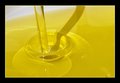
Just oil...by kivgaenComment by Budya: Greetings from the Critique Club!
I really like the simplicity of the image and the gradient of color. While the focus is good, the composition seems a little unbalanced to me. I keep tilting my head to straighten out the image.
The shadow is very distracting; shooting from a different angle would have helped to hide it. That, or trying different light setup (reflectors, etc). There are quite a few light spots that I would have liked cleaned up, especially since it was an advanced editing challenge.
I would also have liked to see it as a tighter crop (tighter from the right), with a focus on the beautiful light refractions.
I hope this helps. Feel free to PM me with any questions.
|
| 08/05/2009 01:19:19 PM |
|
| Photographer found comment helpful. |
| 08/03/2009 06:45:06 PM |
Just oil...by kivgaenComment by bvlindalou: great color of the oil.........love the simple aproach......IMO the border is a little large and over powers a great shot.....still an 8 from me |
| Photographer found comment helpful. |
Home -
Challenges -
Community -
League -
Photos -
Cameras -
Lenses -
Learn -
Help -
Terms of Use -
Privacy -
Top ^
DPChallenge, and website content and design, Copyright © 2001-2026 Challenging Technologies, LLC.
All digital photo copyrights belong to the photographers and may not be used without permission.
Current Server Time: 04/01/2026 11:33:55 AM EDT.