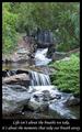
Life isn't about the breaths we take, it's about the moments that take our breath away.by
NatatorComment by Harz_Joerg: Greetings from the Critique Club
Initial thoughts/My opinion
Wonderful tranquilling and peaceful scenery. Easy understandable, well fitting text. A joy to look at.
Content/Composition
While the topic you chose is not new, i.e. showing a waterfall with long exposure, you selected a very nice one and didn't use a too long exposure time. The 0.7 s just made the water soft enough to make the overall mood quiet and peaceful (one does not think about a gurgeling creek as one would at faster shutter speed), but the water still looks natural because it is not just featureless white, especially at the central fall and in the very back.
On your composition I also like that the creek serves very well as a guiding line: the viewers eyes can walk it up and down and sees everywhere some nice spots and features which are all of equivalent quality. Same holds for the plants and rock.
Maybe that's the most important part of this composition: nothing is particularly standing in the foreground and nothing serves as a background for something. Very homogeneous while there is still plenty to see.
Hence, the title you gave it fits very well, because it's a calm, peaceful and philosophical title. Something to contemplate on.
As it has been commented, the image itself might not be breathtaking for everybody, but it's the best image to start contemplating about life and the own breathtaking moments one had. So image and title are very well chosen.
Camera work -technically
You for sure know how to handle your camera: the aperture is set great to not bring anything in the foreground or back by blurring it, exposure is on the spot, very balanced (the white portion of the water seems to be overexposed, but hey: they are just white).
Digital Processing - Technical
Also well done: well cropped, like the border and text.
It could be sharpened a little more, but really only a tiny bit. Too crisp would disturb the atmosphere.
Speaking of atmosphere: a slightly warmer tint, less bluish might have been better IMO.
Fits the challenge
Of course it does!
Good luck for you further submissions and hope to see you with a ribbon soon.