| Image |
Comment |
| 07/07/2009 02:30:23 PM |
|
 Photographer found comment helpful. Photographer found comment helpful. |
| 07/06/2009 02:50:36 PM |
|
| Photographer found comment helpful. |
| 07/06/2009 10:27:28 AM |
Black and Whiteby AmmieComment by rodgers_le: Lighting is kind of ho-hum. The photograph sort of has that green florescent tint to it. The design on the shoes could of made for interesting shadows. |
| Photographer found comment helpful. |
| 07/05/2009 11:46:17 AM |
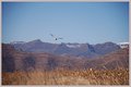
Lonerby AmmieComment by DJWoodward: Challenge Relevance:5.5 Impact/Emotion/Mood:4 Technicals:3 Processing:5.5 Creativity:3
For me, too much negative space, too central of a composition. |
| Photographer found comment helpful. |
| 07/05/2009 07:54:18 AM |
Another Lonerby AmmieComment by hotpasta: the composition doesn't work for me and the image is a little flat and could do with some levels work... |
| Photographer found comment helpful. |
| 07/04/2009 10:35:09 AM |
|
| Photographer found comment helpful. |
| 07/03/2009 05:35:32 AM |
|
| Photographer found comment helpful. |
| 07/02/2009 05:44:21 PM |
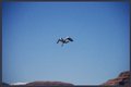
Lonerby AmmieComment by vawendy: Would have liked this much better if the bird wasn't centered. (Things really don't have to be in the rule of thirds for me... but I think this would have been spectacular off center. (as it is, it is very nice!) |
| Photographer found comment helpful. |
| 07/02/2009 01:23:42 PM |
Lonerby AmmieComment by JunieMoon: Nice motion stop. Could use a bit more contrast. Definitely you need to notice the edges when shooting. See in the upper part of the image? That shadowing? Try cropping it out to get rid of the unevenness. Because the sky is also relatively uninteresting, don't include so much. It makes for a tighter and better composition. |
| Photographer found comment helpful. |
| 07/01/2009 12:50:10 PM |
Another Lonerby AmmieComment by Ja-9: IMHO this is to blown out in exposure, you have no richness of tones/color...mind you I like the background alot but it is dull and flat in the tones/color |
| Photographer found comment helpful. |
Home -
Challenges -
Community -
League -
Photos -
Cameras -
Lenses -
Learn -
Help -
Terms of Use -
Privacy -
Top ^
DPChallenge, and website content and design, Copyright © 2001-2026 Challenging Technologies, LLC.
All digital photo copyrights belong to the photographers and may not be used without permission.
Current Server Time: 07/17/2026 03:24:29 AM EDT.