| Image |
Comment |
| 03/11/2009 09:59:24 AM |
|
| 03/11/2009 09:51:22 AM |
|
| 03/11/2009 07:12:44 AM |
|
 Photographer found comment helpful. Photographer found comment helpful. |
| 03/11/2009 06:28:22 AM |
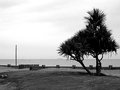
Bleak Strandby oldgrouseComment by Hipychik: Looks like a great place to go sit and think. Would have been better with a more interesting sky. Looks over-sharpened with the white edges on the tree. |
| Photographer found comment helpful. |
| 03/11/2009 12:44:42 AM |
|
| Photographer found comment helpful. |
| 03/03/2009 06:16:21 PM |
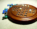
And Now ???by oldgrouseComment by bcenu: Focus could be a little sharper. The blown out background at the top spoils the shot a little. Nice setup and idea though. |
| Photographer found comment helpful. |
| 03/03/2009 01:16:04 PM |
|
| Photographer found comment helpful. |
| 03/03/2009 09:34:50 AM |
And Now ???by oldgrouseComment by mchalmers: A nice idea for the photo.. To me, there are a few issues that distract from it though.
1) The background. I'm not sure if the carpet works as a background, especially in the front where the texture is very pronounced.
2) Sharpness. The photo overall seems to lack focus.
3) Contrast. There are a lot of blown highlights in the picture. Especially in the top.. It has lost all detail. If you don't know what a 'histogram' is, I would recommend reading up on it.
4) Lighting. The light source looks to be fairly harsh (Like a bright lamp close to the subject?). This is why the bright areas are too bright, and the shadows are too dark and harsh.
5) Composition. I actually find the composition to be the best thing about this photo. Everything is on nice angles, and you've followed the rule of thirds to add some visual interest.
Hope that helps! |
| Photographer found comment helpful. |
| 02/26/2009 06:48:53 PM |
|
| Photographer found comment helpful. |
| 02/26/2009 10:11:08 AM |
And Now ???by oldgrouseComment by smudgeSMJ: Blurry. Dark, sharp shadows from lighting. Distracting texture in the carpet. Take a little more time with it. |
| Photographer found comment helpful. |
Home -
Challenges -
Community -
League -
Photos -
Cameras -
Lenses -
Learn -
Help -
Terms of Use -
Privacy -
Top ^
DPChallenge, and website content and design, Copyright © 2001-2026 Challenging Technologies, LLC.
All digital photo copyrights belong to the photographers and may not be used without permission.
Current Server Time: 07/16/2026 01:44:42 PM EDT.