| Image |
Comment |
| 07/01/2009 04:40:31 PM |
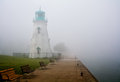
Rollin' Inby cup4tmlComment by Leo: The leading lines of the bottom left is good. But there's a lot of dead space on the right side of the image. Maybe cropping out some of the right would have helped, or trying a portrait framing instead of the landscape framing. Maybe cropping out the right half down the center of the walkway so that the lighthouse is emphasized. The fog creates another problem in that the lighthouse (the main subject) is muted so that the visual impact of the lighthouse gets lost. I'm not a big post processor so I don't know what could have been done to brighten up the teal color of the lighthouse. If the lighthouse could have been "brightened up", that may have made this a stronger image. Good luck on the voting. |
| 07/01/2009 02:27:43 PM |
Rollin' Inby cup4tmlComment by Ja-9: this is stunning...excellent processing and capture...your composition is...wow |
| 06/30/2009 11:52:55 PM |
|
| 06/30/2009 05:44:52 AM |
|
| 06/30/2009 02:09:10 AM |
|
| 06/29/2009 09:13:37 PM |
|
| 06/29/2009 07:44:08 PM |
The Old Lighthouseby cup4tmlComment by NikonJeb: Beautiful! I admire anyone who dares to take the high road and attempt to utilize image grain in a color shot. I admire someone who can pull it off even more! Positively wonderful! 10 |
 Photographer found comment helpful. Photographer found comment helpful. |
| 06/29/2009 04:41:33 PM |
|
| 06/29/2009 04:38:41 PM |
|
| 06/29/2009 03:48:22 PM |
|
Home -
Challenges -
Community -
League -
Photos -
Cameras -
Lenses -
Learn -
Help -
Terms of Use -
Privacy -
Top ^
DPChallenge, and website content and design, Copyright © 2001-2026 Challenging Technologies, LLC.
All digital photo copyrights belong to the photographers and may not be used without permission.
Current Server Time: 07/17/2026 12:29:56 PM EDT.