| Image |
Comment |
| 05/11/2009 01:33:09 AM |
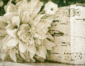
my little rock starby teranbComment by jomari: It has given it a beautiful roseate glow, I really like it, and good for you that you are being truly creative. |
 Photographer found comment helpful. Photographer found comment helpful. |
| 05/10/2009 10:41:28 PM |
|
| Photographer found comment helpful. |
| 05/09/2009 02:24:08 PM |
softpinkby teranbComment by tph1: Good work. I am intimidated by layers. Partly because I tend to ignore directions. I have to spend some time with them, as they sure seem to to be a great tool. |
| Photographer found comment helpful. |
| 05/09/2009 06:56:37 AM |
softpinkby teranbComment by jomari: I like this one too. It still looks like a pencil drawing, ( and I love pencil drawings.) |
| Photographer found comment helpful. |
| 05/08/2009 10:08:27 PM |
softby teranbComment by teranb: Originally posted by cgino:
What do you use to process your image? Here's a quickie done in Photoshop CS3; just increased the dark tones using levels and added a texture...
Your image really is wonderful!! |
Thanks for the encouragement. I have Photoshop, v. 5. Just don't know how to use it. It feels very overwhelming. Like your variation. |
| 05/08/2009 07:06:45 PM |
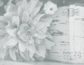
softby teranbComment by cgino: What do you use to process your image? Here's a quickie done in Photoshop CS3; just increased the dark tones using levels and added a texture...
Your image really is wonderful!! |
| Photographer found comment helpful. |
| 05/08/2009 06:44:03 PM |
softby teranbComment by teranb: Originally posted by cgino:
I really like the combination of the flower and the aged box. NICE!! And I love the bit of blur too! But I have to admit I'm with  tph1 and would like to see more contrast; more specifically, more dark tones. In general the effect of the gradient filter is really nice, but if this were my image I would continue to process it with a levels layer to darken those dark tones. If you don't want more contrast, then either think of using this as a texture layer or cool background as tph1 and would like to see more contrast; more specifically, more dark tones. In general the effect of the gradient filter is really nice, but if this were my image I would continue to process it with a levels layer to darken those dark tones. If you don't want more contrast, then either think of using this as a texture layer or cool background as  KarenNfld suggested, or even add a layer on top of it to grunge it up a bit and add more interest as we do in this thread. Bottom line is I see a lot of good to work with here! KarenNfld suggested, or even add a layer on top of it to grunge it up a bit and add more interest as we do in this thread. Bottom line is I see a lot of good to work with here! |
Great ideas. I really don't understand how to use layers. Still getting familiar with my tech stuff! Maybe I should try that next. |
| 05/08/2009 06:43:10 PM |
softby teranbComment by teranb: Originally posted by KarenNfld:
I think it would make a lovely background for a poem or invitation. As a stand alone image I think it's too light, sorry. |
No apology necessary. Thanks for your honest opinion. |
| 05/08/2009 06:34:55 PM |
softby teranbComment by cgino: I really like the combination of the flower and the aged box. NICE!! And I love the bit of blur too! But I have to admit I'm with tph1 and would like to see more contrast; more specifically, more dark tones. In general the effect of the gradient filter is really nice, but if this were my image I would continue to process it with a levels layer to darken those dark tones. If you don't want more contrast, then either think of using this as a texture layer or cool background as KarenNfld suggested, or even add a layer on top of it to grunge it up a bit and add more interest as we do in this thread. Bottom line is I see a lot of good to work with here! |
| Photographer found comment helpful. |
| 05/08/2009 05:46:08 PM |
softby teranbComment by KarenNfld: I think it would make a lovely background for a poem or invitation. As a stand alone image I think it's too light, sorry. |
| Photographer found comment helpful. |
Home -
Challenges -
Community -
League -
Photos -
Cameras -
Lenses -
Learn -
Help -
Terms of Use -
Privacy -
Top ^
DPChallenge, and website content and design, Copyright © 2001-2026 Challenging Technologies, LLC.
All digital photo copyrights belong to the photographers and may not be used without permission.
Current Server Time: 07/16/2026 10:11:02 PM EDT.