| Image |
Comment |
| 10/28/2013 09:58:04 PM |
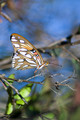
Just Hangin' Outby emoonsComment by Jules1x: Wow. Beautiful capture, the butterfly is very sharp. The color of the butterfly and the color of the background complement each other nicely. |
 Photographer found comment helpful. Photographer found comment helpful. |
| 10/23/2013 07:47:25 AM |
|
| Photographer found comment helpful. |
| 10/22/2013 08:01:48 PM |
|
| Photographer found comment helpful. |
| 10/22/2013 07:44:36 PM |
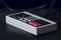
A Clockwork Orangeby emoonsComment by tnun: boldly shown. sometimes simple is good. In the case of this controversial work by an author who later regretted it, maybe this pointer to the thin thesis that sustains it is the best we can hope for. I am not convinced the limited DOF serves in any way the composition or the idea. 5 |
| Photographer found comment helpful. |
| 10/22/2013 04:42:04 PM |
|
| Photographer found comment helpful. |
| 10/21/2013 03:58:34 PM |
A Clockwork Orangeby emoonsComment by RyanW: Amusing take, Georgie, though a bit Dim overall and it kind of Peters out on the right side, don't you think? ;)
Fantastic choice for a novel, I had thought of this book initially myself though opted for different later.
I personally think the shallow focus provides several levels of appropriateness and it certainly looks thick skinned, hopefully it doesn't have to randomly attack people for no particular reason.
a 7 from me |
| Photographer found comment helpful. |
| 10/21/2013 03:08:37 PM |
A Clockwork Orangeby emoonsComment by RKT: 3...cute idea, it's just not what I was looking for with this challenge. The lighting could use some work...it seems a bit harsh and flat all at the same time. Natural light might have been a better choice. |
| Photographer found comment helpful. |
| 10/21/2013 07:28:38 AM |
A Clockwork Orangeby emoonsComment by eniko: A literal take on the book. I like it - perhaps the clock face could have been a tad brighter. From me a 6 |
| Photographer found comment helpful. |
| 10/20/2013 06:24:04 PM |
A Clockwork Orangeby emoonsComment by Abra: This image does bring a smile to my face. The shadow at the top looks more like a rotten section of orange so is a little distracting but I do like the awkward composition. 7. |
| Photographer found comment helpful. |
| 10/19/2013 11:32:05 AM |
A Clockwork Orangeby emoonsComment by Tiberius: Cool. Good concept, nice exposure colors. I would have tried to keep it all the numbers in focus. Even though it's neatly put together I would have spent a bit more on the finish of the set up - the orange dial on the 11 - 12 hours.
I will give it a 6 but might come back later. Good Luck |
| Photographer found comment helpful. |
Home -
Challenges -
Community -
League -
Photos -
Cameras -
Lenses -
Learn -
Help -
Terms of Use -
Privacy -
Top ^
DPChallenge, and website content and design, Copyright © 2001-2026 Challenging Technologies, LLC.
All digital photo copyrights belong to the photographers and may not be used without permission.
Current Server Time: 07/16/2026 07:36:59 PM EDT.