| Image |
Comment |
| 08/12/2013 01:11:25 AM |
|
 Photographer found comment helpful. Photographer found comment helpful. |
| 08/07/2013 07:19:22 PM |
Rainbow Obsidian Mayan Statueby emoonsComment by JulietNN: Interesting that you have two comments that are pretty much opposite of each other here. Depending on the screen tilt! So I think , for you, that maybe you should look at your screen and see it my way then Tang's way and find a middle ground, as then you will be pretty much calibrated. Hope that helps |
| Photographer found comment helpful. |
| 08/04/2013 02:54:43 PM |
Rainbow Obsidian Mayan Statueby emoonsComment by JulietNN: OHHHH I like it, you really have got it quite well. The only thing I am going to say is the toes of this statue are showing too much, but tilt the screen upwards and they disappear and you have a stunning black on black subject |
| Photographer found comment helpful. |
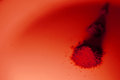
| 07/31/2013 06:56:00 PM |
Paprika one pileby emoonsComment by Cory: I like the concept here, lighting is what hurts here so much. If just the color balance was improved this could be a very nice shot. |
| Photographer found comment helpful. |
| 07/31/2013 01:38:36 PM |
|
| Photographer found comment helpful. |
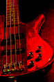
| 07/31/2013 10:51:17 AM |
Red Guitar 3 smallby emoonsComment by CNovack: I think the biggest things that were a detraction to the image is that it has a digitized/posterized look that many don't find appealing. PP brought out some harsh shadows that lose a lot of the potentialy lovely details from what you might have had in the original unprocessed one. The colors seem 'off-key' ;the yellows of the strings are harsh and clash with the red IMHO. Lastly, angle of composition - straight on shots like this add no or little draw for the eye to stay and linger awhile. Compose the shot with an interesting angle can add drama. Hope these critiques help. |
| Photographer found comment helpful. |
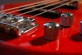
| 07/31/2013 10:42:35 AM |
Red Guitar 1bby emoonsComment by CNovack: IMHO, this one shows potential if a few more things were done. You have a nice rich, red and I like that it is a close-up showing off the instrumentation of the guitar. You have the start of good composing it just needed a little more. Stronger leading lines would boast the visual appeal - move the bridge to fill the bottom left corner so that the eye then follows the strings on the diagonal across the frame up to the top right corner. Lighting is the next thing to tackle to minimize or eliminate hard shadows by the volume & tone knobs if you can. Studio lights are nice but if you don't have that strategic placement of regular lights with daylight bulbs (to avoid any odd color cast that you would have to correct in PP). Using the same wattage you could place one light where you had it for the shot and then another directly on the opposite side to balance the light and minimalize the shadows. Lastly, only a portion of the bridge and a tuning knob are in sharp focus. Items in the extreme forefront and the backdrop are blurred - using an aperture higher than 8 can get you a greater DOF (depth of field) - but you might need a longer shutter speed depending on how much light is shining on the object. If low light, I'd highly recommend a tripod. |
| Photographer found comment helpful. |
| 07/30/2013 09:45:56 PM |
|
| Photographer found comment helpful. |
| 07/29/2013 07:01:22 AM |
|
| Photographer found comment helpful. |
| 07/25/2013 03:59:55 PM |
|
| Photographer found comment helpful. |
Home -
Challenges -
Community -
League -
Photos -
Cameras -
Lenses -
Learn -
Help -
Terms of Use -
Privacy -
Top ^
DPChallenge, and website content and design, Copyright © 2001-2026 Challenging Technologies, LLC.
All digital photo copyrights belong to the photographers and may not be used without permission.
Current Server Time: 06/25/2026 12:47:31 PM EDT.