| Image |
Comment |
| 08/21/2004 02:23:52 PM |
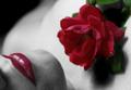
A rose with two-lipsby parrotheadComment by jbsmithana: One of my top two picks. Although it is stretched a little for the Botany challenge (sex sells I guess) I still give it a 10 for the composition, color and clarity. This shot would make an excellent ad for the rose industry at Valentines Day. Great shot overall! |
 Photographer found comment helpful. Photographer found comment helpful. |
| 08/21/2004 02:01:27 AM |
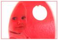
Neon Gracieby parrotheadComment by piwoguy: I don't like the border, but I like everything else about the image- very surreal. (The border seems too clean-cut for the style inside the border) |
| Photographer found comment helpful. |
| 08/21/2004 12:42:04 AM |
|
| Photographer found comment helpful. |
| 08/20/2004 01:08:03 PM |
|
| Photographer found comment helpful. |
| 08/19/2004 12:38:46 PM |
|
| Photographer found comment helpful. |
| 08/19/2004 05:47:04 AM |
A rose with two-lipsby parrotheadComment by Olyuzi: A magnificent composition. The selective desaturation is brilliant and along with the soft focus and contrasty lighting makes this a period piece (30's, 40's, 50's). Only problem is that I do not see this as meeting the challenge theme. This is artistic as opposed to scientific representation, whiich I believe the challenge is about. Would be a 10 otherwise. |
| Photographer found comment helpful. |
| 08/19/2004 04:25:11 AM |
A rose with two-lipsby parrotheadComment by e301: Not at all a bad attempt at a very design-lead stylish image. I think, however, that such very stylised photography requires a bit more PS work to really give it some pop - or a bitt more set-up care. Problems for me are an overall graininess of feel, a sense of wrong colouration on the chin (from those small hairs, and easily fixable I'd have thought), the white marks on the rose, and a feeling of congestion within the image which comes from cropping so very close to the subjects - the rose and the lips. It feels a little lke standing too close to a wall - there is no spcae for the eye to circulate around the image. It has the beginnings of an intersting idea however, certainly - just perhaps needs a bit more definition in terms of light and shape. 6 |
| 08/18/2004 10:40:12 PM |
|
| Photographer found comment helpful. |
| 08/18/2004 01:54:25 PM |
Neon Gracieby parrotheadComment by melismatica: Very interesting portrait. The color is appropriate for the child. I'd like to see a little more brightness in her face. |
| Photographer found comment helpful. |
| 08/18/2004 01:30:38 PM |
|
| Photographer found comment helpful. |
Home -
Challenges -
Community -
League -
Photos -
Cameras -
Lenses -
Learn -
Help -
Terms of Use -
Privacy -
Top ^
DPChallenge, and website content and design, Copyright © 2001-2026 Challenging Technologies, LLC.
All digital photo copyrights belong to the photographers and may not be used without permission.
Current Server Time: 07/16/2026 02:14:43 PM EDT.