| Image |
Comment |
| 02/23/2004 02:30:41 PM |
|
 Photographer found comment helpful. Photographer found comment helpful. |
| 02/23/2004 12:07:37 PM |
Splash Downby scrum8Comment by jenesis: A faster shutter speed may have helped a little here to bring more detail out in the waters movement. Interesting composition. |
| Photographer found comment helpful. |
| 02/23/2004 07:59:28 AM |
Splash Downby scrum8Comment by e301: Very indistinct I'm afraid - and the colours are very muddy for this kind of 'designer' shot. To get that stop motion and brightness into these shots you almost always need good flash work, and this appears to have been pushed towards too long an exposure really, not quite fast enough to stop the motion. |
| Photographer found comment helpful. |
| 02/23/2004 12:21:36 AM |
Splash Downby scrum8Comment by TooCool: I'm not sure what this is supposed to be, but it doesn't look terribly appealing to me. Your focus is very soft and the shot is quite busy...
TC |
| Photographer found comment helpful. |
| 02/22/2004 04:42:24 AM |
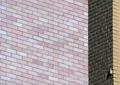
Brickworkby scrum8Comment by RedHotKK: This picture creates an optical illusion for me. One minute the dark part looks like it is around the corner from the pinkish colored bricks, then the next it looks like it is the around the corner of the brownish colored bricks. |
| Photographer found comment helpful. |
| 02/21/2004 11:12:11 AM |
|
| Photographer found comment helpful. |
| 02/21/2004 06:54:12 AM |
Brickworkby scrum8Comment by faidoi: Interesting abstract shot of a building. Pulling out the shot and making it wider would give a refrence point and make the shot more interesting. |
| Photographer found comment helpful. |
| 02/21/2004 02:33:24 AM |
Brickworkby scrum8Comment by Hye5: The difference in lighting on the two sides is extremely distracting and somewhat disorienting. Standard brick pattern is not compelling. |
| Photographer found comment helpful. |
| 02/20/2004 10:59:18 PM |
|
| Photographer found comment helpful. |
| 02/20/2004 07:55:04 AM |
Brickworkby scrum8Comment by e301: Interesting visula trick as to which section of brick is the one in front. Good texture on that section of facing that's parallel to the light, but the larger plane of brickwork displays no texture at all - oddly enough, it actually looks completely smooth, to the extent that it might even be a painted or printed panel. For a really saitisfying balance of composition, perhaps the right side is taken too far out of frame. Intriguing work though. |
| Photographer found comment helpful. |
Home -
Challenges -
Community -
League -
Photos -
Cameras -
Lenses -
Learn -
Help -
Terms of Use -
Privacy -
Top ^
DPChallenge, and website content and design, Copyright © 2001-2026 Challenging Technologies, LLC.
All digital photo copyrights belong to the photographers and may not be used without permission.
Current Server Time: 07/17/2026 07:07:01 AM EDT.