DPChallenge: A Digital Photography Contest You are not logged in. (log in or register
 
Browse Settings
Currently viewing:
Memberlangdon

Show comments:

Per page:

Order:

Comments:


Comments Received by langdon
Pages:   ... ... [59]
Showing 171 - 180 of ~583
Image Comment
IMG_9200.jpg
07/19/2006 04:47:14 PM
IMG_9200.jpg
by langdon

Comment by cryan:
My first ship was the USS Iowa (BB-61). The battleships are the most imposing ships I have ever come across. Nice shot.
Photographer found comment helpful.
Tightly Wound
07/02/2006 05:11:40 PM
Tightly Wound
by langdon

Comment by annasense:
This is very cool! Can't believe it's a guitar string... that's some lens!
Photographer found comment helpful.
Complementary Colors III IMG_0484
07/01/2006 06:43:03 PM
Complementary Colors III IMG_0484
by langdon

Comment by macrothing:
No expert on stop action, however wonder why you didn't choose a faster shutter speed, possibly coupled with a higher ISO. As for the liquid, unless you specifically wanted this transparency in it, perhaps adding some glycerine or such to the water/liquid may have shown more texture and thickness, allowing more of the movement/flow and color(s) to be captured. The glass is quite interesting, however overall the image looks like it may need a fraction nudge rotate up on the right, but not sure. The 'high key' type effect looks ok in my opinion, but does seem a fraction 'blown', but could be intentional. Looks like you've still got the swizzel stick in there - which could have had some 'movement' potential within the shot too - who knows. Hypothetically, as far as out-takes go, likely have given this a 4, maybe 5 - again primarily because the colors are not very strong. Gave your 'real entry' a 4, as you know. edit:typo

Message edited by author 2006-07-01 18:44:23.
Photographer found comment helpful.
Est. 1912
06/28/2006 07:34:22 PM
Est. 1912
by langdon

Comment by Tygerr:
Feels kinda weird commenting on a Langdon photo. Almost like talking to God... Ok, maybe not exactly.

Anyway, I was perusing, as I am wont to do...
Actually wanted to see how active you still are in the challenges.

There's only one improvement I'd like to see on this photo... crop off the bottom part of the driveway - just above those dark patches. That way you retain the drive leading up to the house as Fotomann mentioned, but you also remove those really distracting dark patches.

I just masked that portion with my hand, and immediately that house leapt out at me much more...
Photographer found comment helpful.
Eight Ball -- Corner Pocket
05/14/2006 05:40:52 AM
Eight Ball -- Corner Pocket1st Place
by langdon

Comment by Nightson:
Heh, don't know whether this quite deserves being the highest rated photo on the site ;) but who's to argue

I think it might have been interesting to shift the focus onto the 8-ball, it would have given a different take on the shot
Photographer found comment helpful.
Part of a Nutritious Breakfast
05/03/2006 12:40:44 AM
Photographer found comment helpful.
Part of a Nutritious Breakfast
05/02/2006 06:08:16 PM
Part of a Nutritious Breakfast
by langdon

Comment by aj1621:
Very cute idea. Well done.
Photographer found comment helpful.
Est. 1912
05/01/2006 09:57:55 PM
Est. 1912
by langdon

Comment by fotomann_forever:
::: Greetings from Critique Club :::

Hi, as requested, here is an indepth critique of your submission.

First Impression - the most important one:
Langdon, shame on you! Not filling in your details. Setting a bad example :-P

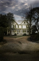
Looks like a pleasant painting that would hang in the living room of a nice country home. Quite soothing.

Composition:
You've gone for everything happening in the center of the photo, which works here, because of the subject itself. The drives leading to the house strengthens this composition for you, without them, I don't think this composition would work at all.

Subject:
I mentioned that it was peaceful. The house itself is lovely as is the scenery around it. With most of the composition being fairly dark, the house stands out well.

Technical (Color, focus, and light):
The color of the house is lookinga little off to me, it's not off a lot, but just a tad towards red.

Focus is sharp and the deep DoF works well.

Light: What intrigues me is that there is almost no shadows. The overcast sky worked well here.

To grow its vote?:
Hmmm... go into the DPC database and change site statistics ;-) Seriously, I can't think of any way to dramatically improve this image. Maybe a bit of sunlight on the trees would have given it more pop, but I think would ruin the mood of the photo.

Summary:
Love the house. Love the photo of the house. I think it's really good work.

Hope to see more from you soon,
Leroy
Photographer found comment helpful.
Part of a Nutritious Breakfast
04/30/2006 05:35:47 PM
Part of a Nutritious Breakfast
by langdon

Comment by buzzrock:
Great Exposure- nice job, focus and DOF perfect-- 9
Photographer found comment helpful.
Part of a Nutritious Breakfast
04/30/2006 04:50:58 PM
Part of a Nutritious Breakfast
by langdon

Comment by dw_photo:
good idea for this challenge, the colors and depth of field are good
Photographer found comment helpful.
Pages:   ... ... [59]
Showing 171 - 180 of ~583


Home - Challenges - Community - League - Photos - Cameras - Lenses - Learn - Help - Terms of Use - Privacy - Top ^
DPChallenge, and website content and design, Copyright © 2001-2025 Challenging Technologies, LLC.
All digital photo copyrights belong to the photographers and may not be used without permission.
Current Server Time: 08/06/2025 07:13:45 AM EDT.