| Image |
Comment |
| 10/13/2003 02:52:18 AM |
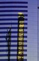
Tower Block, San Diegoby stuartComment: base 1: 1/1; challenge: 1/3; technical: 3/3; aesthetics: 0/3; total: 5
This might have been a better 'fill the frame' shot. I'm missing the 'urban landscape -- picture of buildings' feel here. |
| 10/13/2003 02:50:50 AM |
|
 Photographer found comment helpful. Photographer found comment helpful. |
| 10/13/2003 02:46:56 AM |
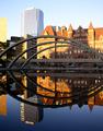
afternoon reflections by tp-fcpComment: base 1: 1/1; challenge: 3/3; technical: 3/3; aesthetics: 2/3; total: 9
Good balance of light, excellent composition. |
| Photographer found comment helpful. |
| 10/13/2003 02:45:23 AM |
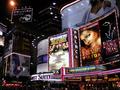
Rush Hour 24:7by ImagineerComment: base 1: 1/1; challenge: 3/3; technical: 2/3; aesthetics: 2/3; total: 8
The streaks from the bus/truck are drawing my eye more than the rest of the picture, which is a shame because there are interesting things in the photo. |
| Photographer found comment helpful. |
| 10/13/2003 02:43:20 AM |
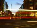
People again on Trafalgar Squareby mubrinComment: base 1: 1/1; challenge: 2/3; technical: 2/3; aesthetics: 1/3; total: 6
First, I'm amazed it seems you've got people frozen like it was a quick shutter, but yet this looks like a night shot which would require a long exposure -- how did you do that? Well, perhaps because it wasn't yet dark yet? I see the clouds in the dark blue sky which wouldn't be visible if it were purely night. Anyway, challenge points off for not having a 'photo of buildings' (one building does not buildings make), technical points off for choice of cropping -- maybe this really should be aesthetic and not technical, but I'm going to slow as it is. |
| Photographer found comment helpful. |
| 10/13/2003 02:39:16 AM |
Graffitiby nfesselComment: base 1: 1/1; challenge: 2/3; technical: 3/3; aesthetics: 2/3; total: 8
The challenge called for 'pictures of buildings (plural), but from a strictly "Urban" perspective, I think you nailed it. Again though, you missed the "landscape" part of the challenge. Still, love the colors. |
| 10/13/2003 02:37:25 AM |
Shapes of the Cityby faidoiComment: base 1: 1/1; challenge: 3/3; technical: 2/3; aesthetics: 1/3; total: 7
Too white -- near blown out in spots. Overall effect makes it look like a 'clean city' though. |
| Photographer found comment helpful. |
| 10/13/2003 02:35:18 AM |
night and rainby bleexComment: base 1: 1/1; challenge: 3/3; technical: 2/3; aesthetics: 1/3; total: 7
Photo seems a little flat and lifeless, but I do like the single point of light -- I guess I'm contradicting myself. |
| 10/10/2003 10:41:10 PM |
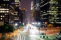
Los Angeles At Nightby Ram21Comment: base 1: 1/1; challenge: 3/3; technical: 3/3; aesthetics: 3/3; total: 10
Crap... how am I supposed to win any challenges when I keep giving out 10s -- oh sure... they're deserved, but that's not my point... I want to WIN! OK, enough whining... This is the 3rd or 4th 10 I've passed out, and this is so far, the best of them. Your image is great -- I love the colors cast by the varous lights and a nice use of the star filter. Overall lighting is spot on. Well done -- but next time, take it easy. I want to win sometime, OK? |
| Photographer found comment helpful. |
| 10/10/2003 10:36:56 PM |
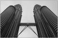
The Two Towersby Adrian TungComment: base 1: 1/1; challenge: 2/3; technical: 2/3; aesthetics: 1/3; total: 6
I think I've seen these buildings in other photos and in at least one movie. Photo attempts to be symmetric, but fails -- needs to be cropped a little more on the right to make the edge the same as on the left -- also in looking closer, the whole thing tilts to the right. |
| Photographer found comment helpful. |
Home -
Challenges -
Community -
League -
Photos -
Cameras -
Lenses -
Learn -
Help -
Terms of Use -
Privacy -
Top ^
DPChallenge, and website content and design, Copyright © 2001-2026 Challenging Technologies, LLC.
All digital photo copyrights belong to the photographers and may not be used without permission.
Current Server Time: 07/26/2026 09:12:32 PM EDT.