| Image |
Comment |
| 04/28/2010 03:17:34 AM |
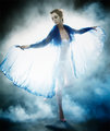
Night Butterfly by kiwinessComment: Shouldn't have been surprised that this was you on the homepage again. Congrats.
Looking forward to seeing you there again next week with whatever you cook up ;) |
 Photographer found comment helpful. Photographer found comment helpful. |
| 04/13/2010 04:25:15 AM |
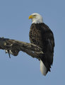
Watchingby DrakeComment: Greetings from the Critique Club!
Composition and Lighting: Natural outdoor lighting. Yet the semi-overcast lighting makes it look a little bit flat. Nothing much to say on composition. Maybe a bit tighter crop on the bottom and right.
Technical: Think this image could have improved a lot with a bit of editing. Some more contrast, a closer crop, bit darker background, bit higher saturation and sharpness, etc.
Overall: Though this eagle shot is impressive, it seems like it is a fairly standard shot to DPC. Not able to get photos of it taking off? |
| Photographer found comment helpful. |
| 04/12/2010 05:01:54 AM |
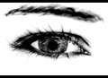
"EYE" see you!by mbrutus2009Comment: Greetings from the Critique Club!
Composition and Lighting: Pretty straight forward and yet not at all. I don't often see such high contrast images on DPC, and that isn't a big surprise because I think they may be too artistic for DPC - kind of like this image. Anyways, I love the creativity of this image. Lovely contrasts.
Thou what is with the trend of black borders on the top and bottom?
Technical: Larger! I agree. Why constrain yourself to 616 pixels wide? Also, nitpicking, it bothers me that some lashes are totally blurry and others seem overly sharp.
Overall: I do like it! First shot of an eye, awesome job. Keep up the good work.
|
| Photographer found comment helpful. |
| 04/12/2010 04:55:00 AM |
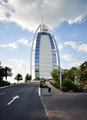
Entrance to Burj Al Arabby theONE77Comment: Greetings from the Critique Club!
Love the lighting and clouds you've captured. Composition seems both too far off center and too centered. Let me explain: the arrows which denote that this is an entrance are so close to out of frame that the lose emphasis. Yet the building is central which makes for an uninteresting composition. Perhaps if you had stood in the middle of the road, got close down to the arrow leading to the building or something to play more upon the entrance theme, this photo would have done better.
Also, the red sign to the right side distracts me. Though I do like the leading lines of the road and sidewalks. |
| 04/12/2010 04:49:42 AM |
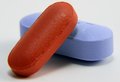
The Blue Pill or the Red Pillby burfinoComment: Greetings from the Critique Club!
Composition and Lighting: Not much to complain about here, the composition is dynamic with the angles of the pills. And lighting is like a product shot. I'd also like to see what you could do playing with the lights to do dramatic side lighting or back lighting or something.
Technical: The first thing that strikes me is that the focus isn't totally sharp on the red pill. Which at f/29, you would think that would be sharp eh?
Conceptual: Obviously this is where you got killed as far as score goes for this challenge. DPC is quite literal. Personally, I like it since I love the matrix.
Overall: Carry this creativity and attention to lighting across some other challenges in a way most DPCers can understand, and you'll be on the quick road to higher scores =)
|
| Photographer found comment helpful. |
| 04/12/2010 04:41:55 AM |
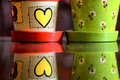
Double reflectionsby oscarburdComment: Greetings from the Critique Club!
ha ha, what are the chances that the random image pull for critique club would give me the two image you've entered into challenges! Congrats, it's you're lucky day .
Composition and Lighting: Love the reflection you've captured here. It seems to me that the pots are off center (too far right), so maybe either crop the image to make it artistically off center, or divide the pots by the center. Kapesh?
The side-lighting is quite nice.
Technical: Nitpicks: the dust/sand below the red pot is distracting. The top red rim is slightly distracting (either crop it or include more - so that it isn't right along the edge of the frame). Slight noise will get you voted down.
Conceptual: As you've seen, you got hammered DNMC - does not meet the challenge. A piece of advice for DPC: meeting the challenge in a mostly obvious way is almost king. I would say the true importance of a photo entered to DPC is having a wow factor that appeals to the masses and makes it popular. H'anyways, I like the idea you were going for here and think it would have done well had you included 3 pots.
Overall: Keep up the good work. |
| Photographer found comment helpful. |
| 04/12/2010 04:30:33 AM |
Moicano Smile.by oscarburdComment: Greetings from the Critique Club!
Composition and Lighting: The lighting highlighting his hair is quite nice, cool backlighting. The composition seems far to centered to me. It may work for this photo, but maybe try position him on the left or right rule of thirds.
Background: to me, all the toys in the background, although suggesting childhood, seem to distract from the focal point.
Technical: The focus is nice. It seems like there is some graininess to this image that could be dealt with Neat Image or other noise removal software.
Overall: Great smile, next time try playing with the lighting and composition to create more of a wow factor.
|
| 04/11/2010 03:44:03 AM |
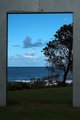
exit to another worldby disassociationComment: Greetings from the Critique Club!
Conceptual: Awesome. Think it fits this challenge beautifully. Makes me want to walk though and enjoy the ocean on the other side.
"exit to another world" - what makes this seem other worldly?
Composition and Lighting: The lighting here seems a bit dull. Though the lighting on the clouds and surf in the background is interesting, the overcast tones in the foreground don't give it any emphasis. Maybe at sunrise or sunset with this same frame, you could have captured a totally different scene.
Technical: The first thing that strikes my technical eye is the grainy texture. I think
Overall: Lovely invite into the surf and sun.
|
| Photographer found comment helpful. |
| 04/11/2010 03:37:18 AM |
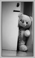
Knock. Knock.by amateurboiComment: Greetings from the Critique Club!
Composition and Lighting: I like the tilt of the image, makes it more dynamic and draws the eye in (though DPC doesn't generally like tilted images). The lighting seems a bit flat.
Technical: The first thing that strikes my technical eye is the grainy texture. I think grain can be used to effectively boost the mood of an image, but I think it hinders this image. Thought the slight reflection off the floor is nice :)
Conceptual: Not sure what you are going for? A giant teddy bear entering the room?
Overall: Fun idea, but DPC always votes down images with technical imperfections. |
| Photographer found comment helpful. |
| 04/11/2010 03:29:56 AM |
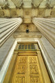
Elegant Entranceby sekarmalathyComment: Greetings from the Critique Club!
Don't thing I've ever given a more in-depth critique to a ribbon winner before, but here goes:
Composition and Lighting: Beautiful. You don't offer much for critique here =). My thing would be that the scene seems to be titled slightly to the right. Lighting is about perfect.
Technical: The first thing that catches my technical eye is the discoloration at the top of the door: the two green lens flare-ish looking things. But that would be easily modified in advanced. The distortion at the bottom of the door frame is slightly bothersome, but again this is a nitpick.
Conceptual: The funny thing to me is that even though this is obviously an entrance and won that challenge, it doesn't say entrance conceptually to me - the doors a closed. They don't invite the viewer to enter in. Though the depth of the pillars do.
Overall: As DPC agrees, this is a winning image. Congrats on the blue.
|
| Photographer found comment helpful. |
Home -
Challenges -
Community -
League -
Photos -
Cameras -
Lenses -
Learn -
Help -
Terms of Use -
Privacy -
Top ^
DPChallenge, and website content and design, Copyright © 2001-2026 Challenging Technologies, LLC.
All digital photo copyrights belong to the photographers and may not be used without permission.
Current Server Time: 06/25/2026 05:24:32 AM EDT.