| Image |
Comment |
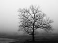
| 04/19/2004 02:55:56 AM |
Foggy Morningby RefocusedComment: Excellent shot, thought provoking. I don't really like the noise on the bottom of the picture and it is slowly blurred out. |
 Photographer found comment helpful. Photographer found comment helpful. |
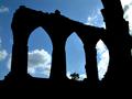
| 04/19/2004 12:40:38 AM |
Bayham Abbey Ruinsby Geo_GriffinComment: I know there was nothing you could do about it but the tree in the middle arch is a little annoyin. The edges of the arches seem too sharp. Composition is beautiful, The eye is drawn to threes, which you've caught well here. I like the contrast against the sky. |
| Photographer found comment helpful. |
| 04/19/2004 12:26:49 AM |
|
| Photographer found comment helpful. |
| 04/18/2004 06:58:09 PM |
the Prowlerby spydrComment: Freaky!
Cool idea, well done. Inside seems a bit noisy, the light (?) distacts attention. |
| Photographer found comment helpful. |
| 04/18/2004 06:53:42 PM |
Closed Foreverby neilmwilsonComment: It looks like a selection tool has been used (the edge of the steering wheel) even though it has been validated. Nice color and composition. |
| 04/18/2004 06:51:53 PM |
Through a Beveled Windowby MarjoComment: I would like to see the flower more centered, frames seem a little tilted to the right. I like the idea of it all being blurry except from the flower. |
| Photographer found comment helpful. |
| 04/18/2004 06:40:33 AM |
2,000 pcs.by HRoxasComment: Greetings from the Critique Club
Composition: Good composition. Excellent use of foreground/background. Pieces in the background are distacting, yet make it more interesting and show that the chaos is attempting to be organized.
Technical: It is well lit and even, but it seems a little wierd. Was it done with a flash? For the backround I don't know if I would have choosen different colors, but it does make it stand out a little more. Good color.
Overall: Original shot, well thought up. I like how it is framed(by the edge pieces) and how it shows the chaos. |
| Photographer found comment helpful. |
| 04/17/2004 12:57:48 AM |
Viperby HomunculusComment: Yes, it is a poweful car, but it doesn't see to represent strength, more beauty I would say. Glare spots are annoying but nothing you can do. seems a bit dark. |
| 04/17/2004 12:34:30 AM |
Window Crossby TikicharmComment: Cool photo, but may be too much like digital computer art for peoples liking. Seems over saturated and the window from is just from editing. nice cross and sun though |
| 04/15/2004 11:13:34 PM |
Face of the Stormby wilksComment: The entire sky is the subject. It makes it less of interest because there is no one thing to focus on, nowhere for the eye to lite upon and react. Its a good sky shot and does have a forboding sense though. |
| Photographer found comment helpful. |
Home -
Challenges -
Community -
League -
Photos -
Cameras -
Lenses -
Learn -
Help -
Terms of Use -
Privacy -
Top ^
DPChallenge, and website content and design, Copyright © 2001-2026 Challenging Technologies, LLC.
All digital photo copyrights belong to the photographers and may not be used without permission.
Current Server Time: 06/25/2026 12:51:34 AM EDT.