DPChallenge: A Digital Photography Contest You are not logged in. (log in or register
 
Browse Settings
Currently viewing:
Registered UserZoomdak

Show comments:

Per page:

Order:

Comments:


Comments Made by Zoomdak
Pages:   ... [117] [118] [119] [120] [121] [122] [123] ... [318]
Showing 1191 - 1200 of ~3180
Image Comment
Anyone Fancy A Cone?
06/09/2006 04:45:14 AM
Anyone Fancy A Cone?
by CraigF

Comment:
Looks out of focus. Cool lighting though.
The Moon is Sick
06/09/2006 04:44:52 AM
The Moon is Sick
by Rimwulf

Comment:
Ah yes the route of adjusting the colors =). Cool shot of the moon. Moon is sick of the injustices on earth? hmmm...
Photographer found comment helpful.
Looking Through the Hole
06/09/2006 04:43:57 AM
Looking Through the Hole
by vixen

Comment:
I like the framing you have here. Image looks a little small though
Photographer found comment helpful.
Photosynthesis
06/09/2006 04:43:07 AM
Photosynthesis
by Carmelynn

Comment:
Awesome image! Refreshing to look at. Like the water drips and layers of the plants! 8
Photographer found comment helpful.
The well in the green
06/09/2006 04:41:58 AM
The well in the green
by cristy

Comment:
Says green, but besides that, it doesn't interest me very much. Doesn't have much happening in it that the eye wants to look at, sorry.
Lion's Head
06/09/2006 04:40:28 AM
Lion's Head
by indy79

Comment:
Like the subdued greens rather the bright bright greens in some of the other photos.
Photographer found comment helpful.
Green Grass and Groundhog
06/09/2006 04:39:30 AM
Green Grass and Groundhog
by TechnocratiK

Comment:
Nice motion blur. Has green in it, but it doesn't say green to me.
Walk in the Woods
06/09/2006 04:37:49 AM
Walk in the Woods
by margiemu

Comment:
Lovely photo! I know this is a green challenge, but this photo looks unnaturally gree to me. Nice composition!
Photographer found comment helpful.
Les Belles de la nuit
06/08/2006 02:29:24 AM
Les Belles de la nuit
by dube140463

Comment:
Greetings from the Critique Club!

Composition: The composition leads the eye straight into the red flowers. There isn't much else the eye wants to look at, they are immediately drawn into the flowers then stay there. The image looks rather flat to me. The lighting isn't very dynamic. Maybe it would be more interesting if the lighting was at a slant to create more shadows or if the flashlight was under the flowers to create backlighting. But as it is, there are hardly any shadows, so it isn't very dynamic.

Technical:the first thing I notice is that it looks out of focus. Maybe because it was shot at night and probably handheld at 1/6 of a second (a pretty slow shutter speed). I recommend using a tripod for anything slower than 1/50th of a second. I also noticed that you shot this at ISO 400, which caused the noise/graininess.

Overall: I think you have a great idea going here. It has a lot of potential to be an excellent image. If you camera was on a tripod (or something else that could give good stability) and the lighting more dynamic, I think this could have been a great image.
Think for Yourself
06/08/2006 01:56:26 AM
Think for Yourself
by Rikki

Comment:
Greetings from the Critique Club!

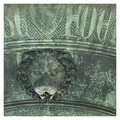
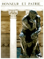
I really like the composition here. Fits the "rule" of thirds relatively well. The framing of the pillar and text above it are excellent. I think a little more space on the right side (to match the amount of space given on the left side) would have helped. Also because the sight-line of the statue leads the eye over to the frame. I think the composition would be better if you had taken a few steps to the right and shot this with the statue on the left side of the pillar and the text the same up above. Then the eye would go from the statue to the pillar up to the text and back around to the statue again.
As far as lighting, I really like it. The only thing that bothers me about the lighting is the top of the statue's head blends with the building in the background. The backlighting really helps the shot though; make the statue really pop out.
I looked up the text in a translator and found that it says "Honor and Fatherland." Not quite sure how that relates your image, but still cool.
I really like this in black and white as well. But I don't know if I like it better than the color version.

Meets the Challenge: the image matches the title and the title is a Beatles song, so yup!

Overall: The lighting is excellent (especially with such a dark foreground and bright background). The composition is good, but I think it could be better. It is a striking image because of the contrast of the darks and whites, but it doesn't speak to me that much.
Photographer found comment helpful.
Pages:   ... [117] [118] [119] [120] [121] [122] [123] ... [318]
Showing 1191 - 1200 of ~3180


Home - Challenges - Community - League - Photos - Cameras - Lenses - Learn - Help - Terms of Use - Privacy - Top ^
DPChallenge, and website content and design, Copyright © 2001-2025 Challenging Technologies, LLC.
All digital photo copyrights belong to the photographers and may not be used without permission.
Current Server Time: 09/14/2025 01:07:05 AM EDT.