| Image |
Comment |
| 10/19/2013 07:36:50 PM |
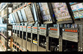
1984 - George Orwellby FourPointXComment: It's one thing to show racks of what might be security/surveillance equipment and quite another to relate it to the story. The connection is missing here as far as I can see. There is nothing threatening as in the novel, just banks of equipment whose purpose is not clear in the image. Visually, is lacks a point of reference which could be achieved by closer point of view on something significant such as a camera or someone being spied upon in the monitors. It's an interesting subject, however, to which most of us may never have access and could use a lot of visual explaining. Look at all those red switches, for example. What do they do? How could you visually hint at their use? As is, the image doesn't tell us anything. 4 |
 Photographer found comment helpful. Photographer found comment helpful. |
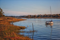
| 10/19/2013 07:24:25 PM |
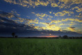
Cold Comfort Farm - Stella Gibbons by StagoleeComment: This is pretty as a rural sunset but hasn't much in the way of references to the book, at least as I understand from a synopsis. Maybe some farm buildings or a fence or some equipment or better some farmers, especially a younger woman, we could sense something of the novel. 5 |
| Photographer found comment helpful. |
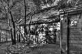
| 10/19/2013 07:00:10 PM |
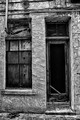
Angela's Ashes by Frank McCourtby illini75Comment: I hate to nitpick topicality but the book is neither a novel nor can it be considered a "classic". However the image seems suitable, say, as a possible dilapidated building where the author might have lived. As to the image itself, I enjoy the collection of textures and spaces, even the random wiring that characterizes such a run-down urban residence. But visually the problem is that there is so much going on that the viewer is quickly overwhelmed with too much information, especially with the texture-amplifying processing. Personally, I'm drawn to the deep blackness of the door, but distracted by the surrounding activity. I think a tighter crop on the window and door would make the impact much stronger. It's a tough subject and the image reminds me of many I've taken myself but disgarded because I couldn't decide what to do with them. So your effort is commendable but I can't go above a 6 for the reasons above. |
| 10/19/2013 04:16:21 PM |
Dr. Jekyll and Mr. Hyde (1886)by GarryComment: Shouldn't the knife blade be on the other side amplifying Hyde's personality, or is this Hyde threatening Jekyll? Anyway, technically well produced as a photo although the facial expressions doesn't quite fit with my impression of the story or its characters. 6 |
| Photographer found comment helpful. |
| 10/19/2013 04:11:56 PM |
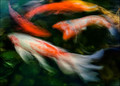
The Water Babies ~ Charles Kingsleyby Ja-9Comment: I know these fish. Love the color and the filigree and the sense of depth even in a shallow pool. Water yes, but babies - ok transformed into water creatures, maybe. 6 anyway for visual appeal. |
| Photographer found comment helpful. |
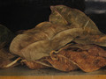
| 10/19/2013 04:11:07 PM |
A la recherche du temps perdu - Marcel Proustby mariucaComment: Haven't read Proust but I know it's long and can understand how the shriveled leaves may reflect such a long passage of time spend in writing the entire set, or perhaps Proust's regret for "lost time". So the image might even serve as an illustration for a literary work which defies illustration. As to the image itself, the color and detail are suburb but the crop/composition could be improved quite a bit. In other words, while the subject itself (the leaves) are visually appealing, the effect is marred by several unattractive elements such as the black glare (upper right) and the edge of the shelf. Better to burn in the glare and crop out the shelf. And of course, if possible recapture the right edges of the leaves which are currently cropped out. Ultimately the worthy qualities are outweighed by these defects which if corrected could result in a 6 or 7 from me but in its current state, only a 5. |
| Photographer found comment helpful. |
| 10/19/2013 04:10:48 PM |
"The Great Gatsby" Rememberedby beatabgComment: Creative visual effect - she looks like a poster cutout pasted onto a photorealistic old car painting. A character transported from the Gatsby country club into a barn. 6 for something different. |
| Photographer found comment helpful. |
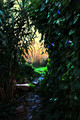
| 10/19/2013 04:05:35 PM |
The Secret Gardenby pmichaudComment: The image is too contrasty and oversaturated, but there is some of the mood as if we were looking out from a secret place to the outside light. 5 |
| Photographer found comment helpful. |
| 10/19/2013 04:03:56 PM |
|
| Photographer found comment helpful. |
| 10/19/2013 04:01:05 PM |
Wuthering Heightsby wdammanComment: Overprocessing has clumped up the normal tonal range and the composition lacks clear intent. As to subject matter, this comes closer to the source inspiration than most images in the challenge. 5 |
| Photographer found comment helpful. |
Home -
Challenges -
Community -
League -
Photos -
Cameras -
Lenses -
Learn -
Help -
Terms of Use -
Privacy -
Top ^
DPChallenge, and website content and design, Copyright © 2001-2026 Challenging Technologies, LLC.
All digital photo copyrights belong to the photographers and may not be used without permission.
Current Server Time: 05/16/2026 01:36:47 PM EDT.