| Image |
Comment |
| 11/17/2011 09:56:39 AM |
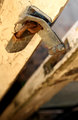
Encroachmentby RohanCComment: Could stand to have been sharpened a bit more but nice bokeh and warm light, compliments the colour of the rust. |
 Photographer found comment helpful. Photographer found comment helpful. |
| 11/15/2011 09:08:07 PM |
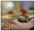
Shyby ionelpopComment: I expect this will rank very high. Great DOF and nice clear focus on the little guy. Really nice job, bumping my vote up. |
| Photographer found comment helpful. |
| 11/15/2011 02:01:50 PM |
Symphony of Colorby sfaliceComment: The saturation is up way too high, the colours no longer look natural. That blue dot is also really distracting unfortunately. If you hadn't bumped the blue saturation up to full, it may not have been so eye-grabbing; the ability to alter saturation is a helpful tool and could have enhanced what was probably a pleasant shade of purple, whereas over-use of the tool has overpowered the subject. Less is more. :-) |
| Photographer found comment helpful. |
| 11/15/2011 01:56:43 PM |
with more than our eyes do we seeby jmritzComment: I can just about see a woman's face but the quality is really poor in this shot; there are artefacts appearing along the bottom, it's really noisy all over and there is no point of focus. Kinda like looking through a cloud! A low-scorer for me, I'm afraid. |
| Photographer found comment helpful. |
| 11/15/2011 01:55:13 PM |
Cosmic contoursby herfotomanComment: The contrast is awfully dark and the whole image is a bit noisy, it almost looks like a scanned photo. I'm afraid this is a low-scoring one for me as the quality is poor and I just can't make out what it is. Might've better suited an abstract challenge (with some work.) |
| Photographer found comment helpful. |
| 11/14/2011 08:57:44 PM |
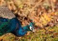
Kittyby bubeltrubelComment: What a gorgeous cat, lovely colouring. Great exposure and focus. |
| Photographer found comment helpful. |
| 11/14/2011 08:54:31 PM |
To The 9'sby Ja-9Comment: Very pretty generally and the colour is gorgeous; a little over-softened for my taste but this would make a great canvas on a wall. |
| Photographer found comment helpful. |
| 11/14/2011 08:52:20 PM |
I Bleed To Know That I Am Aliveby MinsoPhotoComment: I'm not sure what it is but the eyes in this almost look false, like there's an unusual amount of the whites on show. Strange. It distracts me from the focus a bit. I definitely don't like the title. I'm not overly keen on the subject personally either but the bokeh and focus on the fingertip are very good. |
| Photographer found comment helpful. |
| 11/14/2011 08:50:09 PM |
Graceful Linesby dswannComment: The petal edges look a bit blown out to me. The colours and tones are very pretty though and the focus on the rose's centre is nice. This will probably ribbon or definitely make the top 10. |
| Photographer found comment helpful. |
| 11/14/2011 08:46:39 PM |
Colorby WildShutterComment: I'm not sure if this fits the golden ratio? Still, the mix of colours is really good. The cold blue/green stands out nicely against the warm Autumn colours in the bokeh. |
| Photographer found comment helpful. |
Home -
Challenges -
Community -
League -
Photos -
Cameras -
Lenses -
Learn -
Help -
Terms of Use -
Privacy -
Top ^
DPChallenge, and website content and design, Copyright © 2001-2026 Challenging Technologies, LLC.
All digital photo copyrights belong to the photographers and may not be used without permission.
Current Server Time: 05/12/2026 09:36:02 AM EDT.