| Image |
Comment |
| 11/17/2011 10:15:26 AM |
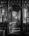
The Chapel of St Andrewby MAKComment: Lovely place, some great patterns on the woodwork, nice light and shadows too. I like this shot a lot but I do wish it was rotated just a little to the left as it's sitting slightly skewed. Maybe taking the shot a wee bit more to the right facing the door dead on would have rectified that. Very nice overall though. |
 Photographer found comment helpful. Photographer found comment helpful. |
| 11/17/2011 10:10:24 AM |
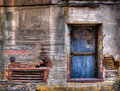
Parking at Parisianby dswannComment: Interesting little wall; different colours, shapes, words, all keep this from being dull without being too busy. I like it, nice sharpness too. |
| Photographer found comment helpful. |
| 11/17/2011 10:05:07 AM |
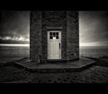
Lightkeeper's Threshold by bassboneComment: Very nice, the stormy looking sky in the background adds to the mood; a very good and sharp image. I can see this ranking quite high. |
| Photographer found comment helpful. |
| 11/17/2011 10:01:02 AM |
|
| Photographer found comment helpful. |
| 11/17/2011 10:00:03 AM |
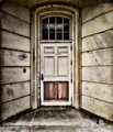
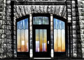
Stained Glassby bmatt17Comment: I love the sharp rough stone around the doors, the gleam almost looks like it was recently raining. The shapes of the glass panels are cool, although I don't really like the selective colour. Normally I like colour popping but I feel this would have looked better as a full b&w image. |
| Photographer found comment helpful. |
| 11/17/2011 09:57:40 AM |
Portalby sfaliceComment: Very pretty scene, a good balance I think. The gate has cool patterns so the shot would have been Ok zoomed in on just that but the lovely blue sky and Autumn foliage to the side brings a bit more life. Nice job. |
| Photographer found comment helpful. |
| 11/17/2011 09:57:23 AM |
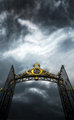
Kingdom of Lost Soulsby gyabanComment: Awesome, can see this doing very well, front page for sure. Nice upward perspective, along with the gloomy sky it gives a sense of strength. I've noticed that landscape or square crop images tend to do better here on DPC but hopefully that won't hold you back. |
| Photographer found comment helpful. |
| 11/17/2011 09:57:18 AM |
|
| Photographer found comment helpful. |
| 11/17/2011 09:57:14 AM |
Back Openedby TiberiusComment: I think I may have preferred this cropped portrait; I know you would lose the cool perspective but all that rubbish in the background totally grabs my eye, especially the red bin and blown out bit on the top left corner. Nice DOF generally though. |
| Photographer found comment helpful. |
| 11/17/2011 09:57:00 AM |
Out of Syncby crikComment: Almost symmetrical but not quite, which I gather is intentional if the title is anything to go by; it does bother me a wee bit visually, I'm a sucker for symmetry though. Nice crisp white offset by the yellow. |
| Photographer found comment helpful. |
Home -
Challenges -
Community -
League -
Photos -
Cameras -
Lenses -
Learn -
Help -
Terms of Use -
Privacy -
Top ^
DPChallenge, and website content and design, Copyright © 2001-2026 Challenging Technologies, LLC.
All digital photo copyrights belong to the photographers and may not be used without permission.
Current Server Time: 05/12/2026 08:38:27 AM EDT.