| Image |
Comment |
| 12/02/2011 04:43:09 PM |
Preparing for a feastby gnoeouComment: Looks like a nice setting, would've liked to see it cropped out further to see more; the light is a bit flat but it's not too bad since the glow from the lamp flame is there. Good DOF. I'm not sure this quite puts me in mind of family, a cosy restaurant certainly though, I suppose you could maybe equate that to a family meal. |
 Photographer found comment helpful. Photographer found comment helpful. |
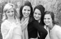
| 12/01/2011 07:51:15 PM |
more than junk bondsby bspurgeonComment: I'll admit I don't quite understand the title. I'm not overly keen on the presenceof the older person, for some reason I feel they look a little out of place, possibly because they aren't directly interacting with the others. I think being unable to see the eyes enhances this. I like the direct eye-contact with the little girl though and I think b&w was a good choice. Good exposure considering the sun. |
| Photographer found comment helpful. |
| 12/01/2011 07:48:29 PM |
Dog Walkby BenstedComment: I think I may have prefered a different crop, this one is a bit too long width-wise. Seeing more of the shoes might have enhanced the idea of the whole family. The overall hue is a bit too pinky/reddish. Nice focus though and I like the idea. |
| 12/01/2011 07:20:39 PM |
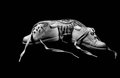
family shoesby LawtonComment: Little shoes beside big ones is a nice idea to illustrate family, i.e an adult and child but I'm not feeling the 'floating' look. The shoes are sitting in jet black space with no suggestion as to what they're sitting on, which makes them look a bit floaty - the same often happens to shots on an all-white backdrop. Good focus on the shoes though, nice and sharp on the laces. |
| Photographer found comment helpful. |
| 12/01/2011 07:17:35 PM |
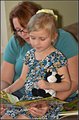
What happens next...........by DanaSComment: The crop feels cramped, I think this would have worked a little better zoomed back a bit, maybe even in landscape orientation. There's an unpleasant shadow at the back of the mother and down the right side of the girl's arm, a different light source may have helped, like a ceiling-bounced flashgun; the light as it is is a bit flat. A sweet idea though (I wish more parents would read to their kids these days!) and a lovely little girl. |
| Photographer found comment helpful. |
| 12/01/2011 07:14:48 PM |
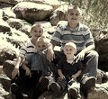
Brothersby NeatComment: This image almost looks like it has some sort of filter over it(?) as the blown highlights on the rocks and the bigger boys' arm from the sun look a bit strange. I'm not keen on the dull yellow hue on this image, I think it would've looked nice in proper colour, especially since the boys are well co-ordinated in blue. It certainly meets the challenge, a nice collection of cheerful brothers; could be sharper overall. |
| Photographer found comment helpful. |
| 12/01/2011 07:10:55 PM |
Leaving the nestby talzamComment: Every parent has this type of moment so this shot is relatable, nice focus on the two of them and I like the backlighting. That pigeon is a wee bit distracting but not overly so. Would've liked the shot to be a bit sharper overall. |
| Photographer found comment helpful. |
| 12/01/2011 07:08:44 PM |
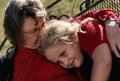
Generationsby karmatComment: The shot feels a little bit cramped; the young girl doesn't look entirely comfortable which enhances the cramped feeling (like she knows the camera is there and feels a wee bit nervous or posey.) I think if the shot were taken (or cropped, whichever) further out, it might have helped. It's a nice scene nonetheless, exposure in the sun is Ok, I like their matching clothing colours. |
| Photographer found comment helpful. |
| 12/01/2011 07:03:40 PM |
Family - Sistersby akandalinComment: I think the contrast needs to be a wee bit darker on this; the highlights are bright and the midtones look Ok but there's a lack of contrast that I feel would help boost the image. The focus is fine, would've liked it to be a little bit sharper; has a nice sisterly feel to it though. |
| 12/01/2011 07:02:14 PM |
Bedroom in the morningby jmespigaComment: I'm not strongly getting the essence of family from this; maybe a little, in the sense that every family with a kid probably has a room similarly full of toys and a messy bed. If that was your intent, I think a landscape crop would have been better, to get a wider view of the child's room. |
Home -
Challenges -
Community -
League -
Photos -
Cameras -
Lenses -
Learn -
Help -
Terms of Use -
Privacy -
Top ^
DPChallenge, and website content and design, Copyright © 2001-2026 Challenging Technologies, LLC.
All digital photo copyrights belong to the photographers and may not be used without permission.
Current Server Time: 05/12/2026 01:40:29 AM EDT.