|
|
|
Showing 961 - 970 of ~2067 |
| Image |
Comment |
| 02/14/2011 03:42:15 AM | Sunset at Anna Maria Islandby Ja-9Comment: Hello and greetings from the Critique Club-
Since I voted on this challenge, I will provide my vote and an explanation for it.
I gave your entry a 5. While you no doubt stumbled upon a gorgeous scene, it is quite another thing entirely to have a composition with a sunset that strengthens it (it’s quite difficult, in my opinion). It seems as though you wanted to convey the greater scene and context a bit here, but it is somewhat incomplete because the water is so dark and the beach is non-existent. Surely, it’s there, but it is completely obscured. The tree also does not feel particularly relevant to the shot, it not having a conceptual connection to the ocean nor the sky, which is compounded by the fact that it is a very strong element in the scene. It is so strong as to dominate and subvert the sunset, which is what you wanted your subject to be. A focus on the sunset itself as the subject would benefit things, in my opinion. It is also, of course, notoriously difficult to enter sunset photos here at DPC, owing to the laurelled history of the subject matter, so there’s that too. Not a bad shot by any means, but lacking something to set it apart from the others.
|  Photographer found comment helpful. Photographer found comment helpful. |
| 02/14/2011 03:21:44 AM | Sunburstby chazoeComment: Hello and greetings from the Critique Club,
As I voted on your photo, I’ll tell you what I voted and why-
I gave your entry a 5, and if I were to explain it succinctly, I would say that you did a good job of capturing a lightness and brevity, but that the photo, to me, feels very incomplete and unsure of what it was trying to be. It is somewhat lacking of direction, and while I do like the bright colors and appreciate the blown areas, it does not seem as though it altogether completes the message.
As far as the more high key approach goes, it works well for this subject matter, but the contrast is not quite lowered to a level typical of a high key shot. It also resides in an area that is neither completely blurred nor sharp. While these rules or guidelines need not be followed, it’s useful to know them and know that to a great extent they guide what people expect in photos. I think, in this case, a more solid and concerted effort towards a high key shot would have benefitted things. I think it also would have worked to have an initially somewhat sharper photo and then go for an impressionist approach (which you somewhat have here). What is somewhat awkward though, is that while you’ve gone for the impressionist approach, and the image is not focused, the portions of the flower that define its shape are very sharp because of the contrast that is still present in them. This is particularly true of the edges of the petals, and I think they destroy some of the feeling of a painting that it seems you were going for.
| | Photographer found comment helpful. |
| 02/14/2011 03:08:12 AM | Januaryby smardazComment: Hello and greetings from the Critique Club-
Since I did vote on your image, I’ll give you my vote and my thinking behind it.
I gave you a 6, personally, and if I were to give a summation of my vote, it would be that this is a competently done portrait, but lacks the oomph to push it beyond that.
You’ve got numerous things going well for you in this shot- the lighting is moody, and matches the expression well. The posing does not seem altogether awkward, but also is not terribly natural, either. I hate posing, both myself and other people, so I feel for you here, and can’t suggest much because I think I’m terrible at it. What I do like about the pose is that you’ve kept the joints bent, and because they aren’t uniform in any fashion, you keep a bit of dynamism present. The lighting itself is soft, and interesting, providing a nice texture to the shot through the shadows. One thing I would prefer is to have a bit more light on your right eye. It is slightly illuminated, but maybe a bit more would benefit things. If you turned/tilted your head ever so slightly you would illuminate more under your brow, while still keeping most of your cheek structure obscured. I assume you shot this yourself though, so it’s always hard to do such things.
One thing that I think detracts from things here, though, is what appears to be heavy dodging on the hand. I’m guessing it was much brighter and distracted the viewer, pull them towards it, and while you have muted its presence effectively, once one sees it, it looks very unnatural.
| | Photographer found comment helpful. |
| 02/13/2011 04:55:25 AM | A Jubilant Swingby dahlinComment: I can see why you would have difficulty deciding between these two. They are both great, but so fundamentally different. I love the expression here, but also the reaching in the second one, especially with the glorious sun rimlight. | | Photographer found comment helpful. |
| 02/13/2011 04:51:11 AM | Let Me Explainby dahlinComment: The shadows you noted are there, no doubt, but because the overall exposure of the wall is pretty low, they aren't horribly noticeable. You could always smudge them out in a fan pattern if they really worry you that much, but it's nice as is. A great moment captured, surely one to look back on later and haunt your daughter with. | | Photographer found comment helpful. |
| 02/13/2011 04:47:45 AM | weatheredby aprudhommeComment: The treatment of the shadows define this photo. Very little in their overall abundance, but striking in their strength. It adds a starkness to the scene. | | Photographer found comment helpful. |
| 02/13/2011 04:45:20 AM | Vitruvian Boyby PaulComment: The toning does, indeed, add a very appreciated nostalgia to the scene. I agree with you in preferring this shot to your entry. The vignette on the other was a bit overbearing to me, and it added a weight that I wouldn't associate with the scene. This shot leaves that lightness of being intact, much to its benefit. | | Photographer found comment helpful. |
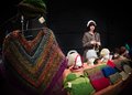
| 02/13/2011 04:40:30 AM | Hat Girlby NeilComment: The spotlight effect you've got here just makes this shot. Her illumination, along with that of the wares, are great. I particularly like the left side of the frame, which is illuminated but muted, which pulls us towards her in the back, yet still acts as an effective part of the scene. | | Photographer found comment helpful. |
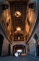
| 02/13/2011 04:38:10 AM | Grand Entranceby NeilComment: What an awesome use of a fisheye. It's so exaggerated and the architecture is such that it almost feels Escher-esque, like the ceiling is curling open above us (sorta like what happens in Inception, if you've seen that....) Very cool. | | Photographer found comment helpful. |
| 02/13/2011 04:33:56 AM | A Face in the Crowdby LandzEncaComment: As a general comment- while it allows you to "change WB" it is not changing it in the truest sense. It is shifting things, and you won't experience the same latitude that you have with a RAW. Same goes for exposure adjustment... you CAN, but it isn't as good. Still good to know, though.
Regarding the photo, I like the calm yet serious expression. She obviously knew she was being photographed, yet it's a very natural look. | | Photographer found comment helpful. |
|
Showing 961 - 970 of ~2067 |
Home -
Challenges -
Community -
League -
Photos -
Cameras -
Lenses -
Learn -
Help -
Terms of Use -
Privacy -
Top ^
DPChallenge, and website content and design, Copyright © 2001-2026 Challenging Technologies, LLC.
All digital photo copyrights belong to the photographers and may not be used without permission.
Current Server Time: 06/19/2026 11:56:00 PM EDT.
|