| Image |
Comment |
| 11/10/2011 10:51:20 AM |
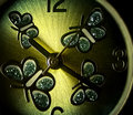
Almost Timeby colorcarnivalComment: Because the texture of the clockface is so cool, I'd like to have seen your depth of field extend through the entire image. |
 Photographer found comment helpful. Photographer found comment helpful. |
| 11/10/2011 10:50:18 AM |
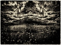
Wynken, Blyken, and Nod... and Clyde by vawendyComment: Very cool image.
Total nitpicking here- there's something odd about the left side of the frame and a portion of the bottom of the frame. The tone is different for some reason.
Great shot though. |
| Photographer found comment helpful. |
| 11/09/2011 08:30:23 AM |
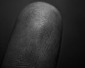
Golden Ratio - Finger Printsby chummiphotographyComment: Shots like this really demand sharper detail than you've managed here. Stopping down will help you with shots like this, as well increasing your contrast. You do have some cross lighting working to help define things, but it could be exaggerated more. |
| Photographer found comment helpful. |
| 11/09/2011 08:28:19 AM |
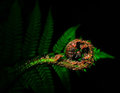
One Man's Home is Another Man's Treasureby nickybComment: This would've been a great entry in the Weston Challenge we had awhile back. I'm less fond of the shots that are strictly still lifes of whatever naturally occuring examples there are of phi, but this one really is done splendidly. Nice job, one of my tops. |
| Photographer found comment helpful. |
| 11/09/2011 08:25:34 AM |
|
| Photographer found comment helpful. |
| 11/08/2011 10:36:38 AM |
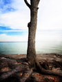
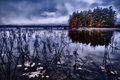
041 aby mbrutus2009Comment: I like the lighting on the clouds on this a lot, and the stretched out pier. The sun has blown in an unappealing way though, which is a bummer. Otherwise, I really like this. I personally enjoy the choppy waves. I like the energy and liveliness that they add, instead of a tranquil feel. The clouds curving around the sun above the pier and the water together really make a feeling of impending action. |
| Photographer found comment helpful. |
| 11/08/2011 10:15:49 AM |
|
| Photographer found comment helpful. |
| 11/04/2011 02:04:34 AM |
|
| Photographer found comment helpful. |
| 11/04/2011 01:53:22 AM |
|
| Photographer found comment helpful. |
| 11/02/2011 06:19:01 AM |
Here’s Johhny!by P-A-U-LComment: I voted, and I was one of your low votes.
I voted it such because the desat felt contrived and what was left seemed overdone, as well. Very artificial looking.
I'm not normally terribly fond of photos of children, so there's gotta be a significant connection to a moment conveyed, and I don't particularly get that here. There is no context conveyed, which is crucial for a successful candid. I would also question the "candidness" of this one, but that's a whole different argument. It's also in the awkward overlap between sharp and purposefully blurred. It's soft, but it looks soft not because you wanted it that way but because that's all you could do, unintentional, unconnected to the feeling you're trying to give the viewer. |
| Photographer found comment helpful. |
Home -
Challenges -
Community -
League -
Photos -
Cameras -
Lenses -
Learn -
Help -
Terms of Use -
Privacy -
Top ^
DPChallenge, and website content and design, Copyright © 2001-2026 Challenging Technologies, LLC.
All digital photo copyrights belong to the photographers and may not be used without permission.
Current Server Time: 06/18/2026 11:05:00 PM EDT.