| Image |
Comment |
| 06/25/2009 07:32:41 AM |
Center of interestby mitalapoComment: Great job capturing a candid moment with such interesting lighting. Echoing  dtremain dtremain, the subtle lighting on the people with the single illuminated face is very pleasing. |
 Photographer found comment helpful. Photographer found comment helpful. |
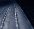
| 06/25/2009 07:28:53 AM |
beltby tpbremerComment: Very simple but effective photo. I especially enjoy the light dropoff as the lines on the belt lead off into the distance. |
| Photographer found comment helpful. |
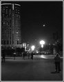
| 06/25/2009 07:20:47 AM |
Fire balls at Melbourne Casinoby millsaComment: When I first opened this, I thought the fireballs were odd streetlights. Then, after looking at them a bit more, they started to look like alien ships or something. It's interesting that everybody is walking in the same direction, as if they were all mesmerized. |
| Photographer found comment helpful. |
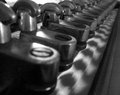
| 06/25/2009 07:17:20 AM |
Print-Machine.jpgby tpbremerComment: The uniformity fading into the distance is cool. I've always liked shots that used this technique. |
| Photographer found comment helpful. |
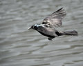
| 06/25/2009 07:15:52 AM |
Scavageby cynthiannComment: Something about the color and grain in this is really reminiscent of an older film photo. I rather like the sheen on the bird as well. |
| Photographer found comment helpful. |
| 06/25/2009 07:11:37 AM |
Mountain bike on Southbankby millsaComment: The colors and lighting of the building are neat, but I think they distract too much from the rider, who almost seems like a secondary subject. Their presence is somewhat one upped by the building's lighting. If you're curious at all, this rider appears to be a trials rider, not a mountain biker. To see some of the crazy stuff they do, you should check out some videos of Danny MacAskill. |
| Photographer found comment helpful. |
| 06/24/2009 07:22:06 AM |
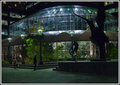
Square Dancerby SoulComment: Hello there,
Greetings from the Critique Club. This is an interesting photo of a sculpture that you’ve got here, one I’ve not seen (I’m from Fort Collins) as well. Photographically, I think things are a bit cluttered. The lines of the building battle for attention a bit with the sculpture here. You’ve got a bit of noise going on here as well from the ISO 800, so I would recommend lowering that in the future unless it’s a necessity for shutter speed. To me, however, the first thing I would change is the way the one of the other dancer’s feet and hand entered the photo on the bottom right. This, combined with the leg of the subject, are in a bit of a fight for attention with the subject. Perhaps you might have photographed this from more of an oblique angle, which would make them work together more instead of against each other. You did a good job of including all the parts of the spectrum from white to black, but I think a bit more contrast and some lightening on the sculpture’s face would’ve helped things out a bit by showing more detail. The uniformity of the sky might’ve detracted from some user’s votes as well, since most people expect a lot of contrast in a duotone entry. It’s interesting how the clouds appear in the glass though- when I first saw this, I thought it was a wire grid of some sort behind the sculpture, only to notice shortly thereafter the warped building reflection.
-Derek
|
| 06/24/2009 06:56:14 AM |
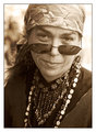
Street Portraitby choltmeierComment: Hello from the Critique Club-
As soon as I view your photo, I am drawn directly to the subject’s eyes. There is great detail and the irises have an interesting hue, which contrasts with the rest of the photo and helps to set them off nicely. There’s a lot going on in your photo, but it isn’t cluttered and the background is nicely obliterated, which does a great job of isolating your subject and also works quite well with your excellent choice of sepia. I’m not too sure how I feel about the reflections in the glasses… obviously this wasn’t up to you to dictate since it’s another street portrait, but the legs especially on the right lens are a bit distracting to me. I like the expression on her face, it’s interesting and somewhat ambiguous. Personally, I’m not a big fan of your specific choice for the border. I think I might like a thin black border, or maybe an inset black border. All in all though, I really like this and would personally have voted it higher than what your final score was.
-Derek
|
| Photographer found comment helpful. |
| 06/18/2009 04:14:52 AM |
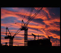
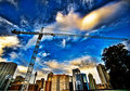
Building the Future by dougi555Comment: Nice texture in the clouds. Good entry. Not a big fan of the border choice, however. Too thick for my taste. |
| 06/18/2009 04:12:32 AM |
|
| Photographer found comment helpful. |
Home -
Challenges -
Community -
League -
Photos -
Cameras -
Lenses -
Learn -
Help -
Terms of Use -
Privacy -
Top ^
DPChallenge, and website content and design, Copyright © 2001-2026 Challenging Technologies, LLC.
All digital photo copyrights belong to the photographers and may not be used without permission.
Current Server Time: 06/17/2026 10:52:59 PM EDT.