| Image |
Comment |
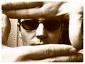
| 06/20/2003 10:40:02 PM |
Shyby anirenoComment: This is one of my favourite shots - the framing with the hands is very effective, as is the texture white background to your left and the dark space to your right. Great photo and fits the challenge very well. Kudos !! |
| 06/20/2003 10:38:04 PM |
Me myself and Iby zeranicoComment: The leaf at the left is a bit distracting, but unfortunately the overall feel I get is that there wasn' much pre-planning put into this one. It feels as if you just sat down on a couch and took a pic. I like the fact that you have a dark shirt on with a dark couch, but if you had a black background as well, then all focus would be given to your face and this would have been a much more interesting shot |
 Photographer found comment helpful. Photographer found comment helpful. |
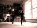
| 06/20/2003 10:35:02 PM |
Break Balanceby DesertShadowComment: Interesting shot - but the inclusion of two people makes it difficult to determine who the self portrait is of. Perhaps a lighter shirt should have been worn for the shot as it doesn't make you stand out from the background, and because of the darkness, the light from the window is overexposed and appears a bit too harsh |
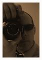
| 06/20/2003 10:33:08 PM |
Just a old fashioned guy with new technologyby agwrightComment: Unfortunately, not really bright enough and a bit too grainy. I'm not sure if the grain was added to the image on purpose, but if it was it doesn't really add much to the picture. Apart from that, the composition of this photo is very good |
| Photographer found comment helpful. |
| 06/20/2003 10:30:08 PM |
|
| Photographer found comment helpful. |
| 06/20/2003 10:29:33 PM |
Sorry, I'm a vampire..by swaroskjiComment: To start with, I think you really need to be in a self portrait, for it to be called one. Apart from that, this is a highly original photo. Very intriguing. Perhaps the background is a bit too dark, and I also would have trimmed off the door frame on the right, as its a bit distracting |
| Photographer found comment helpful. |
| 06/20/2003 10:27:11 PM |
Me... Yo.... Jeby AlexysComment: A nice shot, but there's nothing that makes this photo stand out from the others. Would have been nice to see the background a bit more level as well |
| 06/20/2003 10:26:16 PM |
|
| 06/20/2003 10:25:29 PM |
angby anggComment: I found this photo was taken a bit too close. The focus wasn't quite right and the over exposed area to the right of the face detracted from the image |
| Photographer found comment helpful. |
| 06/20/2003 10:23:23 PM |
|
| Photographer found comment helpful. |
Home -
Challenges -
Community -
League -
Photos -
Cameras -
Lenses -
Learn -
Help -
Terms of Use -
Privacy -
Top ^
DPChallenge, and website content and design, Copyright © 2001-2026 Challenging Technologies, LLC.
All digital photo copyrights belong to the photographers and may not be used without permission.
Current Server Time: 07/16/2026 09:29:33 AM EDT.