DSC_3463edit.jpgby
irishempressComment: Hello Irish.. let's touch on some points here shall we?
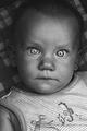
#1. Lighting - Pay close attention to the lighting in both of these shots. In your shot, we have some harsh sunlight coming in at *almost* a backlit angle, causing some blown highlights on the forehead, nose, and cheeks. If you look at the shot you were emulating, you'll see that the light is coming in from in front, and to the side. What that allows you to do is control your lighting and metering better, in order to give you a more even shot across the board, and it also helps bring light into the eyes better, and even out the features. Shooting with the sun where you had it is ok, as long as you meter properly for it and watch for your highlights. The photographer on jinky art used her light to get a soft, more washed out, ethereal look, and, by the looks of it, used either late evening light, or over-cast skies to do that. These are important things to study and look at.
#2. Color - The photographer on Jinky Art was very concious about her color choices. This is one of the harder things to do, but in the long run, it's worth it to try and remember and start making these decisions. After a while, it'll become second nature. Notice how in the Jinky Art photograph, the color of the coat complements the backgrounds really well. This gives an overall feeling of "belonging" and really pulls the viewer into the photo. The hair is also complementary to both the coat and the backgrounds, and the blue in the eyes gives a nice stark contrast, leading you to them. In your shot, the backgrounds and colors seem like a sort of clash. You have red, blue and green, but they don't really work together here to give that "belonging" feel, and it leaves a kind of distracting feel. The cowboy hat is a great prop, but a little fore-thought is needed to make it belong. A more dusty, darker shaded background would have helped, for one example.. and desaturating the red band is also an idea. Also pay attention to clothing, and the colors they have, and try to bring your photograph into a nice harmony, like the ones on Jinky Art that you've emulated.
#3. Composition - What it looks like you've done is taken a couple of key points from both photographs, and incorporated them into yours. The result is that you don't have as strong a photograph as you could have, had you just focussed on one of the compositions.
In photograph #1, the boy is giving a full on look to the viewer, in a rule of thirds type of composition. His hair/head is in the upper third, his eyes, nose, mouth and chin line in the middle, and the neckline and coat are at the bottom. Note also the tilt of the head, helping us see a fresh, inquisitive look.. hinting at personality. Your shot takes the rule of thirds element of this here, but we have the boy looking off, and we miss that subject/viewer interaction that we almost expect from this sort of composition.
In Photograph #2, the boy is looking off to the left, but the photograph leads us that way as well, with empty space. This is a classic trick to give the impression that there is more there than we can see. While it works without the empty space.. it just seems stronger when you have it. In your shot, you've neglected the empty space, and the photo seems a little cramped.
Again, I want to emphasize that your choices aren't *wrong*, I just wanted to point out the differences here, and make you more aware.
So there are 3 of the most important differences between your shot and the shots you've linked to. While we wait for other entries to come in, have another go.. this time, try and pay attention to all the things I've outlined. Sher might also have more pointers for you that I've probably missed. Have fun!