|
|
|
Showing 781 - 790 of ~1843 |
| Image |
Comment |
| 08/10/2005 05:17:15 PM | Adam close upby jeffzoetComment: This is really nice, but may I suggest trying a little more contrast (try a +5 in brightness/contrast), and maybe a *touch* more sharpening.. I think that would really help give this shot some depth. |
| 08/08/2005 02:51:12 AM | |  Photographer found comment helpful. Photographer found comment helpful. |
| 08/07/2005 04:24:31 PM | Mental Balanceby Dax-Comment: Not sure why your work keeps falling short to the voters, this is, again, a stunning shot. Your color work never fails to blow me away. | | Photographer found comment helpful. |
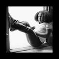
| 08/07/2005 01:32:57 PM | JA4.jpgby debitiptonComment: I'd keep the square crop, but the skin tones here definitely look more vibrant and natural. For this one, you'd have to reshoot to get the compositioal changes I was talking about, but I'm not worried about that for this. It was more a "reminder for next time" sort of thing.. unless you're really wanting to reshoot for it for your personal album or whatever. | | Photographer found comment helpful. |
| 08/07/2005 01:29:27 PM | | | Photographer found comment helpful. |
| 08/07/2005 03:39:41 AM | Living in the Pastby justin_hewlettComment: Hehe.. this is a great moody portrait, love the glasses. I think maybe a hint of a look from her to the viewer.. slight tilt of the head, would have given this photo the finishing touch. The treatment gives it a nice "70's" effect for me too. | | Photographer found comment helpful. |
| 08/07/2005 03:33:08 AM | JA3.jpgby debitiptonComment: Once again, your lighting is practically dead on here. You've got an incredibly strong eye for emulation, and you seem to know what you're doing, and how to get there.
Just two things to touch on for this one (and the other one, I chose this one to put the comment on). #1 is your contrast. Your blacks are not quite as black as they could be. This may be a monitor calibration thing, or other sort, but I'd suggest going in and using either a +5 - +8 contrast boost in Brightness/Contrast, or use a selective color adjustment layer and bring the "neutrals" black slider up a few notches, and the "blacks" black slider up a few notches. This should help get your blacks blacker while leaving the rest of the shot toned well.
#2 is your sharpness. This has a softer feel than the shot you were emulating. The contrast boost will probably help this out too, but I'd suggest also using a small sharpness increase too, either with USM, or with the regular Sharpen, and then using the "Fade Sharpen" under "edit" immediately after applying it. (If you're using PS CS or one of the PS above 7). For USM, I'd just apply it lightly, say starting at 85%/0.2/0 and going from there. This will just help crisp the photo up a bit, and give it a stronger feel.
As always, these comments are based on my personal opinion, on my observations between your photos and the ones you were emulating, and on experience. They are meant as a guide, not as "set in stone" rules or anything. You've done a wonderful job with both your photos, and you should be proud of your work. You'll be a mentor with Sher and I in no time :) | | Photographer found comment helpful. |
| 08/07/2005 03:23:38 AM | JA Assignment1.jpgby debitiptonComment: Hi debitipton :)
First of all, I just want to say that your lighting is fantastic. The shadows around the eyes that you are concerned about can probably be fixed with a simple reflector (piece of white foam board or something of the sort). In this situation, the best idea would be to tripod mount, and then use a cable-release, remote, or self-timer so you can free up a hand or two to reflect the light where you'd like it. A good fill flash might also work, but that would take more work, and a decent flash.. and if you don't have one, the foam board is far cheaper :) Other than that, wow.. you've really nailed the lighting. Fantastic.
Second, Composition. This is where you differ from the chosen shot, and I'll explain why. First, the rule of thirds. In your daughter's chosen shot, you'll notice that the photographer has used the rule of thirds in order to get a more dynamic, full torso, portrait orientated shot. This gives much more room to play with, and allows the model more freedom of movement, and creates less of a "cramped" feel. This is often a personal choice thing, but as we're emulating here, I thought I'd bring it up. In your shot, you've got the model's face dead center, instead of in the upper third of the composition. This tends to "deaden" the composition some, and creates cramping, as you lose space for body language and dynamic feel. You can see in the Jinky Art photo that the play of the torso and the hands gives us a little more story, where in your shot, she's suddenly cut off from us and seems to sink into the ground. Just something to stay aware of.
Finally, Color. First of all, I'll say that I like the desaturated look here a lot. I use it all the time, and it really works for this photograph. I think you made a good decision to deviate from the Jinky Art shot here, as one of the main reasons *I* see for the more saturated color look in that shot is to complement the color of the girl's hair. Your desat work really helps complement your model's skin tones and help her stand out. Good job on that, and it's just something I noticed. The other thing was that I'm wondering if maybe a slightly more saturated color in her skin tones would help as well.. I don't know what her tones are like IRL, but I feel that a little more red/yellow boost could be beneficial. Something to try anyway.
Great work here, try to mess around with your compositional elements a little more.. but you've got some great work.
| | Photographer found comment helpful. |
| 08/05/2005 01:33:48 AM | Sundial Bridgeby RikkiComment: I remember thinking that this was going to be a top-10 finisher. A really strong, well lit image that really grabs a viewer. Definitely a DPC "eye-candy" type of shot, and the sky is almost.. scarily smooth. That UV filter must be a good one.
The "triangular" composition is what makes this shot a winner. | | Photographer found comment helpful. |
| 08/05/2005 01:03:45 AM | Going My Wayby bucketComment: Looks like her red hair is disappearing! doh!
You're really coming along. I was just browsing through your portfolio, and you've got some really fine photos. Keep it up! | | Photographer found comment helpful. |
|
Showing 781 - 790 of ~1843 |
Home -
Challenges -
Community -
League -
Photos -
Cameras -
Lenses -
Learn -
Help -
Terms of Use -
Privacy -
Top ^
DPChallenge, and website content and design, Copyright © 2001-2026 Challenging Technologies, LLC.
All digital photo copyrights belong to the photographers and may not be used without permission.
Current Server Time: 07/27/2026 09:47:38 AM EDT.
|