|
|
|
Showing 741 - 750 of ~1843 |
| Image |
Comment |
| 09/12/2005 12:40:42 AM | skepticalby muckpondComment: Easily the best natural light portrait in the challenge. Such a beautiful child and a wonderful moment of spontaneity.. The colors are fantastic too.. This is going in my favorites. |  Photographer found comment helpful. Photographer found comment helpful. |
| 09/12/2005 12:31:44 AM | | | Photographer found comment helpful. |
| 09/11/2005 09:52:26 PM | Beach Sandalby KOKOCATComment: Hello, and greetings from the Critique Club. I am your host, the indomitable Artyste, and for the next little while, I'll take you on a tour of your image and what I can say aobut it.
Initial Thoughts
Hmm.. too small. A little flat, and the colors seem too "unreal"
Composition / Content
As some of your comments say, the focal point of this photograph isn't focal *enough*. That is, your subject is hard to discern. On DPC, a key element is having a very strong and noticeable subject. You can have an image that makes people think, but be sure that the initial view of the subject is *BANG*.. right there. In your photograph, you simply have too many things going on.. The water, the footprints, the sandal. While the sandal does stand out as being the most colorful object, it simply doesn't work as a main subject, especially in a challenge that calls for it to *be* the main subject. Another thing is that your entry is simply too small. One *must* utilize the full 640 pixel limit allowed, or you simply suffer too many automatically low votes.
Background
For me, the background here is too stunted, cut off. The waves and tide could really have made a grand background here if worked right. One suggestion would have been to get right down at sand level and got a close-up of the sandal with the roaring waves behind it, and a little out of focus. It's little "unique" touches like that that set photos apart sometimes. Always look for new and interesting ways to shoot a subject, utilizing a background to the fullest extent. In your case, it seems to be simply an afterthought, and doesn't really add to the image in any way.
Camera Work / Technical
Seeing that you've not added any information, it's hard for me to comment here. If you request a critique, *please* add as much information about the shot and the camera settings and post-processing work as possible. We can't really help you to the fullest extent if you don't help us help you :) As for generic technical details, I can tell you that focus on your subject is a little soft, and your exposure seems to be a little on the high side. Your mid-tones are just a little too bright, and the shadows not dark enough. Little tweaks to those areas would help the over-all look of this as well. Also, your colors would have looked a lot stronger and more saturated with a half-stop drop in exposure too.
Digital Processing
Again, no information makes this a difficult thing to comment on. However, I can tell you that were I in charge of the processing here, I'd have done some tweaks in selective coloring to bring out the sunset oranges and yellows that are barely noticeable in the sand, darkened the cyans, worked on darkening the shadows and mid-tones slightly, sharpened up the sandal and generally just tried to make this a stronger, more pleasing and dynamic image. To do well on DPC, it's all about the details, and presenting an image that captures an audience.
Fits the Challenge
You do have a shoe or shoe derivative in your image, however, it's not a strong focus on that item, and as thus leaves your connection to the challenge tenuous.. especially to DPC voters.
My Opinion of the Photo
If this were larger, had more of a focus on the subject, and perhaps a more interesting perspective, I think I could really get into the photo. However, as is, it just leaves me flat and thinking, "next". As a personal photo of a moment captured, it's a fine photo. I've taken thousands like this myself. As a DPC challenge entry, it just has too much wrong with it for myself. Think about some of the things I've said, and practice being creative, and good luck on future challenges. |
| 09/11/2005 02:59:21 AM | Dark & Lightby RikkiComment: Hello, and greetings from the critique club. Let's get underway.
Initial Thoughts
Ouch.. kind of hurts to look at for the brightness.
Composition / Content
You've got a really nice compositional element going on here. I like the fact that you've left space in front of where the cat is focusing. Cats, especially black ones, tend to do pretty well on DPC too, so good choice there. The window blinds also seem a little superfluous and unneeded.
Background
Although you don't really have much of a background, per se, what you do have is very washed out, and the color clipping on the yellows is very evident. The plain dull grey behind the cat is also not very flattering to the subject.
Camera Work / Technical
This is where most of the issues lie, IMO. Although I sympathize with trying to properly meter a black cat against an atrociously bright light source (like daylight through a window), I believe that with a little forethought and some experimentation, you could have gotten a little more control than what you've achieved here. I don't know what time of day you *did* shoot in, but it seems to have been at a pretty bright time of day, and perhaps waiting for evening light would have been a lot more beneficial. The softer light would have saved you from such blown highlights, and would have given you greater control over texture and detail on the cat itself. In this kind of instance, I always like to try and shoot on the underexposed side of things, and use post-processing to bring out what I was hoping for. That's just a suggestion though. As is, the harsh light has really caused the cat to become too dark, and you've lost a lot of mid-level detail. Also, the focus seems a little soft on the eyes, which, otherwise, look pretty good (if a little blown out in areas as well).
Digital Processing
You haven't provided any information on this, so I can't be much help. Two things. If you blew this out on your own with PP for an artistic look, I can't fault you for that. Art is what it is. However, for DPC purposes, this look will never do all that well. Blown highlights on this kind of scale are almost certainly score "death".
If you shot it this way, then not much can help you with PP. Again, shooting for an underexposure of about 1/2 stop to a full stop would hlep tremendously.
Fits the Challenge
Definitely fits the challenge. Almost painfully so.. that white light really is bright.
My Opinion of the Photo
It's not something I'm particularily fond of, and the processing and look of the photo just makes it that much harder to like. A little more control over the lighting here, and you'd have had something a lot stronger and easier to view, IMO.
A good try, and obviously you struck quite a number of people as I'd have expected this to be a 4.x photo myself, so keep it up.
Good luck on future challenges. | | Photographer found comment helpful. |
| 09/11/2005 02:33:42 AM | D&L - Denim & Laceby Mary Ann MeltonComment: Hello, and greetings from the Critique Club.
Initial Thoughts
Nice and simple, what a refreshing change.
Composition / Content
You've got a nice composition here, your lines lead us around the photo and to the right focal points, nothing wrong there. Content wise though, although it's definitely simple, it's just nothing one feels compelled to linger on. The lace itself seems to almost be an afterthought, instead of an integral part of the image.
Background
No effective background here
Camera Work / Technical
You've done well with your exposure, focus, and what-not, no glaring or even minor issues here.
Digital Processing
There just seems to be a.. lightish.. quality to the photo that I assume was a post-processing adjustment. A sort of misty feel that, if stronger, would have given a little more of a feel to the photo, but as is, seems to have just washed it out a little. Other than that, things seem to be ok.
Fits the Challenge
You definitely fit the challenge.
My Opinion of the Photo
As I said initially, a nice simple image is a refreshing change. I like the simplicity, but what I like isn't always what everyone else likes, and as I also said, you're just missing a dynamic look that would have really sold this image. Perhaps a pair of jeans draped across an old-time rocking chair with a lace camisole, bra, slip, or some other article of clothing or undergarment arranged artfully would have given more "grab". Something of the sort. Anyway, a good take on the challenge. Good luck in future challenges. |
| 09/11/2005 02:25:04 AM | Drama & Lyricsby rjksteschComment: Hello, and greetings from the Critique Club. I am Artyste, your critiquer for today, and you know you'll get an honest critique from me, because I don't go for the ladies :) So.. without further ado..
Initial Thoughts
Interesting, I wish I had access to cool performance shots.
Composition / Content
Not much I can say here, very dramatic. The smoke/fog/mist seems to move on its own, and the model strikes a very dynamic pose. If there's one thing I can say, it's that I, myself, generally like to see more negative space in the area that a model is looking toward, or moving toward. Having it behind the focus of the model tends to throw me off a bit, unless there's a specific reason for it. Here I suspect it's because the area in front of the model was probably filled with the crowd, equipment, or superfluous stage props.
Background
The darkness and mist combined with the lit sign really ground this image as a stage performance. A good choice, IMHO.
Camera Work / Technical
Perhaps a little too much shadow on the model, but I don't know how avoidable that was. That one shadow on her face is really distracting. Other than that, it seems that exposure and focus are dead on.
Digital Processing
The smooth look was one of the first things I noticed, but I also notice that you were using ISO 1600. Having the *ist Ds (which shares the same sensor as the D70), I'm aware that 1600, while pretty good in good light, can really start to fall apart in darker instances, so the smoothing is understandable. I'm still not fully keen on the over-all "sci-fi" look, personally. Your other PP work looks pretty good, alhough the dodging/burning in the mist is a little strong.
Fits the Challenge
This is one of the weaker links. I feel that your title both works for and against the natural connection to the challenge that your shot seems to be saying on its own. Dark & Light, Dancing Lady, Dance & Light.. are all things that jump to mind. Drama and Lyrics, however, don't seem to have much of a connection.. especially "lyrics".. at least in my mind. This probably worked against you.
My Opinion of the Photo
An interesting and fun shot, but a little over-processed in areas, and that one shadow on her face really bugs me. The negative space being on the back side puts me off to, but I understand it if it had to be used.
Good image, and one to be proud of on a personal level.
Good luck in future challenges. | | Photographer found comment helpful. |
| 09/11/2005 02:07:32 AM | Dynamic Linesby trnqltyComment: Hello, and greetings from the Critique Club. I am your critiquer today, and I think I'm in over my head. LOL.
Initial Thoughts
Seriously, my initial thought was "woah!" and it even came out vocally as such. Some seriously fine subtle color work here.
Composition / Content
I have nothing to offer on this subject, as this is a very tried and true compositional photo on this site, and many others. I can't even explain why the offset circle is stronger than a centered one would be.. but I certainly *feel* it. Leading lines and all that. Your content is just wonderful as well. The colors just really blend, giving it an almost hypnotic appearance. This is one case where it proves that you should always be looking as a photographer.. up, down, left, right, all around you.
Background
Since it's not a *background* per se, it's hard to comment, but what looks like clouds and sky through the circular opening is simply icing on the cake. Brilliant without being tacky, and with a wonderful textural element.
Camera Work / Technical
Again, I feel like just and admirer instead of a critiquer, but I honestly can't find much wrong with anything here. Exposure, DOF, Framing.. everything is pretty darn fine.
Digital Processing
You didn't include any details on this, so I can't really comment, but whatever you did certainly didn't hurt anything.
Fits the Challenge
Finally, something I can critique a little bit.. Dynamic Lines, while being a D&L technically.. aren't really a D *and* L, if you get my meaning. I think people might have been looking for a dual-mode photo in a way. I can't be certain, but it might be one of two weaker links that dropped this score out of the 7 range.
[b]My Opinion of the Photo[/b}
Stunning, it truly is. However, it's also been seen before, and while that doesn't always apply to lower scores in challenges (many examples of "seen before" actually increasing scores), I think that maybe that aspect also contributed to a slightly lower scoring. Also, the fact that it's more "abstract" in design also probably wasn't a help.
Still, I love this shot. The muted, complementary color scheme is simply fantastic. It's like a Southwest color scheme meets avante garde architecure. A great find, and a great shot all-round.
Good luck in future challenges. | | Photographer found comment helpful. |
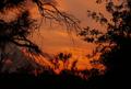
| 09/11/2005 01:54:46 AM | Dark & Lightby HornOUBetComment: Hello, and greetings from the Critique Club.
Initial Thoughts
Nice colors.. but woah.. pretty busy, kind of dizzying, and which tree should I look at?
Composition / Content
Your photo seems to have a slant to it that is aided by the power lines, and by the lines of the clouds. This is a little offsetting, and for a lot of people it tends to say "amateur". Noticing little details like that before cropping is key, and an arbitrary rotation to correct it can help out a *lot*. You've also got an awful lot of silhouetted brush here that steals from the impact of your sunset and colors. Having silhouettes can really enhance a sunset photo, but if you have too much there, it just becomes cluttered, distracts from the viewer's desire to see the focus of the photo (the sunset in this case), and just causes a general "messiness" that voters on DPC don't generally go for. Scouting locations to shoot sunsets in really, *really* helps.. so that you know where to go on short notice when ideas for challenges come up.
Background
The colors are great, very vibrant. Those power lines are a definite deterrent. I know it's nitpicking, but on DPC, things like that can really contribute or take away from, a score. In this case, your background would have been fantastic, but your foreground is the culprit.
Camera Work / Technical
Not much to say on your camera work. You've nailed some wonderful colors, and your exposure is fine.
Digital Processing
If cropping and resizing were all you did in processing.. nice. My experience is that it's hard to get a vibrant sunset like that without at least a little post-color work.
Fits the Challenge
In this case, fits it a little too well. Dark and Light was probably the largest cliche of the D&L challenge, and being *too* mainstream can also hurt a score. Especially if your image isn't one of the more "stand out" of the rest.
My Opinion of the Photo
This is a great "this is what the sky was like tonight" sharing photo for among friends, IMO.. but as a DPC challenge photo, it just has too much against it. Watch for clutter, scout a few choice locations, and concentrate on the smaller details that I've outlined, and you should be on your way to some really good scores. Good luck in future challenges. |
| 09/11/2005 01:44:31 AM | Depressed & Lonelyby cpickettComment: Hello, and greetings from the Critique Club. I am your critiquer, Artyste, and we have a lovely little write up for you today.
Initial Thoughts
A little dark, not sure what I'm looking at here. oh! I see it. Hey, that's not half bad.
Composition / Content
Your composition is quite nice IMO, with but one failing, the little tree/bush hangings there distract a little too strongly. I was drawn to them at first and it took me a minute to get to the rest of the image. Chalk that up to the fact that DPC can be slow to load perhaps. Love the look of the model, and how you've given room for the direction of the bird's walk.
Background
Possibly slightly busier than it could be, I wonder if dropping the aperature to 3.5 or 2.8 would have blurred it out that much more. As I said above, I'm not too keen on the bush being there either, but outdoor shots aren't always that manageable, so it's not a *huge* complaint at all. Nitpicking, really.
Camera Work / Technical
I wish we could know what mode some of these were shot on, I'd be very curious to know if you were on M, Av, or Tv (or P for that matter). It looks to me like this shot was underexposed, and you brought the exposure up in areas yourself. The work on the bird has left a little haloing that is a touch off-putting, and renders the image a little surreal. It works with your title (especially because of the look on the bird's face), but overall it's just a little flat. I think a slight over-exposure and a drop down to a moody dark would have worked a little better.. however, I could be way off base too, and if that's what you *did* do, then I withdraw the suggestion.
Digital Processing
You provided no information on this, so I don't have too much to say except that a little more use of layer masks might have helped the haloing on the bird. (also, that seems to have been strengthed by the slight over-sharpening on the image as well). Sharpening is tricky, and I find that it's better to sharpen in a few smaller steps, than trying to do it all at once.
Fits the Challenge
Yes, that poor bird certainly does look depressed and lonely, I do have to give it that. It's certainly a great candid capture, and good eyes for noticing something that'd get buy a good many of us.
My Opinion of the Photo
I like it. After the initial "I'm not sure.." stage, which only lasts a second or so, it really drags you in and you get the feeling of the photo. The few minor technical issues I mentioned are just that.. minor issues. They may have kept you from a better score, but the emotiveness you've got here is a great capture.
Good luck on future challenges. |
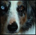
| 09/11/2005 01:31:13 AM | Devoted and Loyalby JutildaComment: Hello, and greetings from the Critique Club. Whattya know.. I got a Jutilda shot to critique. Hope you enjoy it.. I don't give simple ones ;)
Initial Thoughts
Hmm, tad out of focus, and a little too in-the-frame. Almost startling in a way.
Composition / Content
This is a unique composition for a pet portrait, and probably a little weaker than it could have been. For instance, that blue eye is a real stand-out in the shot, and my feeling is that you should use natural "grabbers" like that to the fullest of potential. In this case, instead of having it on the edge of the portrait, where it seems to be an after-thought, I'd have used it as a main focal point. Perhaps if you'd shot it from the other side so the blue eye was in the same position as the brown eye. It would definitely help give the shot a "center", instead of people seeing that eye and feeling pulled off the frame. The model itself is a gorgeous dog, and you really want to try and sell him/her as an image.
Background
The body of the animal is your background, and works as such, but I feel that you just didn't leave enough space for the facial features that this photo kind of begs for.
Camera Work / Technical
Your focus is off. That is one of the first things I noticed when the image came up. Your aperature settings are N/A, so I can't comment on what you used, but possibly using a smaller aperature would have helped with focus by providing a larger DOF. Of course, with a smaller aperature, more light would have been needed. Also, reading your write-up, I can definitely sympathize with an unwilling model. Shutter speed could have been important here too, a good 1/500 or higher might have also given you a clearer shot (but again, light would be a problem, especially indoors). Other than that, your exposure looks ok. A trifle dark in areas.
Digital Processing
Given your processing steps, I can add a couple that would have really helped you here. Some clever Unsharp Mask work could have crisped this up a bit more and taken some of that "wow, this is blurry" look away. I would try a 254/0.3/0 setting with USM, and then slowly raise or lower the % depending on the look. You can also try 0.2 or 0.4 on the radius, but 0.3 usually weilds the best result for minor sharpening.
Also, there seems to be a cyan cast in your whites that some Selective Color work or hue/saturation work could also clear up. In selective colors, I'd chose the cyan channel, and drop the cyan value a bit, and then select whites, and drop the cyan value in that as well. You might have to also tweak a few of the other values, but experiment is key. Dropping the cyan value in the cyan channel might also mess with the dog's blue eye, so I'd do the selective color on an Adjustment Layer, and then just mask back in the blue eye when you're done.
Also, just remember these are suggestions.. no requirements to do them :)
Fits the Challenge
Your title is the strongest link to the challenge if we were going by the title alone. This portrait doesn't really convey Devoted and Loyal on its own so much. However, the "Dark and Light" I can see, although it might be a tenuous connection itself. Most people might simply see the Dog and think "Dog and.. what?"
My Opinion of the Photo
It's a really sweet attempt at a portrait of a loved one, but is a little cramped to me, and suffers from a few items that I've mentioned. Not particularily strong this time around, but I've seen what you can do with a camera, so just hang right in there. Good luck on future challenges. |
|
Showing 741 - 750 of ~1843 |
Home -
Challenges -
Community -
League -
Photos -
Cameras -
Lenses -
Learn -
Help -
Terms of Use -
Privacy -
Top ^
DPChallenge, and website content and design, Copyright © 2001-2026 Challenging Technologies, LLC.
All digital photo copyrights belong to the photographers and may not be used without permission.
Current Server Time: 07/27/2026 12:39:56 AM EDT.
|