|
|
|
Showing 721 - 730 of ~1843 |
| Image |
Comment |
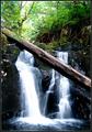
| 09/21/2005 03:30:06 PM | Fallsby madhatterComment: Hello, and greetings from the Critique Club. The critique you are about to recieve is tailored for DPC challenges alone, and is not intended to be seen as an artistic critique per se.
Initial Thoughts
Whooops.. wrong challenge.
Composition / Content
While it's a fairly decent shot of a waterfall (That log really takes away though, for this particular composition), it's not a portrait in the eyes of DPC.. and that's the most important factor. Still, entering simply because you had to work so hard to get the photo takes some guts, so I salute that.
Background
Some blow outs in the sky, and a bit oversaturated in the brush.
Camera Work / Technical
Some overexposures and blown highlights, but focus is nice.
Digital Processing
*slightly* oversharpened to my eyes, and the saturation is still a little high in the yellows and greens.
Fits the Challenge
Not even close.. and I'm *trying* to give an out-of-the-box latitude here.. but .. hehe.. this isn't even in the same country.
My Opinion of the Photo
Like I said, a fairly decent photo of a waterfall marred by the log and the blown highlights, (and possibly too much space up top), but an absolute miss on the challenge. You know this however, and I salute your moxy for submitting it in the first place. Enjoy the brown ribbon :) |  Photographer found comment helpful. Photographer found comment helpful. |
| 09/21/2005 03:22:54 PM | Joshuaby peeceeComment: Hello, and greetings from the Critique Club. The critique you are about to recieve is tailored for DPC challenges alone, and is not intended to be seen as an artistic critique per se.
Initial Thoughts
A nice shot, but a little too loose in compositional elements.
Composition / Content
While it's a very cute shot, and I love the expression on the boy's face, the photo suffers from a lack of strong compositional elements that tend to bring a DPC photo higher votes. It seems to be hurried, like a snapshot that is a little more technically well done. The boy is crouched and seems to be hiding, the landscape orientation doesn't really work for me, and the lawn chair is more of an "amateur" like element and a little distracting. Voters here tend to really grab on to little things like that. While it's a great family shot, it just doesn't meet the DPC standard, and you can see that your score reflects this.
Background
Background is clean and nicely OOF, good job on that.. but it also doesn't really add anything either, being a little too dark and "dirty"
Camera Work / Technical
Some really nice work with your technical skills here. Focus is sharp, DOF is pretty good (I suspect that some voters wouldn't like the hand OOF), and exposure seems pretty good as well.
Digital Processing
The skin tones here still have a bit of a magenta/red cast. Other than that, everything you've listed has been seamlessly done, with no glaring or obvious processing artifacts.
Fits the Challenge
While it technically fits the challenge, it feels less like the kind of portrait that was "expected" here, and more like a quick snapshot. Meaning that voters probably feel it to be a little "lazy" or "rushed", and will vote accordingly.
My Opinion of the Photo
Fun candids like this are some of my favorite photography work on a personal level, but for DPC it just doesn't work if you're looking for higher scores or placement. Because it was done well technically, it probably received some higher scores than other photos like it would have, but the "snapshot" elements just keep it from being anything more. A good shot, I do like it, it just got lost among more formal and compositionally stronger portraits. Good luck in future challenges.
| | Photographer found comment helpful. |
| 09/21/2005 03:06:10 PM | Jacquelineby QartComment: Hello, and greetings from the Critique Club. I am your critiquer, Artyste, and I hope to give you a critique that you can possibly build on for the future.
Initial Thoughts
Stunning eyes, but overshadowed by the overexposure.
Composition / Content
A beautifully composed portrait that might have been stronger if you left slightly more room on the right side (and possibly cropped a touch more from the top). Your model is stunning and has a wonderfully candid and unnervingly intense expression.
Background
The fall off of her vibrant hair makes a wonderful background. I suspect that for some people, however, the DOF dropped a little too quickly It works for me.
Camera Work / Technical
The one major issue that I see here is the overexposure. It really exposes the shallower DOF more than it needs to be, and gives the impression of a lack of focus that isn't really there. It takes a slightly closer look to see that the focus really is great.. but because of the light look of the photo, first glance really tricks you into thinking it's a lot softer than it is. Of course, this is easily fixable in post, since it's not actually blown out in any area. (well, the chin area is a bit, but I'm not sure if that is from the camera or as a result of processing).
Digital Processing
You didn't give any processing info, so I can't really comment on what you've done.. but I do suggest that you try dropping the far left hand slider in Levels a bit to darken up the blacks, and if you have Selective Color, use the neutral channel and give the blacks a bit of a boost as well. That's just basic suggestions, but this shot would definitely benefit from a lower exposure.
Fits the Challenge
No worries here, it fits the challenge beautifully.
My Opinion of the Photo
As always, I tailor my critique to what works well on DPC itself, and not necessarily what works artistically. This is a very intensive portrait, and I like it a lot. The overexposure issue probably did result in a few lower scores, and I personally believe it would look better with a few tweaks.. but overall, you've got a stunning portrait and a beautiful model. Good work, and good luck in future challenges.
| | Photographer found comment helpful. |
| 09/21/2005 02:21:26 PM | My Brown Eyed Girlby debitiptonComment: Hello, and greetings from the Critique Club. Hi Debi! I'm honored to be doing your critique.
Initial Thoughts
A lovely and classic portrait.. and OMG! Skin texture ;)
Composition / Content
What can I say? You've nailed a wonderful composition here, allowing for both a strong sense of of the person, and a strong feel for her traditional outfit. Usually I would suggest cropping more from the top, but in this case, it really works to give us the connection in costume. Nice job. For her expression, it looks just a little bit forced, and I get the impression she was a tiny bit uncomfortable for whatever reason at the time of this shot. Just remember to always keep your model (and yourself) loose and comfortable.. chat about things, ask about their day.. that kind of thing.
Background
Nicely out of focus. The one issue I personally have with it is that the green is just a little off-setting and not very complimentary to the coloring. Work with what we have though, I know this. I also can't really visualize what *would* look better right now. Also, with DPC just having it on black is good for a few higher scores. (if being rather dull).
Camera Work / Technical
Perfect DOF IMO.. You've got the wrong value in the aperature setting.. oops? But I'd say you were using.. f/4 - f/6 -ish? Anyway, a great job there. Exposure is perhaps a tad dark. For portraits like this, underexposure by a half-stop is usually ok (and recover in post), to control blown highlights, but I think with a darker skinned person, it might also be ok to experiment with a slight 0.5 EV over-exposure as well, and drop levels if you need to. Anyway, just some suggestions. Your focus is very tight as well.. The fabric just jumps at you.
Digital Processing
First thing I want to say is that the colors in the costume and the skin tones are just fantastic.. they're strong, dynamic, and rich. Absolutely beautiful work. Without any idea of what processing you did, however, I can't go much beyond that... sorry.
Fits the Challenge
Hmm... it's a portrait.. and it's in color (great color). Yup, it fits :) You continue to show an amazing eye for portraiture.. great work.
My Opinion of the Photo
While it hit me as just a touch dark on my first view, the richness and depth here really counter-balance that first impression nicely. A slightly better expression would really move this portrait into the next level as well, but it's a stunning job nonetheless. Great work, nice score, and look forward to seeing more. | | Photographer found comment helpful. |
| 09/21/2005 02:48:04 AM | Point and Shootby Marc923Comment: Hey.. I'm going to start losing my top spots for the lens if you keep improving this quickly :) Great shot.. you were really robbed. | | Photographer found comment helpful. |
| 09/20/2005 02:35:38 AM | | | Photographer found comment helpful. |
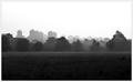
| 09/15/2005 04:14:13 PM | Natural Divideby AlexSaberiComment: Hello, and greetings from the Critique Club. I am your critiquer, Artyste, and for the next little while, I shall proceed with telling you everything you really don't want to hear :)
Initial Thoughts
Pretty nice fog and landscape of a skyline, love the tones, might be in the wrong challenge.
Composition / Content
Everything is really good about this composition except one thing. In a photo like this, where you have areas above and below your subject with equal lack of interest (sky and ground in this case), it is usually better to drop your area of interest (the skyline and treeline here), closer to the bottom of the photo. I realize that you were trying to get a darker area to compete with your light area for the "high contrast", but it ultimately fails, and I'll tell you why in a little bit. Having your focal interest lower provides a better anchor for the photo, and eliminates space that distract. In this instance, a more "panoramic" view would have helped the photo itself. (You don't have to add more sky, necessarily, just cropped out about an inch of ground.)
Of course, that's just a suggestion from a bit of reading I've been doing, and personal experience.
Background
A nice fade out into your sky, which is clean and not overly bright.
Camera Work / Technical
You seem to have metered nicely and gotten a good exposure, focus is good as well. Without processing steps, however, I'm not sure if you achieved this in camera or not. Hard to comment. One of the things I can tell you, on the technical side, is this: This photo isn't exactly a great example of a *high* contrast situation. With high contrast, what you are looking for is a stark change from low light values to bright light values in an image. Here, you have a wonderful foggy fade from dark to light. Lots and lots of midtones between the two. This isn't high contrast as I see it. Sure, you have areas of light and dark, but they don't make the change into each other with sharply. Too many mid-values between. This probably cost you a lot of votes.
Digital Processing
I cannot comment on this area, as you haven't mentioned what you did.
Fits the Challenge
As I mentioned above, I feel that you didn't fully meet the challenge because of the fact that there are too many mid-tone values in this image, especially between your darkest and lightest values.
My Opinion of the Photo
Very well taken. With some minor tweaks, and a more "panoramic" feel, this would look good in a large print hanging from any wall. I just feel that it was too loose with the challenge connection (and possibly just too grey and moody), to get you the higher DPC scores that it could probably get in some other challenges. A great attempt. Good luck in future challenges. | | Photographer found comment helpful. |
| 09/15/2005 03:57:57 PM | Lead Guitarby KonadorComment: Hello, and greetings from the Critique Club. Ben.. my good Ben.. please don't hate me for what I'm about to say :)
Initial Thoughts
Hey, pretty good candid portrait, love the textures.. not really seeing much *high* contrast though..
Composition / Content
This is a very classic and wonderful composition, as I'm sure you probably know. Has a real sense of movement and energy. The expression on the guitarist's face is wonderful, full of concentration and effort. In this area, I can't find any glaring faults. This is a very well taken photo.
Background
A great use of lines in the background to complement the lines of your subject, which add to the dynamic. It's nicely out of focus, and does pretty much everything a background should.. IMO.
Camera Work / Technical
Although there are some traditionally frowned upon features in this photo (noise, reddish skin tones, slight softer focus issues), they all seem to have been done deliberately, and really give the photo a nice artistic feel. Unfortunately, as I'm sure you understand, knowing you as I do, they all probably still contributed to your lower (and undeserved) score. I just mention it so I can hear myself speak really, and maybe give other readers of this critique a moment of thought.
Digital Processing
What can I say, you set out with a vision and seemed to nail what you wanted with your processing. Some great work there.
Fits the Challenge
Actually.. I was going to say that I just didn't feel this was "high contrast" enough, but the more I look at it, and the more I talk about it, the more I see that yah.. your high to low contrast change is pretty stark throughout, not a lot of mid-tone fall off here. I think maybe the whole "Black and White" crowd and a lesser understanding of what high contrast can be (which I still stumble over obviously), led to your lower score as well.
My Opinion of the Photo
It's a great photo. A stunning candid of a performer that he'd probably be thrilled with. If you were to do the whole band, individually, with shots like this, you could probably make an album cover out of it :)
It's unfortunate that some really nice, artistic work like this finds its way to the lower ends of the heap. A good job all around. | | Photographer found comment helpful. |
| 09/15/2005 03:42:04 PM | elixirby marvinComment: Hello, and greetings from the Critique Club. I am your critiquer, Artyste, and I have chocolate. Let's get started shall we?
Initial Thoughts
Another macro of an electronic component.. not too badly done though
Composition / Content
Not that your composition is necessarily *bad*, or that the content is.. but it's certainly not very dynamic, interesting, or awe inspiring either. When push comes to shove, it's really just a piece of electronics sitting on a white surface. Perhaps a nice product placement shot, but it speaks nothing extra that DPC and voters look for. Also, as mentioned, the dust inside the heat-sink is a little distracting and "unprofessional"
Background
A well done white surface, but in the matter of "High Contrast", it doesn't really work with the subject. There just isn't enough blacks in the over all shot to contrast with your large use of white space.
Camera Work / Technical
One of the areas where this photo shines is the technical aspect. Perhaps *slightly* too shallow a DOF, it nonetheless looks good and sharp where it is focussed. Your exposure is excellent, and as I've said, this would probably do pretty good for a product shot. However, having good control over the technical side of an image is but one part of a DPC image.
Digital Processing
Your processing steps seem pretty good, nothing stands out as having been over-done to me.
Fits the Challenge
This is one of the main troubles in my mind. You don't really have a high contrast photograph here. You have a great deal of white, but the darks that you have are small, and secondary. Too much mid-tonal range that just doesn't meet the topic.
My Opinion of the Photo
As I've said, it'd make a decent product shot, but not much else. The challenge wasn't met strongly, it's not a very interesting photo in any significant "DPC" type way, and those two things lead up to a low scoring image. You probably garnered some higher votes because of your technical control, so keep that in mind.. and if you can add a stronger challenge connection and a photo with a little more "wow" to it, you'll go far. Good luck in future challenges. | | Photographer found comment helpful. |
| 09/13/2005 08:08:58 PM | Sparkleby jenesisComment: Hi Jen :) This is really really nice. His eyes are.. wow.
Hope you're doing well. | | Photographer found comment helpful. |
|
Showing 721 - 730 of ~1843 |
Home -
Challenges -
Community -
League -
Photos -
Cameras -
Lenses -
Learn -
Help -
Terms of Use -
Privacy -
Top ^
DPChallenge, and website content and design, Copyright © 2001-2026 Challenging Technologies, LLC.
All digital photo copyrights belong to the photographers and may not be used without permission.
Current Server Time: 07/26/2026 10:14:24 PM EDT.
|