|
|
|
Showing 711 - 720 of ~1843 |
| Image |
Comment |
| 09/24/2005 02:28:11 PM | Higher Perspectiveby lentilComment: Hello, and greetings from the Critique Club. The critique you are about to recieve is tailored for DPC challenges alone, and is not intended to be seen as an artistic critique per se.
Initial Thoughts
I like that you're looking for different ways to approach "perspective", but just too much missing (and too much *not* missing), to be a real contender.
Composition / Content
There's no real composition here. To the viewer, it's as if someone just aimed a camera and fired of a shot without any real thought or care for what they were shooting. A bird's eye view perspective, but without any real focal point (as a lot of the commenters touched on). This is, indeed, one of the most difficult types of shots to do in any way other than a "documenting" type of way. What you want is some kind of point of interest, and then let the neighborhood flow from that, but finding that point of interest can be a real chore.
Background
No true background per se.. but the fade off into the smokey/misty hillside doesn't add much to the photo.
Camera Work / Technical
You didn't give any information for this section, but your exposure looks ok. Focus is a little soft.
Digital Processing
Again, no information so I can't comment on this area.
Fits the Challenge
Technically, it fits the challenge, but that's all it really does. There is no basis for it to go any further, and the points against it probably made most voters start you off with a 5, and then go down from there.
My Opinion of the Photo
For my part, I find it to be a messy, uninteresting photo that has a place as a personal document (for instance: We climbed this mountain today and saw this), but really just falls flat as a DPC entry. Dull colors, clutter, no focal interest, no leading lines, just nothing to really grab me (or a voter). As much as we sometimes wish it (and I know I've been there).. simply meeting a challenge is *not* enough.. and without that little extra effort, languishing in lower scores will usually be your fate. Good luck in future challenges. I do know for a fact that you have some talent there. |  Photographer found comment helpful. Photographer found comment helpful. |
| 09/24/2005 12:23:52 AM | Lightsby GinaRothfelsComment: Hello, and greetings from the Critique Club. The critique you are about to recieve is tailored for DPC challenges alone, and is not intended to be seen as an artistic critique per se.
Initial Thoughts
Oo.. this is interesting.. what are those? Ahhh. Lights.. cool. A little dark though.
Composition / Content
While the composition is really good, I think that the lead lights might be just a *tad* too large, and over-power the scene, and the perspective that you had in mind. Not knowing the area or the scene, however, it's difficult to know how this could have been corrected, but my sense is that the real perspective in this shot loses ground to the group of lights in the fore. Besides that, they are very cool light groupings, and I do like the perspective that is there. It gets a little busy down in the bottom left corner, and voters tend to pick up on that kind of thing too.
Background
A nice drop off, leading us to that orange/golden section at the end of the line of lights. Slightly busy in areas. This image would have been a great choice for an advanced editing challenge, where you could have burned or cloned out some of the busier elements.
Camera Work / Technical
A nice exposure for a "night" or low light with lights shot, although the overall feel of the photo is on the dark side. I think it is also a little yellow for some people's tastes, but I like the color choice myself. Might be a touch soft, but without any real focal points other than light and reflections, it's hard to really tell. The feel is good though.
Digital Processing
No information given, so I cannot comment on this area[/b]
Fits the Challenge
It fits the challenge, but as I said, with the large and prominent foreground subject, the "perspective" aspect is lessened. I think voters may have picked up on this, leading to a few lower votes.
My Opinion of the Photo
It's different, and I like that, but I do believe you lost ground in the score due to the things I mentioned. The perspective being lost in the large foreground lights, the background being very busy and complex, the overall darkish feel. Still, it has energy and a little bit of personality, and the score is probably a bit on the low side of where it should be in my books. A nice entry, and good luck in future challenges. | | Photographer found comment helpful. |
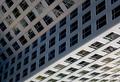
| 09/23/2005 08:11:38 PM | Vertigoby WalkaboutwolfComment: Hello, and greetings from the Critique Club. The critique you are about to recieve is tailored for DPC challenges alone, and is not intended to be seen as an artistic critique per se.
Initial Thoughts
Woo.. dizzy.. nice choice of title.
Composition / Content
Definitely not a classic composition, but it's effective. Perhaps too effective. Although you achieve what your title suggests you wanted to achieve, it's not always a good plan to enter images that will have a negative impact on the voting public, and giving voters a touch of vertigo isn't exactly positive. heh. The coloring is probably where a lot more lower scores came from. It's a little dull in this respect, and the window reflections *are* a little distracting, although in a basic challenge, there's not much you can do about it. Only things I could suggest are to wait for more dynamic sunlight (sunset, sunrise, weird cloud or smog effects), or find a more colorful building. Anything that increases the richness of color will help to increase a score on DPC.
Background
No traditional background, per se, but I do like the difference of shadow on the building faces.
Camera Work / Technical
Pretty good work here.. exposure is nice, focus is good, but it looks like the DOF starts dropping off on the bright side of the building, and is thus softer than the rest. If people really noticed this, it probably led to a few lower scores.
Digital Processing
Good work with the contrast/brightness adjustments, it doesn't look over done, and the sharpening is good as well.
Fits the Challenge
As I said, it does fit the challenge, but perhaps a little too well, giving a dizzying first look. Once used to the photo, however, that intial vertigo passes.. but I suspect you caught a lot of people with it and contributed to a few lower votes.. however, it probably also led to a few higher votes from those of us that tend to like weird effects.
My Opinion of the Photo
Nice perspective shot, but just lacking in that dynamic "wow" factor that is so important in a DPC entry if you're looking for a higher score. Keep shooting, and good luck in future challenges. | | Photographer found comment helpful. |
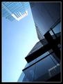
| 09/23/2005 07:59:24 PM | Building Perspectiveby SilienceComment: Hello, and greetings from the Critique Club. The critique you are about to recieve is tailored for DPC challenges alone, and is not intended to be seen as an artistic critique per se.
Initial Thoughts
A really nice perspective shot, love the lines.
Composition / Content
The strong geometrical aspect of this photo intriques me. I love the 90 degree angling and the blocky look. It's futuristic in a way, yet contemporary as well. If there's just one issue I have, is that the tilt of the main vertical line in the photo (from the bottom corner of the main building to the top corner) is tilted, and I can't help but feel it might have been stronger if it was straighter.
Background
The sky fades in just a *little* to brightly for my tastes. Polarizer would have really helped here.. or an ND grad filter of some kind. Don't know if they're available for your camera though
Camera Work / Technical
A good exposure, marred only slightly by the sky. Great focus, great DOF.
Digital Processing
No information given, so I cannot comment on this area.
Fits the Challenge
It definitely fits the challenge, and in a pretty nice and strong way. You were probably hit by voters because of the sky and because of the lack of any really dynamic coloring (and possibly because of that tilt of the main vertical, but hey.. that could just be me).
My Opinion of the Photo
A really nice shot, with some fantastic perspective. A couple of tweaks and this could have really shined. I still think it could have placed a little higher, but a 5.8 is really nothing to be ashamed of at all. Good job, and good luck in future challenges. | | Photographer found comment helpful. |
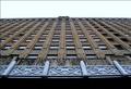
| 09/23/2005 07:49:16 PM | Texas & Pacific Terminal, Ft. Worthby amjltComment: Hello, and greetings from the Critique Club. The critique you are about to recieve is tailored for DPC challenges alone, and is not intended to be seen as an artistic critique per se.
Initial Thoughts
I like the coloring, but the sky is too flat and this is a little bit "same ol'"
Composition / Content
Compositionally, I feel that it's ok, but nothing stellar. The little shift of the blue/grey posts at the bottom off-center things a bit and lessen the symmetry that could have been there. Whether this is something that could have been helped by a photographer shift, or if it's a design element of the building itself, I don't know, but it just doesn't work for me. Another aspect is the landscape orientation. This really would have benefitted, to me, from a portrait orientation.. giving us less of the building, but really adding to the perspective. The building itself has some nice coloring, but the lighting is really dull and flat, and it just loses appeal that it could have had with some more dynamic lighting (say sunset, or night-time long-exposure). Howeveer, the artwork on the building is very pretty.
Background
flat, grey skies are never really big with the DPC crowd.
Camera Work / Technical
Focus seems a *little* bit soft, and it looks like that was over-compensated with sharpening a bit too strongly, resulting in a few artifacts here and there. Exposure is good, but with that lighting, again, just a little too flat.
Digital Processing
It looks to me like it has been slightly over-sharpened to try and compensate for a slight focus issue. The rest of the work you've mentioned seems to have been done nicely. The blue tones work well, and could have been really nice with different, warmer lighting
Fits the Challenge
Certainly does, but as I mentioned in my initial thoughts, I feel that this is another casualty of the "same ol' same ol'" line of thinking. That is, it's a shot that we have seen a thousand times before, and unless it's an amazingly good/dynamic/different take, it just doesn't do that well. Your shot, to me, just doesn't have that extra.
My Opinion of the Photo
A nice attempt at a classic perspective that just falls short because of the flat lighting, gray uninteresting sky, and the landscape orientation of the photo. Keep shooting, and don't be afraid to try looking at things in all new ways. Good luck in future challenges. | | Photographer found comment helpful. |
| 09/23/2005 07:33:57 PM | Focus on Cby TeeQComment: Hello, and greetings from the Critique Club. The critique you are about to recieve is tailored for DPC challenges alone, and is not intended to be seen as an artistic critique per se.
Initial Thoughts
A nice attempt, but lacks some true perspective that could have been very easily fixed.
Composition / Content
Your composition suffers here from one minor thing that becomes a major element, it is almost completely *lacking* perspective. You have taken this shot almost straight on and it doesn't give the viewer anywhere to really go. The viewer is stuck in the middle section of the keys, which don't, tnemselves, really lead anywhere except the top and bottom of the frame. The shallow DOF seems to be just gratuitious instead of an integral part of the photo. However, not all is lost. You were on the right track.. it's just that the composition you chose lacks a dynamic that is, literally, just around the corner. Had you shifted the send the keys more into a vanishing point, toward a distance, you would have suddenly had a much more dynamic photo. Studying your subject and finding new and interesting ways to shoot them can really jump a photo from ok to good, and from good to great.
Background
I like the silverish look of the keyboard cabinet, but it's really not a "background" per se, and really does nothing for this particular shot in this particular perspective, IMO.
Camera Work / Technical
You've done some nice work with the technicals. Good exposure, nice focus where there is focus. I feel that the shallow DOF doesn't add anything though and really just locks the viewer into the center of the photograph, where there really isn't much to look at.
Digital Processing
Good work with the white balance, it looks pretty natural.
Fits the Challenge
There's perspective, but it's a really flat, uninteresting perspective. As I said, a little more work getting around the subject and finding a really nice, dynamic angle, would have improved this shot ten-fold, in my mind.
My Opinion of the Photo
A nice attempt, but just too plain. There are thousands of shots of keyboard/piano keys out there, and to really stand out, you have to *make* them stand out. This is more like a documentation photo, and as such, just fails to meet most DPC voter standards. | | Photographer found comment helpful. |
| 09/23/2005 07:21:16 PM | Redby thomaspeopleComment: Hello, and greetings from the Critique Club. The critique you are about to recieve is tailored for DPC challenges alone, and is not intended to be seen as an artistic critique per se.
Initial Thoughts
The square crop is different, but overexposure is a problem.
Composition / Content
The square crop gives this portrait a unique kind of composition, reminiscent of various album covers I've seen in the past. However, it's also not particularily striking, and is also reminiscent of a mug-shot type of look. The model is also put just a little too low in the frame, and thus looks hunched.
Background
Interesting lighting in the background, probably one of the stronger points in this photo. I also like the matte grey coloring.
Camera Work / Technical
Your lighting here is far too hot, especially for a fair skinned red-head. The harsh lighting on the face has lightened one eye up, yet left the other eye really dark, giving an eerie and off-putting look. Focus also seems a little soft, and the harsh lighting only serves to enhance this. I'd suggest either putting some kind of diffuser on your light source in the future, or find softer lights. The softer focus look is probably due to your shutter speed being 1/5 second. You really want this to be 1/40 or more (1/125 or more if handheld). I had the kodak you own, and I can tell you that it's really not suited as a portrait camera (lacking a lot of manual control), especially in a studio setting. I would also suggest sticking to natural light portraits unless you have access to some really good lighting.
Digital Processing
I have no information on what you did or did not do, so cannot comment on this section.
Fits the Challenge
It fits the challenge, so no worries there.
My Opinion of the Photo
It's a step in the right direction. I like that you are experimenting and it's a great job on the background. A little more control on your lighting, and perhaps some practice with post-processing, and you could be pulling some really good portraits out of that camera. It's going to take some innovation, patience, practice, and experimentation. Good luck in future challenges.
| | Photographer found comment helpful. |
| 09/21/2005 05:22:11 PM | Strummerby peterishComment: Hello, and greetings from the Critique Club. The critique you are about to recieve is tailored for DPC challenges alone, and is not intended to be seen as an artistic critique per se.
Initial Thoughts
Interesting, although not the strongest on the challenge theme in a DPC sense.
Composition / Content
As has been said, the foot sticking out here really does take a lot away from the main point of interest, and in a compositional sense, you really don't want anything leading your viewer off your subject. Content wise, it's a great pose and I love the motion blur on the hand, that's a wonderful little detail that many might have missed. Another point I'd have you consider is that the negative space is on the wrong side. Leading your negative space in the direction of the face and the strut of the guitar would have taken the focus off the foot, and put it more where you were trying to keep it, on the musician.
Background
The vignetting is just a little too obvious and cloudy. Not a smooth progression, and that probably got picked up on by a lot of voters as well.
Camera Work / Technical
A good choice of aperature and shutter speed, allowing some good exposure and that motion blur on the hand. Focus seems a *touch* soft.
Digital Processing
You didn't give any information about this, so I can't really comment. I do like your choice of color saturation though, gives it a nice gritty feel that works well.
Fits the Challenge
For DPC, this is a tentative fit to the challenge. It's a portrait, no question, but it's not what the majority of people were looking for, and as such, was probably hit for that. For my part, it's nice to see a few different takes, and this is a good attempt.
My Opinion of the Photo
A nice alternative portrait shot, some good color, and a nice pose, but a few issues that keep it from being really good. Good luck in future challenges. | | Photographer found comment helpful. |
| 09/21/2005 05:06:29 PM | Three Upset Angelsby moonjeongComment: Hello, and greetings from the Critique Club. The critique you are about to recieve is tailored for DPC challenges alone, and is not intended to be seen as an artistic critique per se.
Initial Thoughts
A lovely and warm photograph of three extremely cute models.
Composition / Content
Pretty good composition, the triangle effect of the models works well, but the varied gazes doesn't really work in its favor IMO. It seems too random and confusing. I feel that it would have been a stronger shot had they all been focusing on *something*.. not necessarily the same thing.. but something, instead of the two just gazing off camera.
Background
Graphicfunk suggested a deeper DOF, but I'm not sure if that would have helped or hindered you in a DPC voter way. Personally, I like the shallower DOF, but the jury is out on which style is preferred to voters in a situation like this.
Camera Work / Technical
Nice work here, excellent exposure, good focus, and a nice DOF that may or may not have worked better by being deeper. (For what it's worth, the shallower DOF helps stand the children out, where anything deeper might start to look busy and lessen the impact of the subjects.. my 2 cents. *I* personally would have liked it shallower)
Digital Processing
You didn't list your steps, so I can't really comment. No obvious or glaring issues however. (maybe a little bit too warm in tone overall)
Fits the Challenge
It fits the challenge, but you might have been docked in score for having multiple subjects. DPC voters tend to be sticklers like that for the silliest of things.
My Opinion of the Photo
A wonderful portraiture of three beautiful children. It's candid, and I'm not really big on where the children are look, but it's still a lovely shot and worth a place of honor in any personal portfolio. Good luck in future challenges. | | Photographer found comment helpful. |
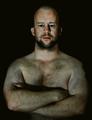
| 09/21/2005 03:45:22 PM | Joe.by johannesComment: Hello, and greetings from the Critique Club. The critique you are about to recieve is tailored for DPC challenges alone, and is not intended to be seen as an artistic critique per se.
Initial Thoughts
eeek.. Now this is different, and freakish.
Composition / Content
Nice composition, it works well. It's a great subject as well, showing off his features, although the expression is very odd.
Background
Black works very well on DPC, so it's a good choice.
Camera Work / Technical
Pretty good exposure (slightly dark in areas to my eyes), and focus is very good.
Digital Processing
You didn't list your processing, but from what I can see, it looks fairly heavy-handed. The veins in the arm don't look natural, and it has the look of some dodging and burning. The color of the skin is a little "sickly", which led to the comments I can see about him being dead or unappealing. The lighting on his face is a little hard and the tones don't flatter him at all, especially since they differ from the body so much.
Fits the Challenge
It fits the challenge, but I suspect that your lighting, processing, and subject just put off too many voters.
My Opinion of the Photo
Artistically, it's a very interesting portrait. However, for DPC, unless this kind of thing is done in a very technically strong and appealling way (check out Heida's entry), it tends to really just work against you. The differences in skin tones, the harsh lighting and contrast, and the "deathly" look are probably the main issues that led to the lower score. A wonderfully *different* shot.. but just suffering from a little too many smaller issues. Good luck in future challenges. |
|
Showing 711 - 720 of ~1843 |
Home -
Challenges -
Community -
League -
Photos -
Cameras -
Lenses -
Learn -
Help -
Terms of Use -
Privacy -
Top ^
DPChallenge, and website content and design, Copyright © 2001-2026 Challenging Technologies, LLC.
All digital photo copyrights belong to the photographers and may not be used without permission.
Current Server Time: 07/26/2026 10:14:18 PM EDT.
|