|
|
|
Showing 701 - 710 of ~1843 |
| Image |
Comment |
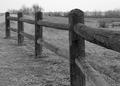
| 09/26/2005 04:35:42 PM | Untitledby fiveriversComment: Hello, and greetings from the Critique Club. The critique you are about to recieve is tailored for DPC challenges alone, and is not intended to be seen as an artistic critique per se.
Initial Thoughts
Not a whole lot of interest here. The perspective is a little "flat"
Composition / Content
While you've got a pretty good composition going, the content isn't very flattering. The fence, while a good start, just doesn't go off at the most dynamic angle. One is really left looking at "just a fence" without any real perspective to it. There is *some*.. just not enough, IMO, to really stand this photo out.
Background
While it's also because of the camera you have, I feel that there just isn't enough depth of field in this photo. Generally, you can get more depth of field by zooming in as far as you can.. going as close to your subject as you can and focusing to the most minimal distance (opposite of infinity), and choose the largest aperature you can. While point&shoot type digital cameras have less play with depth of field, I'm thinking that a getting a better angle on the fence (having it recede into the distance faster), and focusing on the nearest post, would have helped you achieve that shallower depth of field and blurred out the background more. This would have resulted in a much stronger and more dynamic shot for this challenge.
Camera Work / Technical
A nice exposure results in some good basic lighting here. Your focus is sharp where you wanted it, but as I said above, perhaps it remains too sharp into the background
Digital Processing
You didn't include any information, but I can tell you that the photo lacks just a *little* bit of contrast. It does come across as a little too dull and gray.
Fits the Challenge
While it does fit the challenge, I feel that the perspective as shown is a little flat, and would have been helped immensely with just a little shift in point of view.. getting closer to the fence, and shooting it at a more dynamic angle.. with the vanishing lines more towards the center of the image, instead of going off out the side of the frame as it is.
My Opinion of the Photo
It's not a bad photo of a fence, but in the end, that's all it is.. a photo of a fence. There's nothing really interesting, different, or "wow" about this to really put it above the pack in a DPC Challenge. Good luck in future challenges. |
| 09/26/2005 03:26:13 PM | Where Will Destiny Lead?by LadeeMComment: Hello, and greetings from the Critique Club. The critique you are about to recieve is tailored for DPC challenges alone, and is not intended to be seen as an artistic critique per se.
Initial Thoughts
A nice photo, looks oversharpened in areas, despite the blur effect.
Composition / Content
This is rather nice compositionally, although the human subject has been minimalized perhaps a little too much. The scene over-powers here and takes away from the "destination" aspect, at least for me. The tracks lead on to a destination, sure.. but the small figure just seems lost and gratuitous. Artistically, I can see a point that destiny is, traditionally, about being lost and finding our way.. but artistically isn't what I'm worried about when I critique.. and as the image stands, I do believe that voters just weren't grabbed by it because of the lack of a strong connection.
Background
A nice lead off into the distance, but the haze kind of works against you here I think.. lending to a flat color. This might have worked a lot better in a soft sepia tone, or in "hyper-reality".. more of an enhanced color to help the "dreamy" look.
Camera Work / Technical
A nice exposure, but the color is just too flat overall. Your focus is good, but I think maybe using an aperature of f/8 would have helped even more.
Digital Processing
While I generally like the soft-focus effect, and while I can see why you'd use it in a photograph like this, I think it probably turned off too many voters. It's a little strong in areas, and only helps obscure your human subject that much more to my eye. The gradient layer probably contributed to the flat coloring, which is also usually a negative with voters, especially for landscapes or pseudo-landscapes. It works well for portraits or candids.. but landscapes with a desaturated look rarely do well in my experience and observation. There are also areas that look a little oversharpened, but I see that you use the DiMAGE Z2, and I've noticed this "oversharpening" effect from photos of that camera before, and suspect that it's an in-camera thing.
Fits the Challenge
While it fits the challenge on more levels than it appears at first glance, the factors I mentioned above kind of minimize that.. at least on a technical/visual level that is so important to a DPC entry. I think having your human subject more prominent in the scene would have helped this out a little.
My Opinion of the Photo
It's a nice dreamy photo with some wonderful artistic value. I like the statement that I myself can see in it.. the long and hazy road to our destiny.. if it exists. However, on a DPC level, it just falls short in a few areas. It's always a battle.. trying to find a good compromise between what we want to say, and the quest for a better score. Good luck in future challenges. |  Photographer found comment helpful. Photographer found comment helpful. |
| 09/26/2005 02:58:54 PM | Holidayby idnicComment: Hello, and greetings from the Critique Club. The critique you are about to recieve is tailored for DPC challenges alone, and is not intended to be seen as an artistic critique per se.
Initial Thoughts
A little cramped, but nice focus and colors.
Composition / Content
Compositionally, you were on the right track I think. However, the photo has a very cramped and cluttered feel that usually means much lower scores on DPC than not. Every object here just has a little *too* little showing in the photo to give a solid feel of what it is without studying it too much (with the exception of the passport), and having a photo that doesn't say "THIS IS WHAT IT IS!" out loud in the first few seconds rarely does well.
Background
No true background per se, but the map you have the other objects laying on is a little too busy.
Camera Work / Technical
You've provided no information on your camera settings. Remember that doing so, if you request a critique, is helpful for the critiquer. I do see that you've got a nice exposure and great focus, so I see no real problems in this area.
Digital Processing
The reds seem just a *little* saturated to me, but that might just be my monitor or eyes. However, you've provided no information in this area either, so I cannot comment further.
Fits the Challenge
As far as I'm concerned, it fits the challenge.. but the fact that you've gone in so close makes the voter take a little more time than usual to determine if the challenge has been met or not. At first glance it's just a jumble of things. I imagine this led to lower votes than it could have.
My Opinion of the Photo
A little too cramped and cluttered for myself, it is nonetheless a technically well done photo with a theme that meets the challenge. Not very awe-inspiring or "wow".. which is essential to DPC entries, but a nice document-style photo. Good luck in future challenges. | | Photographer found comment helpful. |
| 09/26/2005 02:48:19 PM | choices, choices...by BeeGeeComment: Hello, and greetings from the Critique Club. The critique you are about to recieve is tailored for DPC challenges alone, and is not intended to be seen as an artistic critique per se.
Initial Thoughts
Oo, nicely done. Love the lighting and a great angle.
Composition / Content
A rather nice composition here, it has some great symmetry while also being rather asymmetrical. The shine of the individual signs is great.. I assume they were lit from within? Nicely captured anyway.
Background
While most of the photo is nicely black.. there's a little spot in the lower left where we see background lights. While a minor thing, I'd suggest keeping an eye open for little things like this and cloning them out when you can. It just helps keep your photograph tidy and really helps it with voters, who will always find *something* to nitpick.
Camera Work / Technical
A great job capturing the exposure of these signs. They are nicely exposed, and that's not an easy task with self-lit subjects. Your focus is also great.. nice and crisp.
Digital Processing
You included no information on this, so I cannot comment. However, I do have another cloning suggestion. See the black spots on the "Chur" and "City" signs? Again, tiny little minor things, but cloning them out would have helped a lot I think. Remember that voters are a rabid clan, and tend to grasp "imperfections" big-time. Tiny little things like that can actually cause a full point or two difference in a voter's vote. Also, on the "Affoltern" sign, there's a black mark on the bottom that, with careful cloning, could also have been fixed.
Fits the Challenge
This fits the challenge in a wonderful way. A great choice, and very well presented.
My Opinion of the Photo
This is a great little photo that is pretty clean, well shot, and strong on the challenge. While the subject matter may not be exactly awe inspiring, it isn't boring either, and the light and color really stand it out from something that may have been more mundane. Great job, nice score, and good luck in future challenges. | | Photographer found comment helpful. |
| 09/26/2005 02:37:15 PM | What's a conspiracy?by okiesisiComment: Hello, and greetings from the Critique Club. The critique you are about to recieve is tailored for DPC challenges alone, and is not intended to be seen as an artistic critique per se.
Initial Thoughts
Looks a little fake.. like the whole background was done digitally somehow.
Composition / Content
I'm not sure about the composition. The boy seems just a bit too far towards the side of the photo, making it feel cramped, and giving us far too much space to lose that bomber in. The bomber itself is good, and looks like it belongs in the sky and really does look like it's just flying by.. but the boy looks very.. unreal. As if he was pasted in, or like the background was created behind him. Part of this is the lighting. He's all shaded and shadowed, but the background has harsh daylight lighting. You give the impression that he's just standing outside in the open, but your lighting tells a different story. He might have just been standing in some shade, but I think that's what, for me, makes it look too fake.
Background
It honestly, to me, looks like it was digitally replaced. Had I voted, I probably would have requested a DQ on this for major elements. Now, I don't know if it has been replaced or not.. but that's how it *looks*. Both because of the lighting issues, and the fact that the perspective also seems to be a little off. Also.. what did you tie that stealth toy *to*? I'm just curious about that :) (Actually, now I look at it, were you standing under a tree? that would account for the shade.. and an overhanging limb to support the toy..)
Camera Work / Technical
Besides the lighting that throws me off, there's a distinct lack of focus and sharpness here. The coloring is also just a little flat and dull.
Digital Processing
Your edits seem ok, but are lacking the polish needed to really stand this image out more than it does. Sharpening is one area that could be improved, and a little more color work on the boy's skin tone as well.. it having quite a red cast.
Fits the Challenge
This is an area that is really dependant on the voters' personal preference. I personally don't think it's a very *strong* connection by itself. It seems really static and we're left wondering just what the conspiracy is.. as your title also suggests. I'm sure some people really get it, but others probably didn't at all.
My Opinion of the Photo
Too many elements just turn me off of this photograph as a DPC contender. It looks faked (even if it wasn't), and doesn't have the polish that it might have had. It's a fun photo, but just lacking what it needs to finish strong in a challenge. Good luck in future challenges.
| | Photographer found comment helpful. |
| 09/24/2005 11:15:02 PM | Through this Passageby kenaComment: Hello, and greetings from the Critique Club. The critique you are about to recieve is tailored for DPC challenges alone, and is not intended to be seen as an artistic critique per se.
Initial Thoughts
Focus is off, and the tilt doesn't really work for me. Not sure Sepia was the best choice..
Composition / Content
The composition is OK here, with the exception of the slight tilt, which isn't, in my mind, large enough to look purposeful, so gives the impression of a hurried shot. A "rule" I have heard of is that you should always use a tilt of 10 degrees or more if you're trying to do it on purpose. But eh.. math.. who needs it. The other issue I have is the open door. It's distracting, and half-covers the desk, making it more a clutter element. Also, even with the door closed, I feel the desk itself would have been almost as distracting. In a shot like this, you really want your viewer to have an unfettered line of sight down your vanishing point.
Background
A little too much going on in the background that doesn't add anything to your photo or the perspective you've chosen. This is hard, if not impossible, to to control in a situation like what you've shot in, and in an open challenge, so I wouldn't worry about it too much.. just be aware of situations like that in the future if you can.
Camera Work / Technical
For me, the lighting is a little too harsh, and I'm thinking that shooting this on a much more overcast day, or more towards evening light (or early morning light), would have helped. Your focus is also off, but that is more a factor of the aperature you've chosen and a lack of proper post-sharpening than any focusing issues on your part, I think.
Digital Processing
I personally don't feel the sepia toning here works that well. It's rather strong, and only serves to highlight the harsh contrasts of the open doorway and the poles.. which only serves to distract the viewer from your focal point and perspective. Without any information on why you chose sepia, however, I can't, and won't, bother to speculate on it.
Another thing is sharpening, this image lacks it, so work on that area as well.
Fits the Challenge
While it fits the challenge, there are many elements in this image that take the viewer's attention from it, and thus kind of ruin the effect.
My Opinion of the Photo
A nice idea, but not executed very well. The distracting elements are easily moved or taken care of.. try to avoid shooting in bright daylight with harsh shadows unless you are using that light and shadow to enhance your image or for effect.. and don't be shy about rotating a photo to get your vertical lines vertical. Keep the ideas coming, and good luck in future challenges. | | Photographer found comment helpful. |
| 09/24/2005 10:55:06 PM | Long Way Downby rodehiComment: Hello, and greetings from the Critique Club. The critique you are about to recieve is tailored for DPC challenges alone, and is not intended to be seen as an artistic critique per se.
Initial Thoughts
This is nice, a really good POV.. but there's just something missing.
Composition / Content
This is one of those rare photographs where.. although the subject matter is pretty awe-inspiring.. the photograph itself is still pretty plain. You've chosen a nice composition, and I love the point-of-view, but other factors take away from it too much to really be a true DPC contender in my mind.
Background
Did the shallow DOF hurt you here? My guess is that it did. The blurry background puts focus on the person, but also gives the photo less of an impact.
Camera Work / Technical
You didn't add the information, so it's hard for me to really say anything. What I do know is that selecting a smaller aperature to increase the depth of field woud have really helped. The river would have been much more impactful had it been sharp as well, IMO. Your exposure is also slightly on the dark side on your human subject. Diffused fill flash or a reflector of some sort could have helped here as well.
[bDigital Processing[/b]
Again, you haven't entered any information, so I cannot comment on this area.
Fits the Challenge
Your perspective is probably the strongest part of the image. It's a nicely strong connection to the challenge in its own way, but perhaps not as strong as some voters seem to have been looking for, given your score.
My Opinion of the Photo
I do believe you ended up lower than you may have deserved to with an image that isn't a bad photo.. but a few factors seemed to have turned off the voters (given the comments), and led to the lower score. I personally like it, but it definitely doesn't have that "WOW!" feel that most top placers seem to have. Good luck in future challenges. | | Photographer found comment helpful. |
| 09/24/2005 03:18:57 PM | If You Were Smallby gclarkComment: Hello, and greetings from the Critique Club. The critique you are about to recieve is tailored for DPC challenges alone, and is not intended to be seen as an artistic critique per se.
Initial Thoughts
A pretty good shot, nice colors, a little cramped.
Compostion / Content
While it's an interesting view and composition, I believe that a couple of things would have really improved it over what it is (and what it is isn't *bad* by any means.. ending up under a 5 with this shot really kind of perplexes me). I think that using landscape orientation is a good choice, but to really make this shot stand out, I think a slightly lower perspective, and getting the whole of the initial flower in frame (and using a wider angle), would have stood this out a lot more. Cutting the main subject off lends to a more cramped feel in a photograph, especially if you have background elements that are clutterish. A wider angle for this type of perspective shot is almost a must to give it a more dynamic flow.. although I know that it isn't always possible. Still, a few degrees lower and tilted upwards to isolate the flower more, and I think you'd have pulled out a few higher scores.
Background
As you have it, the stems and stalks of the rest of the flora are just more of a clutter than they are a help to the photo. They do add a sense of depth, but there are just too many for the perspective you've chosen, which makes the plane feel flatter, and the photo more cramped than it could have been.
Camera Work / Technical
You've done a fine job in this area, IMO. A really nice exposure, some great focus, and the depth of field was achieved very nicely. It has a smooth look that seems more natural than not and reminds me of a well done diorama.
Digital Processing
No information given, so I cannot really comment on this area.
Fits the Challenge
It does fit the challenge, but I believe it could have been stronger with just a few slight shifts in your point of view and if you could have used a wider angle.
My Opinion of the Photo
I like this myself, despite the things I've mentioned. I am honestly confused why it finished as low as it did, but one comment seems to be that there were a lot of this type of photograph in the challenge. If that was the case, that could have been a contributing factor, along with the elements I mentioned. Regardless, I think it's a step in the right direction, has a good strong technical element, and deserved to be higher. Good luck in future challenges. | | Photographer found comment helpful. |
| 09/24/2005 02:59:37 PM | Wake my Dreamsby shabbychicComment: Hello, and greetings from the Critique Club. The critique you are about to recieve is tailored for DPC challenges alone, and is not intended to be seen as an artistic critique per se.
Initial Thoughts
Not much going on here.. and I really don't see what it has to do with a perspective..
Composition / Content
Not a lot of content here, being really dark. The shining light obviously is intended to have some significance.. but in those 3 - 10 seconds that the average voter takes to look at a photo? I just don't think it was conveyed well enough. Compositionally, it borders on interesting to me.. but there's just not enough *in* the photo to really anchor it as anything.. I really have to say that even after looking at it for awhile, the main thought I have is "confusing".. and that's not very good in a DPC challenge entry.
Background
A good blackness, don't have much to add for this particular section.
Camera Work / Technical
I'm confused about your aperature.. 10? I assume you mean f/10 (although I've never actually seen an aperature of f/10 before). Without really knowing your intent for photographing this, I'm really just in the dark about your settings, and if they helped you achieve it.
Digital Processing
No information given, so I cannot comment on this area.
Fits the Challenge
For me, and I assume a lot of voters, this photo doesn't meet the challenge in any immediate, visual way.. and just doesn't convey any non-visual, artistic, or personal way strong enough for your typical DPC voter.
My Opinion of the Photo
I'm one of those that really doesn't understand this photo or what it was trying to convey. The title doesn't really help me either, and the fact that you didn't include any information on this shot, especially about your intent or personal feelings about it, don't give me a lot of room to say much more. The fact that you were close to hitting a 5 means that you *did* connect with *some* people, but I'm not one of them. Had you included more information, I might have been able to be more helpful with this critique, but as it stands I can only reiterate what I said above: It is a dark, hard to understand photograph with no strong visual connection to a perspective. I'm sure that you know what your intentions were with the shot, and that it has a strong connection or meaning for yourself, but I couldn't grasp it. Sorry.
Good luck in future challenges. | | Photographer found comment helpful. |
| 09/24/2005 02:41:53 PM | Heart of the House Partyby dragorComment: Hello, and greetings from the Critique Club. The critique you are about to recieve is tailored for DPC challenges alone, and is not intended to be seen as an artistic critique per se.
Initial Thoughts
Hard to determine what this is.. the perspective is there, but difficult to see.
Composition / Content
One of the thins I like about this photo is the composition. It's clever, and a little out of the ordinary. The composition alone, had all the rest of the elements added up, would have sent you on your way to a higher score here. As for content, the choice of a DJ spinning table is good, but like you said, the rest of the clutter is not. On a personal level, or artistic level, the bags of food and the junk laying about might have a story to tell, or whatever.. but for a DPC challenge entry, all it really conveys is, "I didn't care enough to take my time". This is almost always death for a DPC image.
Background
The fade out was a little too quick into out-of-focus I think, and the blur doesn't help the clutter you see back there enough.
Camera Work / Technical
For an image as tight as this one, with little viewing area, the shallower DOF probably worked against you. It just creates an illusion that the whole scene is entirely out of focus. Also, the darker exposure adds to this, making the entire scene hard to really see in the first few seconds (critical area for voters.. you really have to smack it to them in the first few seconds sometimes). Either jump up the ISO, open the shutter for longer, or find a faster lens for indoor low-light shots like this.. or get a much deeper DOF (and clean up a touch.. takes a few seconds to do) to sharpen everything up a little better.
Digital Processing
No information given, so I cannot comment much about this area. However, were I you, I'd have brought up the levels more and done a little bit of color balance to minimize the yellow/red cast.
Fits the Challenge
It fits, but the perspective is hard to see and sort of hidden to my eyes.. especially initially. That initial look can be crucial, and I imagine contributed to even lower scores.
My Opinion of the Photo
A great start compositionally.. this photo was just hounded by too many more negative aspects. Too dark, too blurry, too cramped, off-color.. etc.. that voters really like to nit-pick about, and one can't really blame them. I think it had a lot of potential, you just needed to put a little more time, effort, and thought into it. It's a rare spontaneous photo that does well on DPC. Good luck in future challenges. | | Photographer found comment helpful. |
|
Showing 701 - 710 of ~1843 |
Home -
Challenges -
Community -
League -
Photos -
Cameras -
Lenses -
Learn -
Help -
Terms of Use -
Privacy -
Top ^
DPChallenge, and website content and design, Copyright © 2001-2026 Challenging Technologies, LLC.
All digital photo copyrights belong to the photographers and may not be used without permission.
Current Server Time: 07/27/2026 01:46:51 AM EDT.
|