| Image |
Comment |
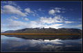
| 01/19/2006 02:21:22 PM |
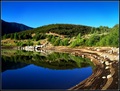
Reflectionsby GautiComment: Nicely composed, but a little flat and hazy in areas. The lack of clarity on the snowy peak (because of the clouds behind), is also something I don't care for much. |
 Photographer found comment helpful. Photographer found comment helpful. |
| 01/19/2006 02:14:20 PM |
OWLby AlainComment: Nice close-up, but lacking a real punch. It's a little soft in the feathers, which loses a bit of detail, and the coloring could have been deeper and stronger in the eye and beak, which would have helped immeasurably. |
| Photographer found comment helpful. |
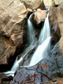
| 01/19/2006 02:12:54 PM |
Boulder Fallsby mystardreamComment: Far too small to be effective, you need to utilize the full 640 pixel limit here to even hope to have a chance of doing well. |
| Photographer found comment helpful. |
| 01/19/2006 02:11:21 PM |
Chincherinchee Chincherinchee Chim Chim Cherriby front_elementComment: A good attempt on a classic photo, but lacks some of the technical prowess needed to join many others. Soft focus, artifacting, and a lack of any really good dynamic lighting are all minor flaws that add together. Keep trying though, this is definitely on the right path. |
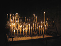
| 01/19/2006 02:09:35 PM |
Illuminationby xuan768Comment: A cool candle set-up, but not much else. The photo lacks a real focal point and sense of any true composition. Focus isn't very tight, causing it to look much softer than I'd like. The crop is also a little too wide. It gives a sense of hurriedness, and a lack of any real feeling. |
| Photographer found comment helpful. |
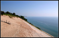
| 01/19/2006 02:07:39 PM |
Sleepy Bear Dunesby buzzrockComment: An interesting landscape. The people walking down/up the dune add a human interest, and the background is nicely done. Just, for me, lacks that little something extra. |
| Photographer found comment helpful. |
| 01/19/2006 02:06:42 PM |
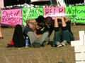
sharing their griefby kerrilynComment: an O.K. political statement, but the photo comes off as being a little staged, and not very technically proficient. The composition is too centered and dull, the neon coloring of the signs is distracting and gaudy, and the grave markers in front are too cut out, and only serve to look out of place (and hard to determine). |
| 01/19/2006 02:01:45 PM |
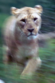
Lioness on the moveby hubbardr1Comment: I like that it's different. The motion blur really works, and the sense of energy is fantastic. It could use some work in the color/contrast, as it looks a little flat, grey and dull in that. The lion's fur especially. A little too much red in areas, where just a little work could have given it the golden hue that would have helped sell.. The greens are also just a little grey and flat. |
| Photographer found comment helpful. |
| 01/18/2006 10:28:10 PM |
Portrait of a girlby totiComment: I remember commenting on this before, and thanks for the answer. As I said, just absolutely gorgeous lighting, and a fantastic high key portrait. This photo is probably why *my* high key portrait is suffering :) |
| 01/18/2006 10:24:26 PM |
Natural Reflectionsby justin_hewlettComment: I really don't like the processing done here. The colors have been pushed *way* too much, and the gradient is a little too strong. |
| Photographer found comment helpful. |
Home -
Challenges -
Community -
League -
Photos -
Cameras -
Lenses -
Learn -
Help -
Terms of Use -
Privacy -
Top ^
DPChallenge, and website content and design, Copyright © 2001-2026 Challenging Technologies, LLC.
All digital photo copyrights belong to the photographers and may not be used without permission.
Current Server Time: 07/26/2026 12:25:44 PM EDT.