| Image |
Comment |
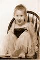
| 08/30/2004 12:30:03 AM |
Spriteby dartompkinsComment: I think this is a nice shot, but I find the negative space too distracting, and the contrast on the model herself a little light. I find it a little too grainy also, but that's just personal opinion, and you could have been going for that purposely, and it's not a score affecting gripe :) |
 Photographer found comment helpful. Photographer found comment helpful. |
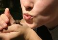
| 08/30/2004 12:27:08 AM |
|
| Photographer found comment helpful. |
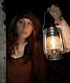
| 08/30/2004 12:25:20 AM |
The Lady with the Lanternby kiwinessComment: absolutely gorgeous! One of these days I'll be able to accumulate enough props to do something like this :) Anyway, props aside, you've done a wonderful job with capturing the moment, and handling the light. This piece really puts me in the moment. |
| Photographer found comment helpful. |
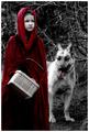
| 08/30/2004 12:23:21 AM |
Little Red Riding Hoodby SonifoComment: This is a very beautiful photo to look at. You've saturated the red almost to perfection in my eyes.. (or as close to as one can come), and the dog was a very nice touch. The one flaw I see is that the saturation has made the girl stand out a little *too* much.. as if she was pasted in to the picture. perhaps some softening of the edges or blending would have helped that. |
| Photographer found comment helpful. |
| 08/30/2004 12:20:55 AM |
'Jack' and the Beanstalkby SteveJComment: lol.. I can't believe it.. it actually took me a few blinks and some "huh?"s to get the play on words :)
I like the humor, but the stalk kind of disappears into the clutter of the fence a little too much. perhaps a different POV would have made a difference. The jack's highlights could have been toned down a little too, in my opinion, as well. Good try! |
| Photographer found comment helpful. |
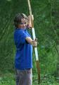
| 08/30/2004 12:18:25 AM |
Robin hoodby rhipsterComment: Boy, Robin Hood sure has gotten modern! :) I like the POV, and the look of concentration. Would have been nice if you could have found more "earthy" tones for the boy to wear, as it would have sold the "Robin Hood" theme a touch better.
However, it's still a pretty good photograph. |
| Photographer found comment helpful. |
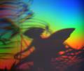
| 08/30/2004 12:16:32 AM |
Fairy Shadowby SamaraComment: creative.. I'd like to find out how you achieved the rainbow effect.. or what you shot this through. |
| Photographer found comment helpful. |
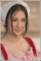
| 08/30/2004 12:15:50 AM |
...Some day my prince will come...by doctornickComment: I like the costuming on this portrait, and the wistful look in the model's face. The depth of field isn't as forgiving as it could be.. the right shoulder strap is an example. I like it, however, overall. |
| Photographer found comment helpful. |
| 08/30/2004 12:13:21 AM |
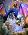
wizardby SeanachaiComment: A nice photograph. Sharply focused on his eyes, which is where we're supposed to look, and the lighting/colors are beautiful. I'm not too keen on the background behind the dragon though. It sort of rips me out of the fantasy, but it's a minor complaint. |
| Photographer found comment helpful. |
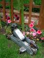
| 08/30/2004 12:11:30 AM |
What was jack thinking?by jmleliiComment: I find the white area a little blown out and there's just too much of it in my opinion, and the beans are out of focus (perhaps a result of shooting through a magnifying glass?) Also, I think that it needs another element of some sort to relate it more to Jack. |
| Photographer found comment helpful. |
Home -
Challenges -
Community -
League -
Photos -
Cameras -
Lenses -
Learn -
Help -
Terms of Use -
Privacy -
Top ^
DPChallenge, and website content and design, Copyright © 2001-2026 Challenging Technologies, LLC.
All digital photo copyrights belong to the photographers and may not be used without permission.
Current Server Time: 07/22/2026 07:25:06 AM EDT.