| Image |
Comment |
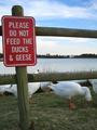
| 10/15/2004 03:28:54 AM |
Somebody Didn't Read The Signby birdyblueComment: A nice concept, but the photograph is lacking a touch technically, IMO. It's a little over-exposed, with a flat feel (not enough contrast). White balance seems to be off, as the geese/ducks are bluish tinged, and the sign seems to have a great deal of artifacting in the red. A couple of extra shots at a few more stops down, or with exposure compensation dialed down a bit, might have given you something more to work with, and a little more post-editing work would have also done wonders. Still, I like the concept, and the composition is nice. The fence is unfortunate, but out of your hands. Keep up the good work, and keep shooting. |
 Photographer found comment helpful. Photographer found comment helpful. |
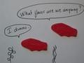
| 10/14/2004 04:01:36 PM |
what flavor?by srpavoComment: I like the concept, to a point, but the photograph itself has a few problems. It's dark, out of focus on the fish candies, and very flat and plain. Not really my brand of humor either. Keep trying. |
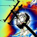
| 10/14/2004 03:58:58 PM |
Can you hear me now? Good!by wlevyComment: Definitely different, and meets the challenge on the most basic of levels. The hue shifting, however, is just not to my taste. Pretty dynamic piece of graphic art in my opinion, but not something I generally score high. |
| Photographer found comment helpful. |
| 10/14/2004 03:54:52 PM |
This "high tech" instrument was built 1892by RUEDISCHMUTZComment: A nice studio attempt. I think the crop is a little tight at the top and bottom, and you've got some vignetting in the two right corners. The focus falls off in wierd places as well, and the lighting seems to be a bit flat. You've got a good angle on the subject though, and for the most part the clarity is good. Keep working on these types of shots.. I know *I* am :) |
| 10/14/2004 03:50:37 PM |
Tree House Telephoneby spydrComment: lighting is a little too harsh here, it looks as if you might have metered on a darker area of the photo (or chose a couple of stops too high). The child's expression and the composition are really good here, but with proper lighting, this could really have "shone". (pardon the pun), and have been an 8 or a 9. |
| Photographer found comment helpful. |
| 10/14/2004 03:48:44 PM |
Tower for spreading the news.by Aussie_BlueyComment: Composition is good on this shot, but I find it rather lacking in lighting. The sky is very noisy, and the overall appearance is just a little flat. You've really nailed the symmetry. |
| 10/14/2004 03:46:55 PM |
Back to basicsby kosmikkreeperComment: Definitely one of the better "can-on-a-string" photographs in the challenge. The duotone is just a little too strong for me, but I love the lighting. Great contrast between the two forms of communication devices here. Overall, a strong image, amusing, and well shot. Good work. |
| Photographer found comment helpful. |
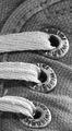
| 10/14/2004 01:18:11 AM |
Shoeby dutch_danComment: Congratulations on the new top 10 placing! I really adore this shot. it's one of the better macros I've seen, and it's just so classic! The texture is unbelievably realistic.. makes me want to stroke it.
Eerrr.. the shoe. ;) |
| 10/13/2004 04:16:21 PM |
Zipby KylieComment: Really love the lines in this one! You have a talent for seeing greatness in cars and architecture :) |
| Photographer found comment helpful. |
| 10/13/2004 04:14:22 PM |
Glam Shotby KylieComment: Hot damn.. I really like this shot. Maybe not as glittery as your 6th place parts entry, but there's something about it that just calls to me.
I've been waiting for more stuff to show up in your portfolio.. I've been anxious to see you put the 7590 to the test! |
| Photographer found comment helpful. |
Home -
Challenges -
Community -
League -
Photos -
Cameras -
Lenses -
Learn -
Help -
Terms of Use -
Privacy -
Top ^
DPChallenge, and website content and design, Copyright © 2001-2026 Challenging Technologies, LLC.
All digital photo copyrights belong to the photographers and may not be used without permission.
Current Server Time: 07/24/2026 02:23:49 AM EDT.