|
|
|
Showing 1121 - 1130 of ~1843 |
| Image |
Comment |
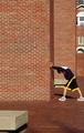
| 04/07/2005 06:45:09 AM | pre-run stretchby petrakkaComment: I've looked at this photo for awhile now.. and uh.. still not seeing the letter.
I *almost* see an A.. but wow, kind of overpowered by the bricks..
<2001: A Space Odyssey> My God... It's full of Bricks!
*disclaimer* This comment is meant as tongue-in-cheek |  Photographer found comment helpful. Photographer found comment helpful. |
| 04/07/2005 06:40:18 AM | Haven't Got a Qby pwm6Comment: lol.. clever title. I like clever titles. You get a full point above my original score for that. | | Photographer found comment helpful. |
| 04/07/2005 06:38:42 AM | Wood-yby dahvedComment: clever title.. almost enough to make me give you a full point more than I'm going to.
Almost.
(j/k, I'm giving you a full point more than I was going to) | | Photographer found comment helpful. |
| 04/07/2005 06:35:21 AM | Accidental Shadowsby KarANNComment: In the future, try and take photographs that you'll be happy submitting in full dimensions. |
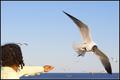
| 04/07/2005 06:25:25 AM | Letter M - Fearless Ternsby snackwellsComment: What a fantastically timed capture. This is the kind of photograph that I love to see. The "M" is a little tough to see, but it *is* there. Good work. | | Photographer found comment helpful. |
| 04/07/2005 06:24:24 AM | H is for Honeybeeby gwendyComment: I think you might have mis-interepreted the challenge, or interpreted it the right way and just chose to go in a different directiong. Either way, the photo is a little too small to be judged appropriately, and falls just a little flat in my eyes. | | Photographer found comment helpful. |
| 04/07/2005 06:22:51 AM | N formed by distorted reflectionby nrulkovComment: I personally would have preferred a much tighter crop here. The bottom half of your photograph is mostly just clutter and distracting. Of course, I realise that to get that N shape cropped correctly would have required you to levitate up about 20 feet.. but I'm just saying what I would have liked to have seen. | | Photographer found comment helpful. |
| 04/06/2005 12:06:56 AM | ...Emergenceby ArtysteComment: Probably one of the highest difference between commenters avg. score and the imaginationless.. err.. I mean.. non-commenters avg. score I've ever had.
Wow. 6.6 to 5.3 That's pretty incredible.
Yes, the hands were a bit blown out. I worked for *DAYS* trying to get better lighting, but one has to work with what one has.. and getting it to look this good was a miracle in itself.
Props to jmsetzler for giving me advice and helping me not throw my camera against a wall while working out the lighting issues with this.
Thank you to most(everyone except lindaruthe... for her.. just a, *HUH?!* lol) of the commenters.. It's always nice to know that out-of-the-box (and, simultaneously inside the box in this instance), can still be appreciated.
This shot is really a milestone for me, as it's the first time I have ever been confronted by a *real* challenge, and come through on it instead of simply giving up and going another direction. Yay me. Message edited by author 2005-04-06 00:08:31. |
| 04/04/2005 07:54:41 AM | Divaby blemtComment: You're on the right track here. Some suggestions:
1. More light on the background. This can either be accomplished by putting some kind of lamp behind the subject, shining on the background (which adds all kinds of other issues, like color balance and white balance problems), or by getting an external flash to bounce off a ceiling or a wall, or a piece of white foamboard strategically placed. Experimentation is best.
2. Something about the lighting you've used has cast a pinkish glow. I urge you to find out what this could be and work to correct it, as I fear it'll haunt you. (both in voting, and personally in the future). It can be fixed in post, using color balancing, but it's best to find out what's causing it. (perhaps the room you're shooting in has pink or red walls, or some other major element?)
3. I, personally, don't like the cat looking up so much. If he/she were looking more towards the camera, but up above it, you'd get more of the personality coming through. As it is, he/she just seems distracted, and the viewer loses a personal attachment, which is key to portraiture.
Anyway, the rest of it is good.. nice focus, a good background color, a good composition. Just a few points to work on.. you want to try and maintain a more natural white balance, and things should fall into place. Good luck, and practice, practice, practice. | | Photographer found comment helpful. |
| 04/04/2005 06:51:39 AM | Heaven Sentby clarmoreComment: This has an extremely "classic" feel to me.. like something out of the pages of a 40's or 50's magazine. Nostalgic in a way. The B&W/duotone method you chose here is gorgeous, and only enhances this image. The selective desat on the eyes, as well, is an enhancement, and is just subtle enough to not be overpowering.
Great job. I think, perhaps, this is *the* best B&W/duotone effect I have ever seen on a digital photograph. | | Photographer found comment helpful. |
|
Showing 1121 - 1130 of ~1843 |
Home -
Challenges -
Community -
League -
Photos -
Cameras -
Lenses -
Learn -
Help -
Terms of Use -
Privacy -
Top ^
DPChallenge, and website content and design, Copyright © 2001-2026 Challenging Technologies, LLC.
All digital photo copyrights belong to the photographers and may not be used without permission.
Current Server Time: 07/26/2026 08:59:19 AM EDT.
|