| Image |
Comment |
| 07/17/2003 10:39:55 PM |
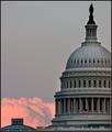
domeby magnetic9999Comment: Helluva picture. Make prints of it.
I see that from a top-down perspective the dome is circular and from this angle it is domed but nothing drives me to think of round. It is such a good photo, though, that I hesitate to give it such a low score just because it doesn't evoke the idea of round for me. |
 Photographer found comment helpful. Photographer found comment helpful. |
| 07/14/2003 01:06:36 AM |
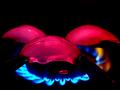
Ice Kabobsby AleciaComment: Composition
This is a great photo for temperature because it demonstrates differences in temperature so well. Not only does the subject matter exemplify differences in temperature, the colors of the opposing components helps to visually sort the cold from the hot. The ice cubes could be centered better (as they don't appear to be intentionally placed anywhere in particular). The positioning of the front ice cube seems to be arbitrarily off-center to the left.
Color
The juxtaposition of the red color on the cold items and the blue color in the warm flames creates a subconcious issue for the viewer, too. Culturally, red normally refers to hot while blue is reserved for icy objects.
Lighting
The lighting is used to good ends with the source of the red coloration coming from somewhere above (notice the light reflection on the upper edges of the ice cubes) but not overpowering any of the other objects in the work.
Focus
The focus is good but I would like to see a longer depth of field so that the front of the flames from the burner are sharper (perhaps this is a problem with gas flames).
Overall
I like this image; especially the lighting effects. Creative solution for this challenge. |
| 07/13/2003 10:59:38 PM |
|
| Photographer found comment helpful. |
| 07/13/2003 10:54:26 PM |
|
| Photographer found comment helpful. |
| 07/13/2003 10:46:03 PM |
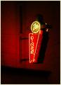
Neon at Nightby Firstrich1Comment: I think this image was a good idea but it is so far away. Couple that with my personal feeling that shooting neon lights will generally give you the impression of a softer focus.
I think this image would be better if it was shot closer. |
| Photographer found comment helpful. |
| 07/13/2003 10:36:44 PM |
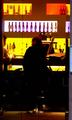
Lime Barby PaulkComment: Composition
Thie is a well-designed shot. The main model is made more human, approachable and believable by the two other people in the shot. The photo would not have as much impact with only the main person sitting at the counter. The yellow light with the white light above it seems to give character to the locale selected for this shot. The beer bottles over the counter speak of some story or local quirk that any regular of this bar would know.
Color
The washed out colors of the ligths behind the bar and the overpowered darkness of the subjects in teh foreground lend an exhilirating edge to the top of the photo that becomes more grounded as the viewer approaches the bottom of the image. This could hint at some gritty realism that comes from a late night discussion with a stranger and a bar tender (or not).
Lighting
The lighting in this image evokes some emotion for me as the top of the image seems to promise a place that's fun to be and then as your eyes trail down to the models/subjects you begin to get baser, more connected feeling.
Focus
The focus in this image is not sharp and that is not put to good use in this composition. It doesn't kill the emotions evoked by the rest of the presentation but the viewer could be brought in more easily if the main model's head/face were in better focus.
Overall
I like this image. I don't think I would crop it any differently but I think a better focus would have given this picture a stronger voice with which to pull in viewers. |
| Photographer found comment helpful. |
| 07/13/2003 10:24:38 PM |
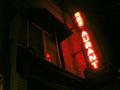
Resaurantby rooComment: Composition
I like the overall composition of this piece. The invasive darkness (did you use some filter for this effect) that is lit only by the neon sign; the angles of the straight edges. This works well as it cannot be anywhere except "on the town" and it is definitely nighttime.
Color
The overriding color in this composition is the red/white color from the neon sign. The image almost tires and dries my eyes the way neon signs can at night. Once again, I'm interested to find out how you achieved this color; through filtration or just camera settings.
Lighting
The lighting is where this photo takes on personlity. The cropping is well selected in that the artist gives enough space to the image so that the viewer can see how the neon light is overpowered by the darkness of the night. It takes little room on the right of the screen to see the power of the darkness. The left side of the image takes more real estate to see the light diffuse.
Focus
The focus seems a little soft but that could be the effect of the neon light.
Overall
I like this image as it isn't a bright picture of an area I'd be likely to venture into at night. It is a darker, more flavorful area and the personality of this locale is captured in this photo of the neon sign that stands as a beacon for the whole area.
|
| 07/12/2003 09:44:29 AM |
Nude in the shadowby AlexysComment: Composition
This is a good idea with this subject. To expound, the subject\'s nipples and hair lend themselves to the lighting scenario selected. The nipples are promenent and make a presentation on the background. The subject\'s hair has body and, thus, doesn\'t lose its ability to add texture to the photo even though the lighting would normally cuase this feature to appear only as an outline. The angle of the subject also affords the artist a series of focus points to present to the viewer; to wit:the ring on the hand, the elbow and upper arm, the back of the shoulder, the breast, the ribcage (see comments on lighting).
Color
The color usage is a little confusing in that the tonal quality of the lower half of the subject\'s body presents more definition of the subject\'s features. The deep contrast between light and dark at the top of the photo lends itself more to conveying a message with stark differences than with subtle tones. The difference between the subject and the background or the subject and the shadow is good except between the ribcage and the navel. The front of the subject\'s body tends to blend a little with the background. Very good definition on the subject\'s back (especially in light of the proximity to the shadow -- The back is darker and mroe defined than the shadow).
Focus
The focus seems to have a sufficient depth of field to include both the model and the model\'s shadow.
Lighting
I\'ve alluded to this before but the lighting is inconsistent from the top to bottom of this photo. Either the deep contrast from the breast up or the softer tones from the ribcage down could tell a story but as this composition covers the whole area, I would expect to see a more consistent lighting scheme. The lower section of the shadow even seems to become blurred as opposed to the crisp definition seen between the shadow of the elbow and the darkness of the hair. I would like to see a more consistent edge to the shadow.
Overall
I like this pohoto. It has a central focal point but enough other items of interest so that a viewer should take some time to digest the whole image. |
| Photographer found comment helpful. |
| 07/12/2003 08:25:47 AM |
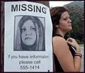
Sandcastlesby ellamayComment: I'm not sure I understand the title but I do like the photo:
The subject in the foreground is off-center; thus giving me more context (the water and the skyline in the background) in which to interpret the foreground subject. I'm intrigued by the posturing of the model; hands on hips and one leg thrust forward. I interpret this pose to be less contemplative and more evaluative. In my own life I strike similar poses when I'm unsure of something and I'm evaluating or trying to determine womething. I like the ripples that are expanding outward from the subject as they are at the bottom of the photograph and inobtrusive; thus lending promenience to the subject without overwhelming the viewer.
The perspective of the viewer seems to say a lot but I don't know exactly what it says. I have some feeling about the size of the subject in relation to the size of the skyline in the background. My best guess is that this comparison is what engendered the title for this work.
The lighting is decent for a panoramic shot. I don't like the lighting as much for a portraiture as the definition and tones of the subject's back are blurred and without definition. The bright sunlight on the subject's right shoulder implies that if this shot has occurred 20 minutes before or after (depending on locale and orientation) the back of the subject would be in more detail. The lighting also casts the back of the subject's head to lose any definition other than its outline.
|
| Photographer found comment helpful. |
| 07/09/2003 07:31:21 AM |
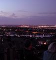
waiting for the fireworks overlooking Colorado Springsby vtruanComment: Good subject and good composition except for the people. Getting the two people in the foreground to turn around would have preserved the city power and presence while humanizing the creation and juxtaposing a sense of awe at being above a good sized city with a feeling of warmth and welcome as though the viewer shared some of the eveing with the the two human subjects. |
| Photographer found comment helpful. |
Home -
Challenges -
Community -
League -
Photos -
Cameras -
Lenses -
Learn -
Help -
Terms of Use -
Privacy -
Top ^
DPChallenge, and website content and design, Copyright © 2001-2026 Challenging Technologies, LLC.
All digital photo copyrights belong to the photographers and may not be used without permission.
Current Server Time: 06/01/2026 04:47:07 AM EDT.