| Image |
Comment |
| 08/24/2003 09:35:32 PM |
I dropby ursulaComment: It seems like the "pop" of this image isn't dependant on the negative space but rather on the inverted eye within the drop. Perhaps that's just the first thing I focus on but each time I've been through the images it just seems to be the focal point. I like the technique, the lighting you chose and the background image. It just seems to be a study in refractive composition (pun intended) rather than negative space. - 5 |
 Photographer found comment helpful. Photographer found comment helpful. |
| 08/24/2003 09:32:18 PM |
Hopperby JackoComment: Good concept but a very shallow DOF. My preference in this picture would have been to have a consistent color for the negative space instead of fading from the bright, reflective white to almost black at the top. - 5 |
| Photographer found comment helpful. |
| 08/24/2003 09:30:28 PM |
Bisected Seascape; Bournemouth not Bondi!by hughletherenComment: Good idea and I like the angle you shoot this. That doesn't make up for the lack of contrast in the reflective surface or the lack of definition in the surfer. I think you might have played with the brightness and contrast and gotten a slightly better image out of this one. |
| Photographer found comment helpful. |
| 08/19/2003 11:47:28 PM |
Money desolationby zepequenoComment: DOF is very shallow on this one - tie is OOF in one direction and hand appears OOF in the other. Creative interpretation, good use of B&W, could be good stock shot if it was sharper (I'd play around with USM in PS). This could also be a great abstract with the cropping you chose. - 6 |
| 08/19/2003 11:43:11 PM |
|
| Photographer found comment helpful. |
| 08/19/2003 11:28:47 PM |
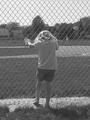
Behind The Fenceby StewanComment: Good capture but my first feeling was of rejection as the fence seems to be keeping the model out of something while others are visible through the obstruction. - 5 |
| Photographer found comment helpful. |
| 08/19/2003 11:27:32 PM |
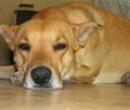
My ill dogby TellopazzoComment: Good shot and nice capture of the facial fur but I just don't see desolation in this one. - 4 |
| 08/19/2003 11:26:38 PM |
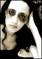
Desolated: make up for nobodyby diegohsComment: Good idea and the model seems to have produced something you could work with but I think the effect around the eyes is overdone. The light on the model's left arm (right of photo) is too hot; especially against the dark hair. - 5 |
| Photographer found comment helpful. |
| 08/19/2003 11:24:35 PM |
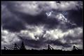
Desolation by heidaComment: Could just be me but the sky looks over edited. - 4 |
| Photographer found comment helpful. |
| 08/19/2003 11:23:18 PM |
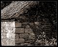
Forsakenby KonadorComment: Great textures and good use of shadow. Wow. What a range of textures and light you have in this composition. It looks like the combination of a few white blocks with the light on the left of the photo cause one block in particular to be blown out. Outside of this challenge I'd like to see that one area on the left of the image spot edited as I think you could really have a nice piece of artwork with this image. - 8 |
| Photographer found comment helpful. |
Home -
Challenges -
Community -
League -
Photos -
Cameras -
Lenses -
Learn -
Help -
Terms of Use -
Privacy -
Top ^
DPChallenge, and website content and design, Copyright © 2001-2026 Challenging Technologies, LLC.
All digital photo copyrights belong to the photographers and may not be used without permission.
Current Server Time: 05/31/2026 06:57:54 PM EDT.