| Image |
Comment |
| 09/14/2003 11:38:22 PM |
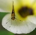
fuzzy faceby chalconeComment: Great subject. Nice depth of field. Wish you could caught the wings extended to add more area covered by the insect. |
 Photographer found comment helpful. Photographer found comment helpful. |
| 09/14/2003 11:36:20 PM |
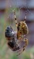
All wrapped up!by visitorComment: Depth of field is a little shallow so that the mummified insect is OOF but good shot of the spider. I'm sure you're gonna be tired of the it's not an insect comments so maybe this'll help - 7 (I woulda liked a slightly different angle to show more of the spider's face |
| Photographer found comment helpful. |
| 09/14/2003 11:31:28 PM |
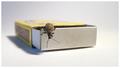
Thinking outside the boxby e301Comment: Creative interpretation, good focus and good depth of field. Good soft lighting with such a light background, too. High marks for technical merit - 8 |
| Photographer found comment helpful. |
| 09/14/2003 11:30:43 PM |
All Terrainby crabappl3Comment: I think this either needs to be brightened or have the saturation punched up. Good depth of field. |
| Photographer found comment helpful. |
| 09/12/2003 09:07:40 PM |
whewby buzzrockComment: Good subject and composition. I think a very low side light would have helped bring out the definition although this lighting does allow the fire from the lighter to set the tone. |
| 09/12/2003 09:00:24 PM |
Freedom of speechby kostiaComment: Good composition. I like the angled interpretation but I wish the books were at more of a diagonal as the 1984 title almost reads correctly. I think rotating the image clockwise might help to maintain the accent that is normally created visually by presenting the image at an angle. The lights glaring off Catcher In The Rye (I assume) and off Lolita are a little distracting and I doubt you could have done much to compensate for that is post shot processing. Perhaps a polarizing filter or a diffused light source would have helped that effect. 7 |
| Photographer found comment helpful. |
| 09/12/2003 08:55:57 PM |
Teenage symbols of freedomby nbortonComment: I think I would like this better with a tighter crop at the bottom. Less of the white would help the miter board, license and key tell more of a story (even if it fell a little lower than the exact midpoint of the photo). 7 |
| Photographer found comment helpful. |
| 09/10/2003 03:18:04 PM |
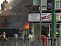
Fire in the Streetby ImagineerComment: Nice photojournalism shot. I especially like the apparent disregard of the man in the left FG as he seemingly nonchalantly looks away from the activity and life of teh fire. What's the story here? Both individuals just seem to take the fire for granted. |
| Photographer found comment helpful. |
| 09/10/2003 03:15:47 PM |
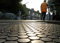
The Crossingby ImagineerComment: Jon,
This is a great subject. I love the lighting. Oddly enough, for a city shot, I'd like to see what this looks like without the people (or at least the bright orange vest) in it. Maybe a young couple or girl standing where the guy in the orange vest is would lend an off-center human touch. Again, I this setting appeals to me as something to work with.
Can you duplicate this shot in a wintery setting where the trees don't provide so much activity to the background? The sunlight overpowers the streetlight and the houses give a feeling of community/humanity. I like the feeling of people given by the lighting in the house windows and the obviously man-made circles in the FG. This is a good example of using hot light. The lack of intensity and the jacket on the person in the BG help cool the picture so that early Fall just seems to emanate from the shot. |
| Photographer found comment helpful. |
| 09/08/2003 01:41:39 PM |
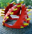
Drillheadby Geo_GriffinComment: George,
This was a different take on the challenge but I struggle to put my finger on why. It seems to me that more people were going for an esoteric feeling of repetition. In looking at your subject it seems that you have a couple of drawbacks here. The repetition of the drill bit teeth (what I assume you were intending to use for repetition) seems to be competing with the repetition of the bricks in the sidewalk as the sidewalk is not only repetitious but symmetrical and more plentiful. That could be a good contrast between the parallel lines in the sidewalk bricks and the teeth on the bit but with the angle you choose to shoot, the red of the drill head and the yellow teeth are already cast into contention with two other textures/colors in the background. The smooth, tannish/light-colored area that slants up from the bottom lefthand side and the activity of the green leaves. These two textures rob the image of the artistic contrast you might have gotten with just the drill and the sidewalk as a backdrop (as shot from higher above the drill). I can see how this image has multiple focii for the viewer to try and take in and it definitely does meet the challenge of demonstrating repetition. My conclusion is that it sadly overwhelms the viewer rather than presenting a powerful message that is present (and that you saw). Good job seeing the repetition in this; the trouble comes in the translation for the rest of us to see. A backdrop would have helped you tell this story or, as I said before, shooting this at such an angle so that the drill was outlined against the bricks in the sidewalk so that the viewer got more contrast between the diagonal repetition and the parallels of the bricks might have helped, also.
Just my $0.02 |
| Photographer found comment helpful. |
Home -
Challenges -
Community -
League -
Photos -
Cameras -
Lenses -
Learn -
Help -
Terms of Use -
Privacy -
Top ^
DPChallenge, and website content and design, Copyright © 2001-2026 Challenging Technologies, LLC.
All digital photo copyrights belong to the photographers and may not be used without permission.
Current Server Time: 05/31/2026 08:18:10 PM EDT.