| Image |
Comment |
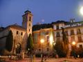
| 07/30/2003 07:14:33 AM |
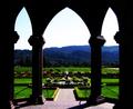
Under Archesby JPRComment: Assorted probs: Cant see the inside of the building, some fill flash may have been useful. Hills turned blue by glare. Over saturated colour.
Nice composition, perhaps a bit more of the floor would lead the eye in at the bottom (and from there to the garden) rather than at the bright sky (which leads the eye straight out the top of the pic). |
 Photographer found comment helpful. Photographer found comment helpful. |
| 07/28/2003 08:01:44 AM |
Sky in Glass and Steelby ImagineerComment: Problems on the right side, mostly cos the pole is slightly convex (might be barrel/pincushion problems) but also cos the repeating elements of the left are absent on the right.
Theres a few decent pics within the frame shown:
The 45degree wire from the bottom left can unify the whole thing if you crop where it runs out in the top right.
The repeating theme of the 60degree pole is also a good element to use. I think you'd need more on the left to make it work. You'd also need to crop some of the top and bottom, as well as the right side.
The right side might be redeemed if you show the end of it, I.e. show empty sky on the right.
Also, glass and steel dont make a good contrast, being both hrad and modern.
|
| Photographer found comment helpful. |
| 07/11/2003 11:53:03 AM |
|
| Photographer found comment helpful. |
| 07/11/2003 11:51:26 AM |
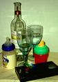
A Night Out - I Remember Them!by Alpine99Comment: I like the concept, but I think the joke is ruined by the over-obviousness of the baby bottles. Cant think how I'd arrange it, but I'd lose the clown bottle and dummy, use a rental video(s) and move it into the background, and (the hard part) try and make the red/green cup look like its wandered into and inturupted an adult conversation between the glasses. The symbolism of the cup beting between the two glasses would be my start point. You need to deal with the technical issues too, lighting is poor, angle is too high, image needs rotating clockwise about 3 degrees, wall is too close and causes that weird shadow in the bottle. |
| Photographer found comment helpful. |
| 07/11/2003 11:42:55 AM |
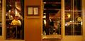
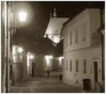
Belgian Pubby jorel138Comment: I'd have gone for a symetrical composition, with the noticeboard in the middle. |
| 07/10/2003 08:33:34 AM |
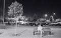
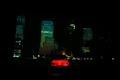
Night warriorby zepequenoComment: Needs more car and less background. Also, get lower to make the car loom a bit. |
| 07/10/2003 08:31:17 AM |
|
| 07/10/2003 08:28:11 AM |
|
| 07/10/2003 08:26:24 AM |
|
| Photographer found comment helpful. |
| 07/10/2003 08:23:54 AM |
|
Home -
Challenges -
Community -
League -
Photos -
Cameras -
Lenses -
Learn -
Help -
Terms of Use -
Privacy -
Top ^
DPChallenge, and website content and design, Copyright © 2001-2026 Challenging Technologies, LLC.
All digital photo copyrights belong to the photographers and may not be used without permission.
Current Server Time: 07/16/2026 06:10:15 AM EDT.