| Image |
Comment |
| 08/21/2009 08:27:58 PM |
Toast McGotes! by todbedyComment: Nicely done. Excellent composition. The lighting on the toaster is great, the toast seem a little washed out. |
| 08/21/2009 08:24:36 PM |
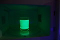
i think i NUKED it too long!by apercepComment: Nuke'em til they glow. Great idea and fun execution. Nicely lit, but your subject (inside of a microwave) is not the most photogenic but still rocks. |
 Photographer found comment helpful. Photographer found comment helpful. |
| 08/21/2009 08:20:34 PM |
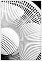
Fanby timfythetooComment: Cool (pun intended) photo. I like the crop and the tones a lot. I think cropping out the top 10-20% might give a more powerful composition with some additional symetry. |
| Photographer found comment helpful. |
| 08/21/2009 08:14:58 PM |
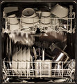
The Dishwasherby fridjoComment: Well done. I really like the square composition. All the lines and angles are great. |
| Photographer found comment helpful. |
| 08/21/2009 08:13:45 PM |
The "Royal.Shirt.Steamer" - R.S.S TEFALby CheerzComment: Nice composition with the iron pointing towards the corner. Leaving some space for the iron to move into may have added some impact.
The title perhaps has a few too many periods -- Not.Sure.What you were going for :) |
| Photographer found comment helpful. |
| 08/21/2009 08:10:02 PM |
Mosquito Killerby micComment: Not a big fan. The dusty floor is kind of ugly and the white highlight on top is a distraction. |
| Photographer found comment helpful. |
| 08/21/2009 08:09:00 PM |
|
| Photographer found comment helpful. |
| 08/21/2009 04:36:08 PM |
Don't mix colorsby ionelpopComment: First impression is wow as the colors and the metal contrast so nicely. Second impression is confusion, as in why is the inside of a dryer so brightly lit. Photo still works on many levels. Bravo. |
| Photographer found comment helpful. |
| 08/21/2009 04:34:21 PM |
ECO Friendly Dishwasherby ineedauniquenameComment: Interesting take on the challenge, kind of like a barefoot entry in the footwear challenge. Will be DNMC to some. I like all the lines and curves in the composition. Not sure the angle or the DOF works for me. May have been more interesting to zoom in on one subject more. |
| Photographer found comment helpful. |
| 08/21/2009 04:31:05 PM |
Web Dryerby angkokwengComment: Nice view point and use of DOF. I like all the metallics details. Not sure if cutting off the bottom work for me. I think you need to either crop off more or show the whole thing. |
| Photographer found comment helpful. |
Home -
Challenges -
Community -
League -
Photos -
Cameras -
Lenses -
Learn -
Help -
Terms of Use -
Privacy -
Top ^
DPChallenge, and website content and design, Copyright © 2001-2026 Challenging Technologies, LLC.
All digital photo copyrights belong to the photographers and may not be used without permission.
Current Server Time: 06/26/2026 03:11:14 PM EDT.