| Image |
Comment |
| 11/22/2004 12:09:10 PM |
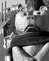
passing timeby speaseComment: Given the theme, this image is a bit unsurprising. Also, (1) the black lines in the numbers are a bit dirty, and (2) the black spots in what should be white areas, which takes away from the general cleaniliness of the photo. Otherwise, this is a fine photo. 5 |
| 11/22/2004 11:49:23 AM |
THE Colonelby toddheadComment: I, too, am commenting from the thread.
I think that the cropping in the entry photo is much stronger than the full-colour version as it really emphasises the face wonderfully. However, the desaturisation works against you as the head blends into the background quite a bit. Having said that, the strong, blue background rather overpowers the face in the colour version. Desaturisation could work, but on different colours for different reasons. |
 Photographer found comment helpful. Photographer found comment helpful. |
| 11/17/2004 10:00:15 AM |
|
| Photographer found comment helpful. |
| 11/17/2004 09:54:16 AM |
Amberby alanfreedComment: Of course this photo is fantastic. My only gripe is with using a very bright shirt which takes a lot away from the face. 8 |
| Photographer found comment helpful. |
| 11/17/2004 09:52:23 AM |
|
| Photographer found comment helpful. |
| 11/17/2004 09:51:36 AM |
|
| 11/17/2004 09:51:23 AM |
Charlieby WarbyComment: The right side of the face is blown out and there appears to be too much neatimage used. Other than that, this is a good capture with a lovely expression. 5 |
| Photographer found comment helpful. |
| 11/17/2004 09:50:19 AM |
|
| Photographer found comment helpful. |
| 11/17/2004 09:49:02 AM |
|
| 11/17/2004 09:47:20 AM |
Smokyby loboz33Comment: Lovely graphic. However, you've got a good deal of space at the bottom but none at the top. I feel that there needs to be more space on top. Also the white border rather takes the eye away from smoke. |
Home -
Challenges -
Community -
League -
Photos -
Cameras -
Lenses -
Learn -
Help -
Terms of Use -
Privacy -
Top ^
DPChallenge, and website content and design, Copyright © 2001-2026 Challenging Technologies, LLC.
All digital photo copyrights belong to the photographers and may not be used without permission.
Current Server Time: 07/16/2026 09:48:00 PM EDT.