|
|
|
Showing 1091 - 1100 of ~1239 |
| Image |
Comment |
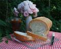
| 07/02/2003 09:12:55 AM | Homemade BREAD!by OneSweetSinComment: *critique club*
(Just before I begin, my wife wants to say that, on seeing this photograph, she immediately felt the urge to eat it.)
Overall
The challenge was to capture a scene that reminds us of the countryside. Freshly-made bread set against a foliage background certainly works within this theme. I wonder about the flowers being necessary as they run contrary to the theme. The red, checked tablecloth and knife belong here, though.
Composition
Besides the flowers, I feel that the indistinctness of the drink object detracts from the composition, as does the knife angle. Overall, the whole scene would look better without the drink and the flowers, leaving a far-less cluttered effect and a more powerfully focus on the actual subject. Bread doesn’t really mean countryside; it only suggests old-fashioned, itself reminiscent of the countryside. The choice of a plastic bread board, a symbol of modern life, therefore, might be questioned. A wooden board would fit better; the wood colour and texture complementing that of the bread.
Compositionally, the colour contrast of the red triangular foreground and the green backdrop is effective, but could be more so if the actual lines were more clearly demarked by removing the foliage (and the unnecessary elements) from the table. The bread board could then be positioned to support the overall colour scheme. Also, the bread would stand out more, fixing the theme solidly. I feel that the green is a little dark. The brightness of the tablecloth asks for a similarly bright green.
Consequently, the green being brighter would also help reduce the effects of the bright spots created by the leaves.
Technical
The exposure on the bread crust is just right, at a shutter speed that reinforced the white sections of the tablecloth. However, the speed was too fast for the drink, the darker foliage and the left side of the vase. I understand that if you had exposed for the white of the bread, even more of the shot would have been underexposed. In times like this, you have 2 choices pre-shooting, 1 post-shooting: use a neutral density filter, choose a narrower aperture, or play around with the curves in Dimage Viewer. Actually, I think that a narrower aperture would have helped the green colour balance by introducing an extra in-focus and brighter background layer.
Comments
Generally, I find this image a touch bland, its subject weakened by the clutter around it and the static nature of the objects. Maybe actually including your boy showing his eagerness to eat the bread would lighten the scene, but that’s a different shot altogether. I’m having trouble finding the purpose here. If this shot were for a magazine, the clutter would have to be removed as less means more in such shots. If you were simply trying to capture a moment from a countryside life, the objects wouldn’t be so deliberately placed on the table. For example, the drink would be difficult to use at present, and it’s unlikely that flowers would be directly over the drink leading to the possibility of petals falling in.
I’m afraid that my comments are mainly negative. A lot of that has to do with personal taste. I’m sure others will enjoy your image, but, for me, I don’t have any ‘still life’s on my wall.
Best wishes,
Jim
|  Photographer found comment helpful. Photographer found comment helpful. |
| 06/27/2003 01:24:47 AM | | | Photographer found comment helpful. |
| 06/27/2003 01:23:00 AM | |
| 06/27/2003 12:37:07 AM | | | Photographer found comment helpful. |
| 06/27/2003 12:18:22 AM | | | Photographer found comment helpful. |
| 06/26/2003 11:55:41 PM | | | Photographer found comment helpful. |
| 06/26/2003 11:54:20 PM | | | Photographer found comment helpful. |
| 06/26/2003 11:48:11 PM | | | Photographer found comment helpful. |
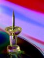
| 06/20/2003 12:10:57 AM | To the Pointby TerryGeeComment: *critique club*
Overall
Terry, I've had a look through your profile and posted stuff. You are a good photographer with a sharp eye for composition and colours. I won't, therefore, try and claim that you made a 'mistake' in this photo. I think that you deliberately aimed for the effects you created. (Having browsed your 'prettypixel' site, I know that you have an interest in creating photographs that seem painted.)
A question that we must ask ourselves seriously in this site is do we accept criticisms from those who, clearly, don't know what we're trying to do in our art? I believe that the answer must be a firm yes. This site contains some very highly skilled photographers and some commenters who don't even own a camera. This gamut reflects our public to a large extent. Negative, or uninformed, comments will be felt by those in the general scene, and it's very helpful for us to receive those opinions, too.
Your photograph can be judged on a number of different levels, therefore: as an art work, forgetting actual photographic considerations; as a photograph, where camera techniques apply; and as avante-garde photography, which this piece is, where even so-called 'bad' techniques are used for particular effects.
Technique
Actually, I like this. If I had taken it, it would be on my wall for a while. Maybe I'd have liked the colours to have been more vivid, a brighter light source would have helped. The grain is, perhaps, a little too pronounced, although you used a very wide aperture. The image seems a bit affected by jpeg artifacts, although I suspect that's one technique you use to create the blocky, paint-like feel. I don't think that some elements are developed well-enough. The light refraction seems unintentional, especially at the base of the pin. The cd(?)'s right-hand side is very sharp, unlike the rest. The actual focal point appears to be just a touch forward leaving the image just a shade unsharp.
You set up very simple objects well, and the composition is very effective. The negative space is used well, and the shot features no unnecessary elements. Good work. |
| 06/19/2003 11:39:31 PM | Night Fallingby boyte1Comment: *critique club*
Overall
I'm new to this site, but I've learnt very quickly that the range of abilities here is huge. Some will understand your photographic point immediately, while others just look for standard shots and criticise everything they don't understand.
The challenge called for "office art", a title which can range from anything found in offices through anything appropriate to hang in offices. Here, I believe that your shot captures some of the melancholy of evening work. Besides that, I don't think that there's anything really interesting here.
Artistic
The tonal palate used is narrow. You could have upped the saturation on the lower left-hand reds somewhat, and maybe brightened the top left-hand blues. The clouds don't appear menacing and are a touch soft.
Compositionally, you're trying to contrast the whispy left clouds with the more dramatic right ones. Perhaps you felt that the inclusion of the lights would provide some feeling of scale.
Personally, I'm not really into clouds, so, part of this critique reflects my own prejudices more than anything else. I find the image lacking in real drama, brought about by a dullness of colour and somewhat staid composition. If you had waited for a better timing, when the clouds were more interesting, the overall effect would have been better. |
|
Showing 1091 - 1100 of ~1239 |
Home -
Challenges -
Community -
League -
Photos -
Cameras -
Lenses -
Learn -
Help -
Terms of Use -
Privacy -
Top ^
DPChallenge, and website content and design, Copyright © 2001-2026 Challenging Technologies, LLC.
All digital photo copyrights belong to the photographers and may not be used without permission.
Current Server Time: 07/16/2026 03:27:40 PM EDT.
|