| Image |
Comment |
| 08/02/2007 12:46:56 PM |
Hold on to your hat by booboo_goonComment: not sure if the close shadow helps or hurts probably would be better if it was a softer shadow. great expression. getting the hat into a third point would have been nice but would have centered the model too much. |
 Photographer found comment helpful. Photographer found comment helpful. |
| 08/02/2007 12:37:35 PM |
|
| Photographer found comment helpful. |
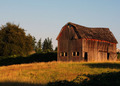
| 08/02/2007 12:34:26 PM |
Gimme Shelterby jsundinComment: would be better with an off center horizon line. maybe shot from a different angle to remove the house in the background from view. |
| Photographer found comment helpful. |
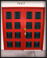
| 08/02/2007 12:32:02 PM |
Paint it Blackby CamabsComment: great use of tonal elements and color contrasts. nice focus and positioning. |
| Photographer found comment helpful. |
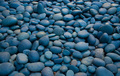
| 08/02/2007 12:28:03 PM |
Stonedby spartacus9Comment: nice texture and size proportions. interesting use of color, but has good tonal range. |
| Photographer found comment helpful. |
| 08/02/2007 12:25:57 PM |
Drift Awayby cabaComment: would do better with off center picture elements. At least horizon is not 50/50 like most pictures. writing is distraction. hard to drift away with this much land in the frame. shot lower with more sky could solve that. if the main subject is the lone cloud, then the person in the foreground detracts from it. |
| Photographer found comment helpful. |
| 08/02/2007 12:18:58 PM |
This Place is Emptyby GotakaComment: great proportions, and use of thirds, rotated correctly unlike most submissions. color enhancement used to reduce distractions to the main photo element. natural shadow used to frame photo nicely. |
| Photographer found comment helpful. |
| 08/02/2007 12:15:05 PM |
Cool, Calm and Collectedby gtjewellComment: horizon is at 50/50 and not even level, photo elements evenly distributed, but centered. I'm more drawn to the bridge in the background than the one to the fore that is plainly your subject. |
| Photographer found comment helpful. |
| 08/02/2007 12:10:45 PM |
|
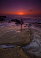
| 08/02/2007 12:09:08 PM |
"dance little sister"by LMA128Comment: this would be better shot more from her level, or from farther out. looks like she is having fun chasing the waves though. this is a photo to send to grandparents and not particularly suited to a photography challenge. |
| Photographer found comment helpful. |
Home -
Challenges -
Community -
League -
Photos -
Cameras -
Lenses -
Learn -
Help -
Terms of Use -
Privacy -
Top ^
DPChallenge, and website content and design, Copyright © 2001-2026 Challenging Technologies, LLC.
All digital photo copyrights belong to the photographers and may not be used without permission.
Current Server Time: 07/16/2026 01:15:40 AM EDT.