| Image |
Comment |
| 07/28/2003 02:50:59 AM |
flower clusterby shutterflyComment: The dark, vignetted border makes the image look dirty. The desaturation also reduces the richness of the shot. |
| 07/28/2003 02:48:03 AM |
|
 Photographer found comment helpful. Photographer found comment helpful. |
| 07/28/2003 02:46:26 AM |
Backyard Buddyby karmatComment: Can't quite work this out - could be a moth, cuddly toy? Good shot and keeps me guessing. |
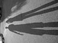
| 07/27/2003 07:00:18 PM |
shortcutby spidermanComment: How have you lost the sky colour without spot editing? Perhaps a blue hue drop out? Very stylish shot if it's legal. Great composition and capture. [8] |
| 07/27/2003 06:58:06 PM |
Stretched Outby GiovanniComment: Was it intentional to place this unrotated? Assuming it's an error I quite like the shot. I would have cropped out the detail at the top though which kills it a bit. |
| 07/27/2003 05:09:29 PM |
Barbie Goes TOPLESS!by DoorskidderComment: As far as I'm aware everyone's always made Barbie topless when possibel whatever the era! A little more focus/DOF on her 'nipples' may have helped, since they are the main points of the image (excuse the pun!). [6] |
| Photographer found comment helpful. |
| 07/27/2003 05:06:03 PM |
Flavor of the Weekby natorComment: This image is quite degraded by compression/resolution. The desaturation makes it look quite nostalgic, so that helps. I definitely think the border is pointless though and does nothing to enhance the subject. |
| Photographer found comment helpful. |
| 07/27/2003 05:01:17 PM |
A growing trend. by DiversqComment: Nice snap. A good study of a worrying trend too! I like the space to the left of the shot, but it would have been nice not to crop the back of the bench even if it meant pulling back slightly. [7] |
| Photographer found comment helpful. |
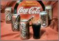
| 07/27/2003 04:58:27 PM |
Trendy always!by yoddoyComment: Image is quite heavily compressed (pixellated). Apart from that I would prefer either a more acute angle (so that you were closer to some of the products) - or a very square face-on view which may present the shades in a more striking way with horizontal lines offerig the feeling of 'infinite' lines to right and left. [5] |
| Photographer found comment helpful. |
| 07/27/2003 04:54:23 PM |
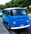
60's Love Shackby kopa21Comment: Nice study. Image is a little noisy and slightly unsharp, so reducing size would help a little. When you're filling the frame like this the quality of the shot becomes more relevant. I would have cropped tighter too. [6] |
| Photographer found comment helpful. |
Home -
Challenges -
Community -
League -
Photos -
Cameras -
Lenses -
Learn -
Help -
Terms of Use -
Privacy -
Top ^
DPChallenge, and website content and design, Copyright © 2001-2026 Challenging Technologies, LLC.
All digital photo copyrights belong to the photographers and may not be used without permission.
Current Server Time: 06/17/2026 08:59:50 PM EDT.