| Image |
Comment |
| 08/12/2003 04:43:45 AM |
Triptychby zeuszenComment: Not paticularly 'future'. Interesting technique though I find myself wanting the three images to be dead central. |
 Photographer found comment helpful. Photographer found comment helpful. |
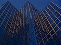
| 08/12/2003 04:42:10 AM |
Virtual Realityby johnnykillchristComment: This is an interesting angle - though not my idea of the future - but it should have been straightened before submission. When looking at geometric shapes any slight discrepancy with angles/alignment is blindingly obvious. The overexposure is also a bit overcooked - or not overcooked enough! |
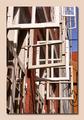
| 08/11/2003 04:22:40 PM |
Inside Looking Out by connieComment: If this doesn't win a ribbon I'll eat my head. Great subject, model, DOF, focus - it's got it all. A touch more light on the pup would have been good. [10] |
| Photographer found comment helpful. |
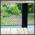
| 08/11/2003 04:16:37 AM |
Going Up?by dsidwellComment: I love the design in this shot. Great colours and composition. One point - I wonder if you'd rotated, until the vertical 'line' was 90 degrees, whether that would have made the shot neater? I think the design would have been even stronger as a pattern, making it more difficult to discern the subject. [9] |
| Photographer found comment helpful. |
| 08/11/2003 04:13:08 AM |
|
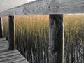
| 08/11/2003 04:11:35 AM |
The perfect angle for a spidery homeby JeanComment: So strong is the pattern and DOF effect of this that I wonder if it would have looked even more interesting with the contextual background cropped out - so that the top ends at a point through the top rail? I think that if you'd shot it so that the top rail was at 90 degrees to eye level this would have worked, but cropping would look odd because of the angles.
Love the shot. [8] |
| Photographer found comment helpful. |
| 08/11/2003 04:07:40 AM |
Hot Summerby GrziComment: Great compsosition - lovely, strong colours and definition. |
| Photographer found comment helpful. |
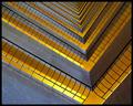
| 08/07/2003 04:34:54 PM |
90° Abstract by timmiComment: Love the shapes and design in this. Colour is quite dramatic - overexposure of bottom part produces almost too much glare, but it survives! [7] |
| Photographer found comment helpful. |
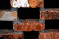
| 08/07/2003 04:31:38 PM |
Bricksby ckrolstonComment: This house will fall down fairly soon! Lighting is a bit flat and the interest in the shot is limited. Prominent right angles though. |
| 08/07/2003 04:29:59 PM |
a²+b²=c²by mjasrComment: A more face-on viewpoint would have improved this - creating more visible, squared-up right angles. Colour is a bit washed out and the focus is soft. Border does not help. |
Home -
Challenges -
Community -
League -
Photos -
Cameras -
Lenses -
Learn -
Help -
Terms of Use -
Privacy -
Top ^
DPChallenge, and website content and design, Copyright © 2001-2026 Challenging Technologies, LLC.
All digital photo copyrights belong to the photographers and may not be used without permission.
Current Server Time: 06/21/2026 05:43:43 AM EDT.