| Image |
Comment |
| 09/02/2003 09:53:33 AM |
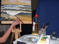
Artist Toolsby trainComment: This viewpoint is a little too uninteresting, showing too much background and too little focus on the tools and subject. Taking the shot closer, from the table level looking towards the easel may have been more engaging. You could have played with the DOF to focus on either the tools or the painting then. |
| 09/02/2003 09:49:49 AM |
Drivenby casualguyComment: As tools go it's about as obvious as it gets. But this is a great shot, well composed, nicely lit and an excellent capture. I imagine this will score highly too. |
| 09/01/2003 05:01:05 PM |
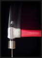
Toolsby mgkarimiComment: It's a good tool shot but the image is blurred - probably because lighting is dark and shutter speed is slow. You really needed a tripod or to rest on something solid. Nice contextual composition though. |
 Photographer found comment helpful. Photographer found comment helpful. |
| 09/01/2003 04:51:22 PM |
Augerby RefocusedComment: This is great! Love the capture of the water - it's just a shame that the image is a bit too skewed clockwise. That's a rather large tool! |
| Photographer found comment helpful. |
| 09/01/2003 04:43:31 PM |
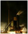
The tool makers forgeby ozthunderComment: Very dramatic. Somehow looks a bit like a Turner painting in its tones. perhaps a little off challenge brief but I'm actually quite grateful! |
| 09/01/2003 04:11:38 PM |
Wood Splitterby TarbiniComment: I love the textures of this shot. I find the anticlockwise skew distracting though. |
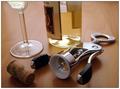
| 09/01/2003 04:03:07 PM |
My favorite toolby sahkoComment: A very clean and well lit shot. Good concept too, although I would have chosen an odd number of objects which help make the set-up look more impromptu and would have been easier to arrange. Alternatively, I would have left the cork on the screw. Perhaps the viewpoint could have been improved too - an overhead with more of the glass in view? |
| Photographer found comment helpful. |
| 09/01/2003 03:58:17 PM |
|
| Photographer found comment helpful. |
| 09/01/2003 03:57:28 PM |
|
| Photographer found comment helpful. |
| 09/01/2003 03:56:13 PM |
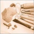
Potter's Paraphernaliaby GeneralEComment: I think sepia is a bit inappropriate as I find myself wanting to know what colour all the objects are! Interesting tools but I wonder if a more intriguing viewpoint would help to make the shot more interesting. |
| Photographer found comment helpful. |
Home -
Challenges -
Community -
League -
Photos -
Cameras -
Lenses -
Learn -
Help -
Terms of Use -
Privacy -
Top ^
DPChallenge, and website content and design, Copyright © 2001-2026 Challenging Technologies, LLC.
All digital photo copyrights belong to the photographers and may not be used without permission.
Current Server Time: 06/19/2026 01:32:37 PM EDT.