| Image |
Comment |
| 10/24/2004 06:00:09 AM |
Breadwinnerby JPRComment: Great observation. Excellent stuff as usual Jason. |
 Photographer found comment helpful. Photographer found comment helpful. |
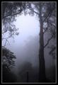
| 10/21/2004 04:59:18 PM |
Trees: Natural Airby dinnComment: This is just a wonderful shot of a remarkable scene. You've really done it justice and this is definitely an image that I'd hang. |
| 10/21/2004 10:51:06 AM |
The Old Neighborhoodby KylieComment: Love the warm feel to this - a very appropriate treatment. It's a great angle too with some clear detail and good light. |
| Photographer found comment helpful. |
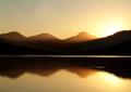
| 10/19/2004 11:02:13 AM |
Loch Arklet2by geewhyComment: As below - very aesthetic indeed. Sumptuous colour and striking shapes alongside a very satisfying, hazy sun-ray. |
| Photographer found comment helpful. |
| 10/19/2004 10:46:58 AM |
Cruzin' by bruskiComment: Welcome to Club de Bleu with this one I think. Flawless, exciting and very dynamic. What a rush.
I'll remove all my clothes and run through London's streets if this doesn't win a ribbon. : ) |
| Photographer found comment helpful. |
| 10/18/2004 06:28:27 PM |
Up she comes!by sidpixelComment: :: Hello from the Critique Club ::
............................................................
This shot is not as bad as its score indicates. You have interesting subject matter and some lovely motion from the water. But, from what I can gather, the voters would not have liked this for the following reasons:
> gloomy lighting which has left colour and contrast quite flat
> 'parts' too obvious and unchallenging
> composition not engaging enough
Improvements would be:
> better, brighter lighting
> less 'human' viewpoint (eye-level is always a little dull)
> getting closer
These are simple things to improve so I hope you don't take poor ratings to heart, as this shows promise in my view.
Cheers
Jon |
| Photographer found comment helpful. |
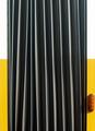
| 10/18/2004 05:41:44 PM |
accordion with indicatorby visaksenComment: :: Hello from the Critique Club ::
............................................................
This has been horribly under rated in my view.
It has strong composition, it's an imposing subject, it's well lit and very striking. Why it rated so low truly astounds me.
By way of critique I find it difficult to pick fault, but I just wonder whether cropping the bodywork on the left would make the image stronger?
Don't be put off by the result - this is good stuff.
Cheers
Jon |
| Photographer found comment helpful. |
| 10/18/2004 05:31:11 PM |
Endsby leafComment: :: Hello from the Critique Club ::
............................................................
Well, I'm sure you knew this wouldn't win any awards - but your image does have character!
It was a nice take on the challenge with good DOF and some effort made to use some directional light. Taking it seriously, I would offer the following by way of improvement:
> cleaner background
> get in even closer to lose more of the context
> a touch more lighting towards the front to pick up a bit more detail
Hope this helps. : )
Jon |
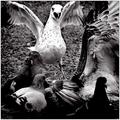
| 10/17/2004 07:45:46 PM |
For Jackoby MambeComment: Well observed and shot. I would crop the top and right (making a square) to remove the background and draw attention to your subject more. |
| Photographer found comment helpful. |
| 10/14/2004 05:46:24 PM |
|
| Photographer found comment helpful. |
Home -
Challenges -
Community -
League -
Photos -
Cameras -
Lenses -
Learn -
Help -
Terms of Use -
Privacy -
Top ^
DPChallenge, and website content and design, Copyright © 2001-2026 Challenging Technologies, LLC.
All digital photo copyrights belong to the photographers and may not be used without permission.
Current Server Time: 06/23/2026 01:36:36 AM EDT.