| Image |
Comment |
| 04/23/2011 09:03:12 PM |
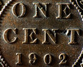
Crop the Irrelevant Crap (And Leave the Crappy Crap)by oscarthepigComment: Originally posted by one2one:
You could have dusted off the crap on this cent before
taking the shot. Highlights are blown out which makes
this image extremely contrasty and not pleasing to the
eye. Totally last minute setup, if you could call it
that, and it shows. Your crop is way too tight and
should have left more of the dotted border in
frame. Image is asymmetrical.
Apart from that, nice job. |
You are incorrect on all counts. |
| 01/26/2011 08:09:45 AM |
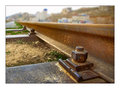
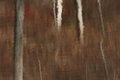
Screwed for the Last Hundred and Ten Years by HighNoonerComment: No doubt it'll be considered sacrilege to add a negative comment, but I'm shocked this is what took the blue. To me, it seems very flat in spite of the strong perspective lines. The lighting is bland, and the colors are drab. Then again, the voters rated my stupid coin macro at 6+, so go figure.... |
 Photographer found comment helpful. Photographer found comment helpful. |
| 01/06/2011 07:15:47 PM |
|
| 11/28/2010 02:35:37 AM |
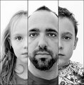
Father and Child Reunion by timfythetooComment: Pulls the eyes outwards in a reverse-cross-eyed fashion. Uncomfortable.
eta: almost works if you let your eyes defocus magic-eye style. Message edited by author 2010-11-28 02:37:01. |
| Photographer found comment helpful. |
| 11/28/2010 01:45:05 AM |
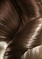
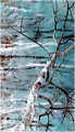
motifby posthumousComment: Wow.
 mitalapo mitalapo makes a great observation, but  skewsme skewsme's is superior, IMO (sorry). I do prefer the browns in yours, though. Message edited by author 2010-11-28 01:47:52. |
| Photographer found comment helpful. |
| 11/28/2010 01:44:23 AM |
caeruleanby skewsmeComment: Wow.
mitalapo makes a great observation, but yours is superior, IMO.
eta: Nothing about this looks like a photograph. Message edited by author 2010-11-28 01:57:19. |
| Photographer found comment helpful. |
| 11/28/2010 01:39:22 AM |
before Dawnby whiterookComment: cutout nailed it. IMO, this is one of your finer, artier offerings. I'm surprised you didn't get a posthumous comment on it. I really hate the aspect ratio, though. |
| Photographer found comment helpful. |
| 11/28/2010 01:03:17 AM |
|
| Photographer found comment helpful. |
| 11/28/2010 12:59:30 AM |
|
| Photographer found comment helpful. |
| 02/15/2010 12:14:50 AM |
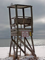
The chairby whiterookComment: The empty lifeguard station, "no lifeguard on duty" sign, and the deserted beach are just perfect together. The gull (Sara?) is a great addition. Jutilda's right; some more negative space would be nice as it would further emphasize the irony being depicted. The colors and clarity are very atypical of a Whiterook submission. I'm surprised no one complained about the horizon not being perfectly horizontal. All-in-all, it's very nicely done. |
| Photographer found comment helpful. |
Home -
Challenges -
Community -
League -
Photos -
Cameras -
Lenses -
Learn -
Help -
Terms of Use -
Privacy -
Top ^
DPChallenge, and website content and design, Copyright © 2001-2026 Challenging Technologies, LLC.
All digital photo copyrights belong to the photographers and may not be used without permission.
Current Server Time: 06/21/2026 03:22:25 PM EDT.