| Image |
Comment |
| 10/22/2003 12:14:32 AM |
|
 Photographer found comment helpful. Photographer found comment helpful. |
| 10/22/2003 12:13:57 AM |
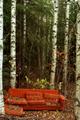
Alone in the woodby jonwamComment: This shot would have worked great with the couch in color and the rest of the picture in B&W, give it a try, it would really emphasize the solitude of the couch in the forest, and the contrast of the couch and the forest. Nice shot nontheless. A tripod might have helped the sharpness a bit though! 7 |
| Photographer found comment helpful. |
| 10/21/2003 11:49:46 PM |
|
| Photographer found comment helpful. |
| 10/21/2003 12:03:17 AM |
Anyone?!?by NukktaComment: Strange, this is complete deja vu, I did almost an exact replica of this for the Freedom challenge. NICE IDEA lol! Might have looked better in B&W, wish I could've used mine in this challenge! Nice job! Mine is in my portfolio under challenge entries if you wanna take a look! |
| Photographer found comment helpful. |
| 10/11/2003 05:40:36 PM |
|
| Photographer found comment helpful. |
| 10/10/2003 05:50:04 PM |
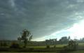
Tallinnby zummerComment: I like what your trying to do here, but I think you got too much sky, and not enough of the town (assuming there is something more to photograph). I like this photo nonetheless. Might have been better on a clearer day, those bright houeses would have looked great, but you only got what ya got. 8 |
| Photographer found comment helpful. |
| 09/26/2003 12:15:38 PM |
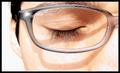
Peace in the glass frame (or eyelashes at rest)by denisprayComment: I love the concept of this shot, and the way you've overexposed the image. My only quibble is the shadow from the glasses, if you had positioned the light perpendicular to the face you may have been able to eliminate that shadow! I great shot though! Congrats! |
| 09/26/2003 12:10:11 PM |
Afternoon sunby jamijcComment: Nice shot, the black and white works very well, especially with this particular cat! Would be nice to see a closer crop though. Nonetheless great job! |
| Photographer found comment helpful. |
| 09/26/2003 12:08:15 PM |
untitledby jmawtComment: I like this photo, the compostition is well-done, and it gives the appearance of a candid! I would like to have seen it in black & white, since color is not a main theme, and in b&w more attention would have been draw on the man. |
| 09/22/2003 12:13:42 AM |
personal spaceby grigrigirlComment: Excellent. My fav so far. The darkness around her mouth (though many will not agree) enhances what the title states. This image is very clear, and well saturated. The pattern and color of the fabric on her shoulder make her dark, and foreign looks, even more beautiful then they already are. Composition is great, I would have liked to see a little less light around her eye perhaps, but thats my only quibble! Awesome work, 10! |
| Photographer found comment helpful. |
Home -
Challenges -
Community -
League -
Photos -
Cameras -
Lenses -
Learn -
Help -
Terms of Use -
Privacy -
Top ^
DPChallenge, and website content and design, Copyright © 2001-2026 Challenging Technologies, LLC.
All digital photo copyrights belong to the photographers and may not be used without permission.
Current Server Time: 07/17/2026 12:32:26 PM EDT.