|
|
|
Showing 1451 - 1460 of ~4455 |
| Image |
Comment |
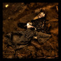
| 08/05/2009 10:56:53 AM | sweet deathby pauleeartComment: HI from the CC Club,
This is an amazing shot, reminds me of something i have seen before, just not sure where or what.
I love the tones and colours you have going on here. The pig is sublime, not sure what the other white things are, they sort of look like eyeballs gone wrong.
I am presuming that you laid the cloth on the pig, if you did it really makes this image surreal and full of impact. It almost seems like it is being tucked into bed.
The only thing i would change in this shot is a closer crop, make a tube with your hand and look through it and you will see a closer crop that sometimes works and sometimes doesn't.
Even though the pig is dead or very fast asleep, i do get a sense of peace from this shot.
I am certainly looking forward to see a LOT more work from you, this is a stunning image Message edited by author 2009-08-05 10:58:34. |  Photographer found comment helpful. Photographer found comment helpful. |
| 08/05/2009 10:38:50 AM | Another Day Passes Byby Alex_EuropaComment: CC CLub here
1st Impression. I am immediately taken to the sunset adn that is drawing my eye, it actually took me a bit to see that there where grave stones in the shot. The sky is very dominant. The title is fitting though on this and does explain it. A tip that I have used at sunset when I am shooting from the top of my car. I turn on my fog lights or low beams ( and cover them with a white sheet , sometimes!))and it give you the fill light that is pretty delicate and illuminates , what in your case would be the front row of stones.
Your horizon is a little tilted so straightening that out would be a bonus. WOW I just noticed you used your shutter at 88 seconds that explains the clouds moving. I do not see any sharpening in your notes, that would have helped as well.
You did a great job on this and placed well, well done | | Photographer found comment helpful. |
| 08/05/2009 10:27:49 AM | It's Heads......YOU LOOSE!by ASTONishingComment: Hello from teh CC Club!
This is definitely a different POV and you did a good job on that
1st Impressions, too dark and too grainy. The grain and darkness adds to the picture to give it a dramatic edge, but there is too much. Your ISO was well up there at 1600, I think if you had some more natural or side strobe or even a table lamp it would have helped a tad with the wifes figure, hands and grain.
I am not sure if in Post processing you bumped up the reds or if this is from the grain, but in hue and saturation you could have brought it down just a tad. The red does add more drama, as it gives the overall feeling of impending doom, but it is way too much on the coin,
The point of view is excellent, it makes the viewer the one behind the hands and turns them into the aggressor. Your DOF is also good with this and the position of the hands in the shot fills the whole shot.
Remember to use up all of your allocated space of 640, as it important to have a bigger show.
You did good on this shot, well done
If you have any questions, feel free to contact me | | Photographer found comment helpful. |
| 08/05/2009 10:17:39 AM | Leaving Intensive Care the Last Timeby StringfellowComment: Hello from the CC Club
1st impression. A very cold and lonely photograph, the blue tint that you have going on here really emphasis that.
It is slightly off kilter, the right side has more wall than the other. I think that if you are going to do a dead straight centered focus, you really need to be standing in the middle of the hallway.
Your ISO was right up there and I am surprised at the lack of grain, good job on that. In post processing, I would sharpen it a little to bring out more details and make it as sharp as a tack.
I think you have captured a photograph that speaks volumes to people that have been in this situation. well done
| | Photographer found comment helpful. |
| 08/05/2009 10:06:22 AM | Ghostby Rino63Comment: HI from the CC Club
Well, wow you scored really well with this shot, nicely done.
1st impressions, to me the chair is annoying and is drawing my eye to that first. Other than that, there is nothing else I can say.
Good positioning, great DOF, clean sharp lines, very nicely done, but try it without the chair!!
Well done
| | Photographer found comment helpful. |
| 08/05/2009 10:03:01 AM | Ceased To Beeby kingskingdomComment: HI from the CC Club!
Well, looks like you so did not bomb on this shot, well done.
Your DOF is great, your sharpness is sharp, you have good clean lines, good choice in the background. Not many would have gone with the black on black, but this really worked out well for you here.
There is not a lot to critique here as you pretty much nailed it to the board! I would love to see what you could do with this in Advanced Editing! | | Photographer found comment helpful. |
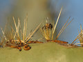
| 08/05/2009 09:59:36 AM | Impaled DEAD bee, LIVE wormsby HarveyGComment: HI from the CC Club!
Well, these little worms look like they are Cinnabar moth Caterpillars!
Well, for your first ever challenge you did amazingly well! You read the rules and used crop and unsharp, there is also a lot more that you can do in in Basic.
You captured a great shot that was just right for this challenge. In post processing, a couple of thing you could play with is, contrast, saturations, selective colours.
Prickly pear have very flat oval shaped pads and can range from dark green to a yellow green colour. A little selective colour may have brought out some more green to really offset the insects on here.
Overall you did a great job, well done | | Photographer found comment helpful. |
| 08/05/2009 09:33:11 AM | Remembering how we got Life from Deathby SinickPhotographyComment: Hi from the CC Club
A sad reminder of our freedom!
1st impression, I would not know that this was a memorial wall unless I actually knew it was. I am from England and live in America, but there are many people that would just see that as a wall and unaware of what it is.
So getting some of the lettering in it standing out would have helped the viewer with this one. Play around with position when taking a photo like this, a straight on with a slight tilt would have eliminated the people. So play around with your DOF.
I see that your ISO is at 400, try 100 so there is less grain in the shot
Sharpening and contrast is your friend also in basic, it will bring out more details that are hidden.
It is a good shot |
| 08/05/2009 09:26:54 AM | Reminders of death - one for each life - lost on the roadby gmjComment: CC Club here!
What a sad picture.
1st impressions are that your horizon is slightly tilted, it needs straightening out. Maybe a little saturation or selective colour to make the blues, yellows and green pop a little more. On the left hand side a crop that doesn't cut off the cross may help the viewers eye as well.
Good placement, well done |
| 08/05/2009 01:26:56 AM | The face that stands out!by nichmonComment: CC CLub here,
Well, it is certainly from above. He has a handsome face!
1st Impression, it is way too small, in basic remember you can go up to 640. Use all the given space you can in shots. It is also very dark, not sure the recovery helped much as it does bring out details , but it also darkens as well. I would play with the shadows and highlights a bit, expose and offset. Your ISO is your friend in situations like this, just bumping it up would give you a faster shutter speed. Great job on the sharpness, that is spot on
This would have been a fantastic shot, if it was brighter and less small. |
|
Showing 1451 - 1460 of ~4455 |
Home -
Challenges -
Community -
League -
Photos -
Cameras -
Lenses -
Learn -
Help -
Terms of Use -
Privacy -
Top ^
DPChallenge, and website content and design, Copyright © 2001-2026 Challenging Technologies, LLC.
All digital photo copyrights belong to the photographers and may not be used without permission.
Current Server Time: 05/04/2026 06:38:43 PM EDT.
|