|
|
|
Showing 1351 - 1360 of ~4455 |
| Image |
Comment |
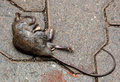
| 08/25/2009 04:15:35 PM | Dead or Alive?by muvoComment: Hi from the C Club
Well, you asked for an in depth comment on your shot.
I think it is pretty dead or as close to dead as it could be.
It is actually not a bad shot, it is crisp and clean, leadign lines of curves go well with the pavement slabs. Your processing is pretty good, could use a little more contrast and depth, but your colours are spot on for a rat.
try again, you have the eye for it
|  Photographer found comment helpful. Photographer found comment helpful. |
| 08/25/2009 10:59:32 AM | Archesby louinsdComment: Hi from the C Club
Nice shot!!!
I really like that you have the repetitive pattern going on, it does scream circles to me. Your DOF is very good and POV excellent.
I think what hurt this shot is the straight conversion to black and white. Playing around with the selective colours , shadows and highlights then converting it to black and white can make a huge difference.
Your sharpness is spot on, details are good. Nice shot indeed
| | Photographer found comment helpful. |
| 08/25/2009 10:54:00 AM | Head Circlesby Mekachu300Comment: Hi from the C Club
You asked for an in depth comment from the Club,
First Impressions, it is a very busy shot, it almost has a dirty look feel to it. Brightening up the photo in post processing with exposure and or brightness contrast would have helped with the overall feeling of this shot.
it was a clever idea and you have your main focal point and then leading lines downwards. I believe this would have been better if the main focal point was not cut off. Playing around with selective colours may have given the darks a little more depth , thus giving the photo some as well. I dont think a crop would have helped this much.
So overall, a good concept.
|
| 08/25/2009 10:37:49 AM | Up in the Heavensby PatrolComment: Hi from the C Club
England really does have some amazing Cathedrals, well done on capturing this one,
You have really good light at the center which shows off your circle perfectly, very nice tones that are even throughout. I am wanting to zoom in on the circle though, so I think it is all or nothing with this shot, either zoom right in or have it positioned right at the top with more of the stained glass windows showing. You are the tiniest bit off center with your center window which is making the sconces on the right lower than the right. But I am just nitpicking as I am now trying to find things wrong with this shot as there is hardly anything at all.
I like it very much and now I am planning on going there too because of this shot. Well done | | Photographer found comment helpful. |
| 08/24/2009 08:28:46 PM | A 30-Year Old Gameby angkokwengComment: Hi from the C Club,
this is certainly a fun game, my kids have something familiar to it.
As a photograph, it is pretty good.
It is sharp on the outside edges, the black and white conversion is good. Having it at this angle, i think that you should have made sure it was completely in the center, you have more bottom that top.
I can not see anyting that you could have done in PP to improve this shot, well done!
| | Photographer found comment helpful. |
| 08/20/2009 09:16:11 AM | Dinner honoreesby MelethiaComment: Well, hey there Ms Retired!!!!
So what are you going to do with yourself now???? Are you coming back to the US? | | Photographer found comment helpful. |
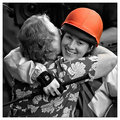
| 08/20/2009 08:21:51 AM | The Red Hat Club Rides Again (Haywood Smith, 2005)by kingskingdomComment: Hi from the C Club
Excellent photograph.
Very clear, sharpness is spot on. I know you are colorblind and I think in this instance it shows, in the helmet cover being orange.
There is absolutely nothing more I can add to this shot. I think it is a very emotive shot. | | Photographer found comment helpful. |
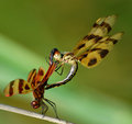
| 08/20/2009 08:15:19 AM | "Dragonfly Qigong"by jomernerComment: Hi from the C Club
Well, wow, I loved this shot and gave it an 8 when in voting. Here are the reasons why.
It is an outstanding shot, the crispness is defined in the wings, the clarity is excellent, your bokeh is smooth as butter and compliments the dragon flys well.
My only nitpick was the DOF, maybe just a tweak of the contrast would have given it a deeper feeling. Maybe pushing those greens to a darker colour would have helped.
Other than that, spot on shot!!! Do it again! | | Photographer found comment helpful. |
| 08/20/2009 08:10:52 AM | "Boys Will Be Boys" by George E Sargentby jeroweComment: Hi from the C CLub!
Whatttttttt an adorable baby, how big is that smile!!!!
You need to crop out some of the bottom of teh shot, just so it is straight, as of right now it is tilted and gives the feeling that he is going to fall over to the left. Because the letterings are so large, i think a crop off the top, to the third hoof print would have made him seem just a little more in proportion than he is right now.
I an not see anything that you can do to improve this shot bar the crop, it is adorable.
well done | | Photographer found comment helpful. |
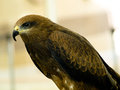
| 08/20/2009 08:06:55 AM | The Falcon Lords by stfleckComment: Hi from the C CLub
Nice looking bird there!
There is something about this shot that just feels a little off. I think it is the straight lines behind it. They are throwing the bird off and making it look like it should be straightened out. I think a squarer crop may have helped this a little with that issue. The bird looks great, sharp and clean. I would like to have seen you zoom in a little bit more on this as you have such good clarity on the head. In post processing, the selective colours, colour balance and curves would have pushed those colours on the wing nicely. Maybe, just maybe exposue and contrast with a touch of gamma would have deleted your background somewhat.
Nice shot, well done |
|
Showing 1351 - 1360 of ~4455 |
Home -
Challenges -
Community -
League -
Photos -
Cameras -
Lenses -
Learn -
Help -
Terms of Use -
Privacy -
Top ^
DPChallenge, and website content and design, Copyright © 2001-2026 Challenging Technologies, LLC.
All digital photo copyrights belong to the photographers and may not be used without permission.
Current Server Time: 05/04/2026 12:26:27 AM EDT.
|