|
|
|
Showing 721 - 730 of ~1467 |
| Image |
Comment |
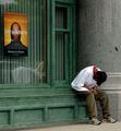
| 07/16/2004 05:07:58 AM | Gogglesby shutterflyComment: Hello Wendy from the Critique Club,
Composition
Hey, this a nice jokey sort of portrait. The tilt to the head and the expression are great and there is a sense of balance, despite the almost square positioning. A slight change in camera angle might have removed the door in the background, although it is not particularly intrusive. The crop is tight to the head at the top but any less tight might have upset the balance.
Focus
The shallow depth of field is well controlled, providing a good clean main subject and an out of focus background.
Exposure
You have desaturated all but magenta(?) and the black and white image is nicely exposed, with no clipped highlights - the highlights and shadows on the face add to the image, neither too bright in the highlights nor too dark in the shadows. The desaturation was neatly handled with no obvious interference between B & W and colour.
Challenge
It clearly meets the challenge - pity in a way that it came so close after the Desaturation Challenge - but maybe that is where the inspiration came from!
Overall
This is a nice portrait, perhaps all in black and white and with less foggy goggles so that you could see the eyes, one to keep for the subject! I like the happy expression and the way the water drips are caught on the face and neck. I wonder what lighting you used - there is an interesting highlight on the chin and cheek from a different light source - it does not detract! Perhaps it is just natural light and the highlights are reflections from the pool. Well done!
Hugh
Any comments or reactions, feel free to contact me. |  Photographer found comment helpful. Photographer found comment helpful. |
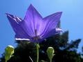
| 07/15/2004 06:59:28 AM | purple symmetryby cmangisComment: Hello Carol from the Critique Club,
Composition
This was shot from below, giving a nice backdrop of the sky. The use of the sun to light the back of the flower as well as part of the front is atractive. The tree in the background is a bit distracting and the buds don't really add to the image. A different camera angle might improve the composition (moving further to the right?) and putting the main subject in the top right 1/3 corner might help but you might lose the backlit petal.
Focus
The shallow depth of field aids the composition and the primary subject is nicely in focus. The sharpening you applied looks just right.
Exposure
The exposure was well handled, the highlights are just clipped but there is no loss of important detail, the same is true for the blacks.
Challenge
One could grumble about what purple is - your image is perhaps a little blue for me but that is nitpicking!
Overall
This image has potential - it could possibly have been impoved a little by trying out some alternative camera angles but the combination of front and backlighting look great.
Hugh
Any comments or reactions, feel free to contact me. | | Photographer found comment helpful. |
| 07/15/2004 06:42:41 AM | "Purple Rain"by ladpupmoeComment: Hello Peggy from the Critique Club,
Composition
This is a very attractive image - the contrast of purple against green works really well, as does the diagonal stem. Some commentators have suggested a tighter crop - I have tried it and maybe there is some potential there but you would lose some of the balance provided by the green. It has a lovely soft bokeh - the Pentax Optio S is a remarkable camera and you have shown it off to its best advantage.
Focus
The use of shallow DoF is entirely appropriate, drawing the eye to the shape of the leaf and the water droplets. The sharpening applied is just right, sharp but impercetible.
Exposure
The histogram is work of art in itself! A full range of black to white and loads in the middle - perfect for this image.
Challenge
This fits well with the challenge and the rain looks very natural.
Overall
I very likeable image. Maybe a slightly different crop and moving the rear leaf out of the way would provide an alternative image but these are the most minor of suggestions.
Hugh
Any comments or reactions, feel free to contact me. | | Photographer found comment helpful. |
| 07/14/2004 05:00:15 AM | | | Photographer found comment helpful. |
| 07/14/2004 04:57:53 AM | | | Photographer found comment helpful. |
| 07/14/2004 04:56:22 AM | | | Photographer found comment helpful. |
| 07/14/2004 04:54:54 AM | Mood for Loveby graphicfunkComment: Brilliant idea, beautifully executed - the light heart was a stroke of genius!
My only 10. | | Photographer found comment helpful. |
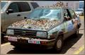
| 07/13/2004 07:57:49 AM | Fear No Artby hannafateComment: Hello Hanna from the Critique Club,
Composition
This must have been an opportunity shot - composed as well as possible bearing in mind the location. The wire across the front is distracting, as is the background and the other vehicles but maybe it would have been difficult to rearrange it. I have played with a tighter crop and it doesn't help. At least the diagonal placing of the car, providing depth, works.
Focus
The whole image is in focus - maybe if you had used a larger aperture (smaller f number), you could have thrown some of the distractions out of focus but you would lose some detail on the main subject - your choice.
Exposure
Exposure looks about right, you have some blown highlights but they do not contain important detail and the image has a good even range from black to white.
Challenge
I guess this is unusual enough to meet the challenge - it would have been better in a controlled environment but we have to make do with waht is ther!
Overall
Well spotted and the capture is about as good as you could make it in the environment. Keep shooting, maybe there will be an opportunity to shoot it on its own one day.
Hugh
Any comments or reactions, feel free to contact me. | | Photographer found comment helpful. |
| 07/13/2004 07:40:19 AM | When Giant Spiders Attackby JesuispeureComment: Hello Amanda from the Critique Club,
Composition
Well spotted - makes a dramatic image. Like the way the tower leaps away from you and the rule of thirds works well in forcing one's eyes back to the "spider" image. The blue splash near the top of the tower provides interest and balance to what otherwise might have been bottom heavy. I guess this must have been taken tripod mounted (if you didn't you kept very still!) and the 1600 ISO creates just a tiny haze of noise centre left but this camera is fantastic - I have a EOS 300D too and love it.
Focus
You don't say what lens you used but it must have had a short focal length because the whole image is well focused - an achievement at f/4.0
Exposure
Tricky to take night scenes - you have done well - there are the tiniest amount of blown highlights and they don't matter - no loss of important detail and the balance of gold spider against the blue lights is just right.
Challenge
Very few submissions really met the challenge - yours was one of them (IMHO)!
Overall
A dramatic image, well captured, scoring very nearly 6. What more could you want? A higher score? Well that is in the hands of the audience and that is often beyond comprehension. Well done!
Hugh
Any comments or reactions, feel free to contact me. | | Photographer found comment helpful. |
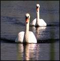
| 07/13/2004 07:20:16 AM | Extraordinary beings: Cygnus. Powerful and beatiful. Here they run to defend the net.by greslizzzComment: Hello Fe from the Critique Club,
Composition
The composition is pleasing. I like the diagonal placing of the two swans and the nearly square aspect ratio. The verical bar on the left and another fainter one on the right are distracting - if they are the net you refer to it needs to be more nearly in focus. If they are reeds or vegetation, it might have been better to change the camera position to avoid them.
Focus
The first swan is clearly the centre of attention and is in focus. The second swan is not well focused. Maybe it would atract more attention if it was. To increase your depth of field, reduce the aperture (higher f number).
Exposure
This was a difficult shot to expose right, a light subject against a dark background. The swans are both overexposed, losing detail in the highlights. The background water looks muddy, especially near the top of the image. Although it would have made the water darker, I would have exposed less to capture the detail on the swans.
Challenge
Long titles can cause DPC commentators to mark down - it is better for the image to tell the story - not always easy. Is this extraordinary? Maybe not for me but it is what you feel that matters!
Overall
A pleasing image overall - keep shooting and you will see improvements.
Hugh
Any comments or reactions, feel free to contact me. |
|
Showing 721 - 730 of ~1467 |
Home -
Challenges -
Community -
League -
Photos -
Cameras -
Lenses -
Learn -
Help -
Terms of Use -
Privacy -
Top ^
DPChallenge, and website content and design, Copyright © 2001-2026 Challenging Technologies, LLC.
All digital photo copyrights belong to the photographers and may not be used without permission.
Current Server Time: 06/15/2026 02:22:48 AM EDT.
|